SMT201 AY2019-20G2 Ex1 Lu Zhimao
Part One: Thematic Mapping
2014 Master Plan Landuse
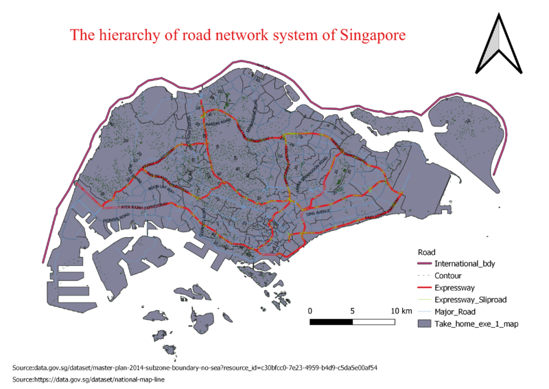
In order to have a good hierarchy of road network system of Singapore, I decided to categorise them according to the types of road. After that, I chose to use different types of lines and different colours to represent each road network system. For example, I chose to use a thicker line and brighter colours to catch attention for roads that are frequently used such as expressway. For major road and slip road, I would like to represent with thin lines and those colours can show a contrast with other road systems. All the roads and expressway are a label with names, however, without zooming to a bigger picture, we are only able to see the names for expressway and some of the major roads.
Level of Schools
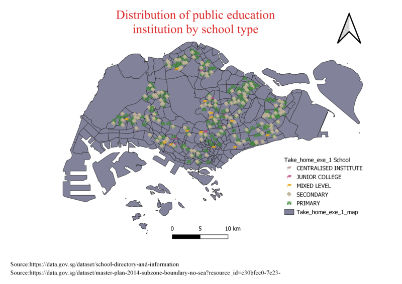
In order to have a good distribution of public education institution, I have to check the csv file if there are any missing or incorrect data. If there is a need, I have to adjust accordingly. After checking the data, I choose to use geocode to upload the data in to QGIS instead of using MMGQIS. Using geocode is more suitable in Singapore context as it reduces the chance of missing datas. After that I chose to categorise them according their education level and assigned a unique colour or symbol to each type of data. I use whiteboard representing primary school, book representing secondary school and hat representing JC. As there are three different type of JCs, therefore I use 3 different colour hats to represent each type of JC.
Road Network System
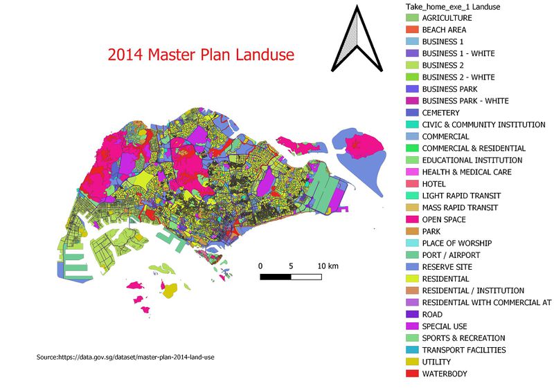
After uploading the 2014 master plan landuse into QGIS, I realised the landuse layer is not a good visual representation for the reader to analyse. In order to improve it, I reduced the thickness of the line so that it provides the reader with clearer visuals on the layout. After adjusting the settings, I categorised them according to their type of industries. It is very important to choose the right set of colours as a different type of industries are very near to one another. If the colour too similar it may cause a longer time in search of the industries.
Part Two: Choropleth Mapping
2010 Population Aged 65+
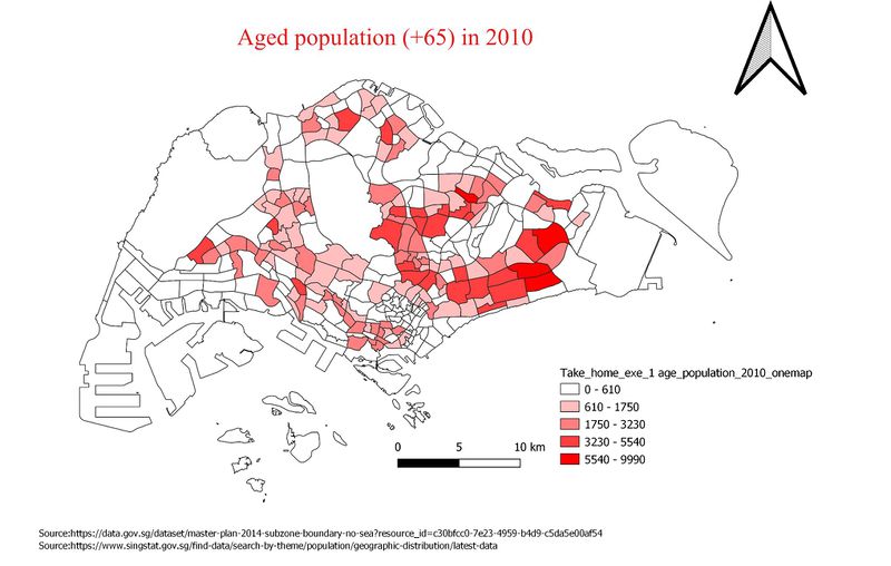
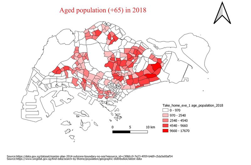
Based on the visual distribution of 2010, it is evident that the East side of Singapore has a higher density of aged population as compared to other parts of Singapore. This can be seen through the legend where it provides a colour scale to show the viewer the density. The darker the colour, the higher the aged population density. Assumption: Industry areas and Changi location are not an ideal place for elderlies to stay therefore it is generally white in colour on the map.
2018 Population Aged 65+
Comparing the visual representation in 2018, it can be seen that in 2018, the number of aged populations has increased due to more subzones are in the coloured zones as compared to the previously white zones in 2010. This comparison goes to show that the aged population density has not remained solely in the East, but it has spread further throughout the parts of Singapore. In addition, it is slightly evident that in 2018, it consists of a darker colour subzone where it was previously light in 2010.
2010 Proportion Aged 65+
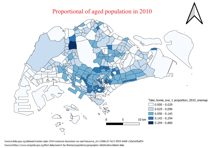
With the total population taken into consideration alongside the aged population, it can be seen that the density of the map has moved to the central part of Singapore whereas when the data only considered aged population, it was more concentrated in the East side of Singapore. The ratio of the aged population against the population plays a very important factor as it takes into consideration the total population size. A smaller denominator and a larger numerator will result in a higher density shown on the map.
2018 Proportion Aged 65+
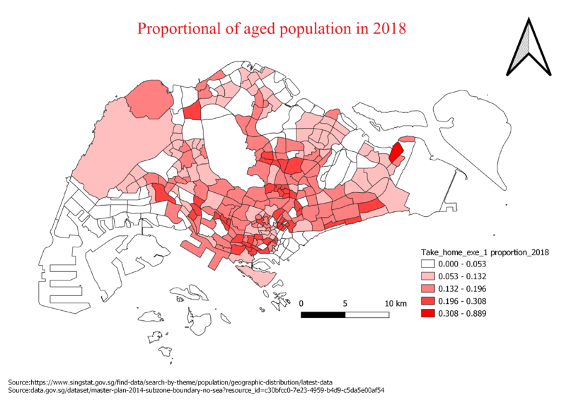
Some areas became darker in colour because it has taken the total population into consideration, thus generating a less biased view on the density of aged population. For example, we only looked at aged population assuming there are 5 people in that area, upon looking at the total population (assuming 6), therefore the proportion size density of aged population is higher.
Percentage Change From 2010 and 2018
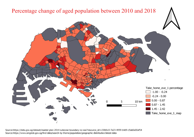
There are several data covered in the area coloured in grey. Firstly, it is data which existed in 2018 but not in 2010, thus no percentage change is shown. Secondly, data in 2010 could be non-existent and still remain so in the 2018 data. Lastly, being unable to change null values to 0 as in terms of percentage-wise, 0 represents a change in the aged population. Therefore, in ensuring that the data representation remains accurate, double layers are used fill-up the empty subzones.
In terms of the aged population, the data generally showed that there is a high-density population on the East side of Singapore. After taking into consideration the total population, the density of aged population has spread across the west side of Singapore, although showing that the central part of Singapore consisting of the highest density. Atlas, the percentage change of the aged population accurately depicts the spread of the aged population as well as the proportion of the aged population which is in line with the density population of the areas as shown previously.
Within 8 years, majority of the subzones actually showed a higher density as compared to 2010 while only a few subzones actually decreased in density, thus we can safely conclude that there is a growing ageing population in Singapore.
Discussion
I obtained the data for 2010 and 2018 through singstat and after analyzing the data, I decided to do some data cleaning in order to customize the data into the format I would need for my attribute tables. Such as eliminating the commas and spacing and ensuring the capital letters of each subzone matched in both the 2010 and 2018 data. There has to be zero discrepancy between these 2 data else null values will appear resulting in an inaccuracy of data. I joined the CSV file containing the 2010 and 2018 data sets into the layer of MP14. This is so to add the attributes into the MP14 therefore easier to extract and formulate formulas to get the data we want. For proportion of aged population, I used the formula of (2018age65+ / total population 2018). In the process of joining, any null values that were obtained were treated as 0 to prevent any data being left out. I tabulated the percentage difference between 2010 and 2018 using the following formula ((proportion2018 -proportion2010)/proportion2010) and change the output from whole number to decimal.
