SMT201 AY2019-20G2 Ex1 Lee Sean Jin
Jump to navigation
Jump to search


Contents
- 1 Part One: Thematic Mapping
- 2 Part Two: Choropleth Mapping
- 2.1 Singapore's Aged Population (65 and above) in 2010
- 2.2 Singapore's Aged Population (65 and above) in 2018
- 2.3 Singapore's Proportion of Aged Population (65 and above) in 2010
- 2.4 Singapore's Proportion of Aged Population (65 and above) in 2018
- 2.5 Percentage Change From 2010 and 2018
- 2.6 Reasoning behind classification choices, methods of derivations of new variables and handling missing values
Part One: Thematic Mapping
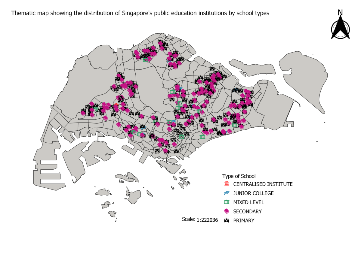
Distribution of Public Education Institutions in Singapore

Data Source: School Directory and Information [1]. Master Plan 2014 Subzone Boundary (No Sea) [2]
I used the SVG symbols taught previously in the Hand's On exercises to categorize the schools. The types of schools are a form of categorical data, thus they can be differentiated from each other by unique symbols of different colours. I chose grey as the map base so that the bright coloured and black symbols can be easily identified on the map. This is so that the viewer can identify any trends and patterns at a glance. The increased size of the symbols to increase their visibility as I found that the symbols were too small even when the map was zoomed in.
Singapore's Road Network System

Data Source: Road Section Line LTA Datamall [3]. Master Plan 2014 Subzone Boundary (No Sea) [4]
As the data provided from LTA did not distinctly categorize the road types, I used QGIS to do this. Road names that contained "Expressway" were categorised into Expressways, names with "Road" were categorised into major roads and the remaining uncategorised roads were categorised into minor roads. For this map, I chose grey as the background map colour so that road lines can be clearly visible because both brighter colours and darker colours can be easily identified. Apart from using colours to differentiate the different road types, I also changed the thickness of the lines for each type of road. Expressways are seen as "larger" roads in reality thus their lines are the thickest, on the other hand, minor roads being "smaller" are given thinner lines.
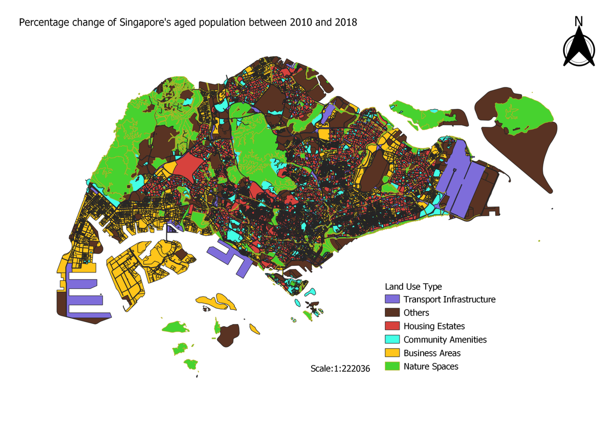
Singapore 2014 Master Plan Land Use

Data Source: Master Plan 2014 Land Use [5]
For this map, I used colours to categorize the types of uses for land. Since Singapore's land has different uses, this resulted in a multi-rainbow coloured map which made the visualisation hard. Thus I used QGIS to merge some categories together. For example, all the land that is used for business were merged together under the same category of "Business Areas" while land that is used for agriculture or parks were merged into the category of "Nature Spaces". I found that further classification of the land use types were necessary to produce a map that more concisely visualised the data. Using this method, we are able to identify the little pockets of green spaces in the dense jungle of housing estates or the amount of communal amenities surrounding each housing estate at a single glance, which makes this view more effective.
Part Two: Choropleth Mapping
Data Source for all maps below: Singapore Residents by Planning Area/Subzone, Age Group and Sex, June 2000 - 2018 [6]. Master Plan 2014 Subzone Boundary (No Sea) [7]
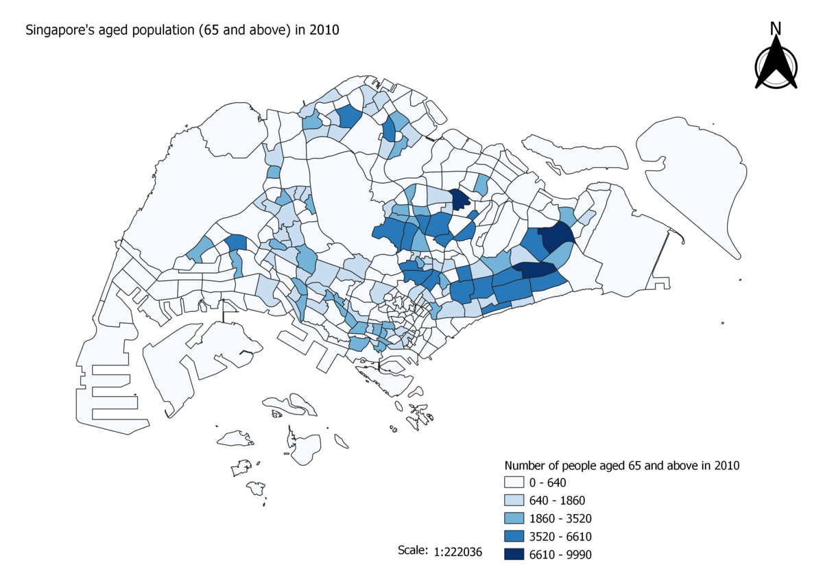
Singapore's Aged Population (65 and above) in 2010
_in_2010.png)
From the Chloropleth map, it is evident that there is a greater number of people who are aged 65 and above in the east as indicated from the darker tones of blue. Overall, the majority of the map is in white, which indicates that many areas have low to zero numbers. However, upon closer inspection, we can see that some of these white areas are non-residential areas which is inhabitable or has a low number of residents.
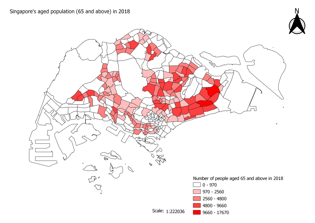
Singapore's Aged Population (65 and above) in 2018
_in_2018.png)
There are evident shifts in the population of people aged 65 and above. One significant change is that the west side of Singapore has more coloured areas as compared to 2010, which shows the trend of an aging population. The population of the aged seems to be relatively unchanged in the east. However, upon closer inspection, we can see that the scale of the legend has changed where the number of aged has almost doubled in 8 years. With the darker tones of red in the East, we can conclude that the number of aged residents in the east has increased significantly which further affirm the trend of an aging population.
Singapore's Proportion of Aged Population (65 and above) in 2010
_in_2010.png)
I define the proportion of the aged population to be the ratio between the population of aged and the total population in each individual subzone. This map is a different way of visualising the distribution of the people aged 65 and above in Singapore. There are a few key differences between this map and "Singapore's aged population (65 and above) in 2010. Firstly, there seems to be a cluster of darker tones of orange brown in the central of Singapore compared to the blues in the other map. This shows that there are less people below the age of 65 in these subzones which causes the proportion of aged population to increase. Secondly, areas in the east of Singapore have lighter tones compared to the darker blues from before. This shows that there is a greater number of people below the age of 65 in these areas, which decreases the ratio between the aged and the non-aged.
Singapore's Proportion of Aged Population (65 and above) in 2018
_in_2018.png)
The proportion of the aged population in the west of Singapore seems to have increased,whereby many subzones which were previously lighter toned now have deeper tones. This implies that the number of aged in the west has increased. The proportion of the aged in the aged seems to be similiar to that of 2010 and greater in the east (darker tones). However, due to the change in scale of the classification, for the same color intensity, the proportion of aged population is now higher than previously, which shows evidence of an aging population.
Percentage Change From 2010 and 2018

This map further iterates the observation that there are significant increases in the aged population in the east and west side of Singapore as evident from the darker tones of purple which shows a larger percentage change in the aged population between 2018 and 2010. Even though the purples in the central areas are not as dark as that in the east and west, we can see from the legend that there is still a 35% to 75% increase in aged population in these areas which makes it significant. This map is also useful in uncovering areas that experienced a large surged in aged population between 2010 and 2018 such as the northern areas in Singapore. In previous maps, we observed that those areas did not stand out in terms of the number of aged population or the proportion of aged population. Without this map, we will not be able to realise that the aged population in those areas increased rather significantly. We can also observe that the central areas of Singapore has a cluster of subzones that experienced 0% change in the aged population.
Reasoning behind classification choices, methods of derivations of new variables and handling missing values
Classification Choices
For the maps showing the distribution of the aged population and the proportion of aged population in 2010 and 2018, I used Jenk's natural breaks under the "Graduated" symbology to classify the data. This was because I thought that this method of classifying the data would give the best arrangement of values into the different classes. I tried out the other methods of classification but found that they were unsuitable. This was because the fixed intervals of the values allowed data to become skewed, whereby a large amount of data got categorised into the extreme ends of the data classification. This led to the map becoming too uniform which made it hard to visualise any form trends and patterns. As for the map showing the percentage change of the aged population between 2010 and 2018, I used the Quantile mode of classification under the "Graduated" symbology instead. Both the Quantile and Natural Breaks method were suitable in showing the aged population trends, however, I felt that the Quantile method was better because it shows the distribution of subzones with 0 changes of aged population. This was something that the Natural Breaks method failed to capture.
Methods of derivations of new variables
I used the join function in QGIS to join the population age data with the Master Plan 2014 Subzone Boundary in order to visualise the information on the map. I then used the QGIS field calculator to find the sum of the number of people aged 65 and above for both 2010 and 2018. I also used the field calculator to find the proportion of aged in both 2010 and 2018. As for the percentage change of aged population between 2010 and 2018, I first joined the sum of the aged in 2010 and 2018 to the Master Plan 2014 Subzone Boundary using Excel followed by the use of the field calculator to find the percentage change. Below some examples of the formulas used in the QGIS field calculator:
Sum of the number of people aged 65 and above: "2010_Population_65_to_69" + "2010_Population_70_to_74" + "2010_Population_75_to_79" + "2010_Population_80_to_84" + "2010_Population_85_and_over"

Proportion of people aged 65 and above: "2010_Population_+65Aged" / "2010_Population_Grand Total"

Percentage change of aged population in 2010 and 2018: (("2010_and_2018_2018_+65Aged" - "2010_and_2018_2010_+65Aged") / "2010_and_2018_2010_+65Aged") * 100
Handling of missing values
Upon discovering missing values in the Attribute Table in QGIS, I used the QGIS field calculator to replace null values in all the columns where null values were present. One example of the expressions used is shown below:
if("+65Aged" is null,0,"+65Aged")