SMT201 AY2019-20G1 EX1 Tan Kin Meng
PART 1 THEMATIC MAP
Data was obtained from data.gov.sg[1] and geocoded with Python and OneMap's API
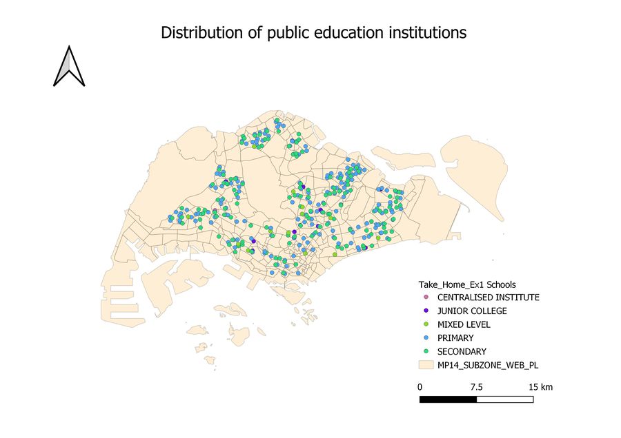
Public education institutions
The map above shows the distribution of public education institutions in Singapore. For this thematic map, I used the categorize function to classify different schools with the feature "main level_". Since the data points of the school are nominal in nature I have a few options, namely, the use of shape symbols or varying hues. In this particular case, I have tried out both the options and I realized that using different hues can help the viewer distinguish the schools better than symbols. Hence, I chose hues to represent the various schools in Singapore.
Data was obtained from Data Mall and classified with LTA's documentation [2] [3]
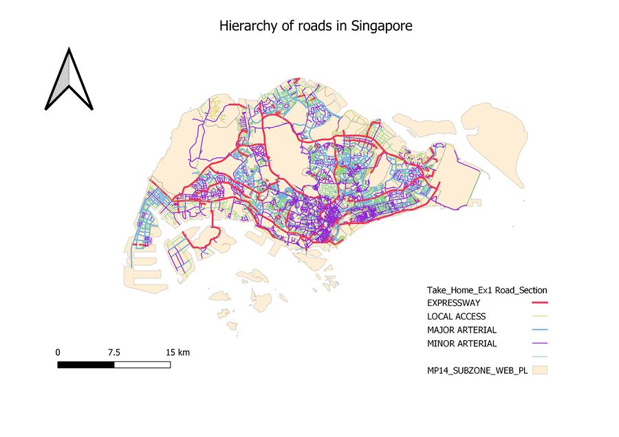
Road Network
The map above shows the different hierarchies of roads in Singapore. They are namely Expressway, Major Arterial, Local Access, and Minor Arterial. I classified the hierarchy of roads based on LTA's official documentation. A new field is added and used to classify the roads based on keywords such as Expressways, Highways, Drive, Avenue etc. I then categorized them based on the new field and adjusted the width of roads as well as colors to help distinguish the hierarchy of roads.
Master Plan Landuse 2014 data was obtained from [4]
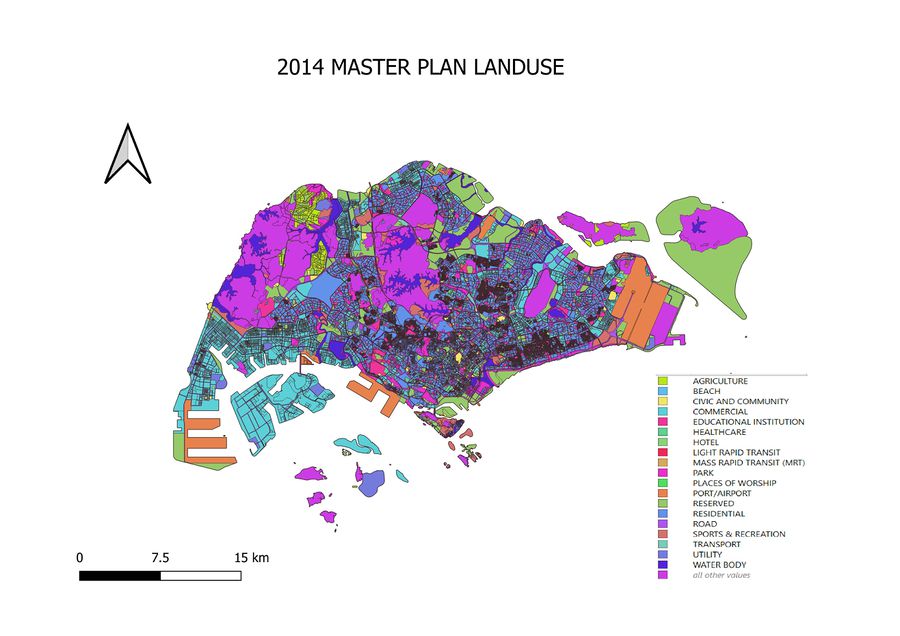
Master Plan Landuse 2014
For the Master Plan Landuse 2014 thematic map, I aggregated similar landuse functions together with attribute table with the help of the variable LU_DESC.This is for a more organized legend. Various hues are then used to distinguish the land use of each sub-zone within Singapore. Due to the number of types of landuse functions, I have decided that using symbols for every type of use could look disorganized. Therefore, I chose to use hues to represent each land use function. However, if the purpose is to visually identify a single landuse function such as residential land use in Singapore amongst the various landuse functions, a better way may be to use symbols to distinguish them
Part 2: Choropleth Mapping
All the data henceforth was found from [1] and processed from the data downloaded
COMPARATIVE ANALYSIS OF THE AGED POPULATION IN 2010 AND IN 2018 (65+))
Analysis
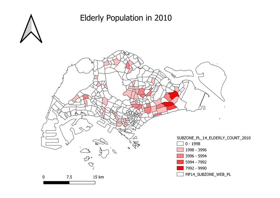
Using 5 classes of equal intervals to categorize the population of elderly in each subzone, it can be inferred from the maps displayed above that the number of elderly in the Eastern parts of Singapore are increasing more rapidly than in the Western parts of Singapore and the Central parts of Singapore. In particular, the number of elderly in Bedok and Tampines aged 65 and above are increasing rapidly and has one of the highest number of elderly in Singapore. Although less rapidly growing in size, the number of elderly in the Western region such as in Yunan and Hong Kah are also increasing.
Choice of classification
The reason as to why I chose 5 classes of equal intervals is to be unbiased in the representation of data. The population of elderly are distributed across subzones in Singapore and this method allows viewers to see the difference in the distribution of elderly across subzones. (http://webhelp.esri.com). This allows for a clear and distinct comparison between the number of population in 2010 and 2018. In addtion, currently, the distribution of elderly are still not skewed enough to use quantile intervals. Therefore, I chose equal intervals for the current time, it may be more suitable in the future to use quantile intervals since the number of elderly will form a large proportion of the population and it will be more difficult to distinguish the distribution between subzones. Colors are used in this comparisons in order to tell the spatial patterns across region.
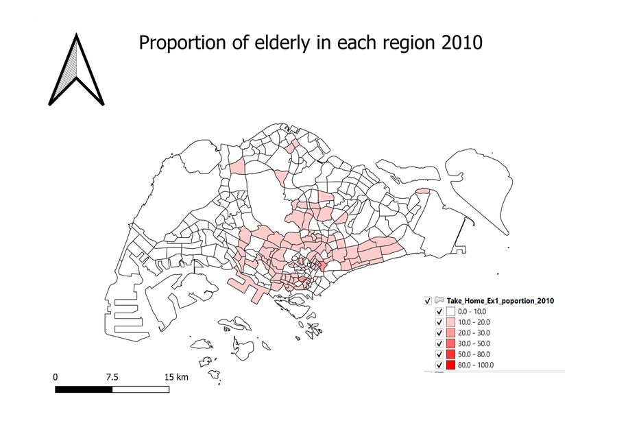
How is calculation done? Proportion of elderly = number of elderly aged 65+/Total population (This calculation is repeated for 2010 and for 2018)
Choice of classification
Similar to reasons above and for comparison purposes, equal intervals are used for both so that if the proportion increases, there will be differences between the two maps, keeping the intervals relatively equal. However, equal intervals have the disadvantage of having too small a range for significant differences to be seen in the upper bound. Hence, as the size of proportion increases, I also increased the interval size a little to account for the proportion size that falls into the upper bound range so that visible changed could be monitored.
COMPARATIVE ANALYSIS OF PERCENTAGE DIFFERENCE IN ELDERLY BETWEEN 2010 AND 2018
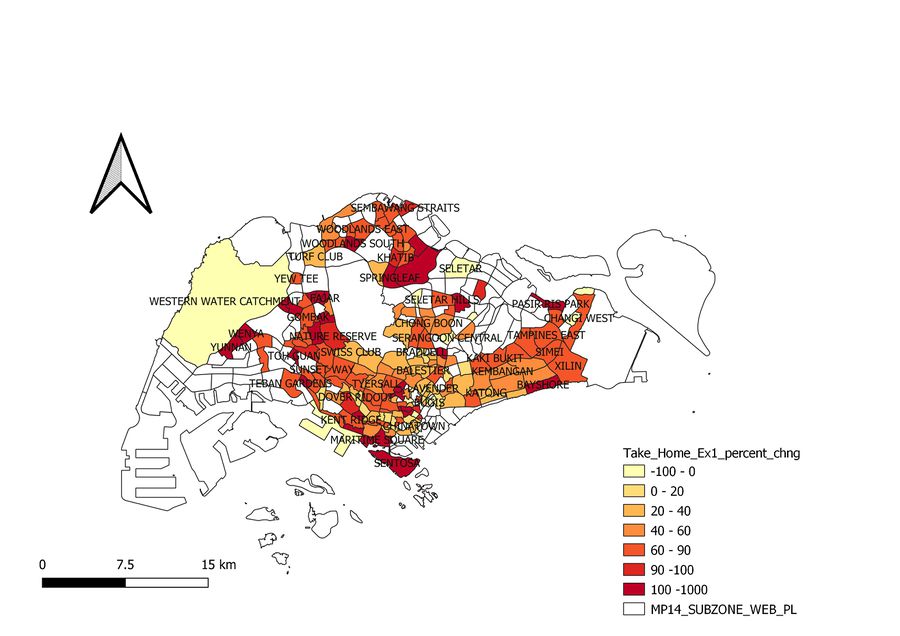
Percentage change is calculated by: [(Elderly aged 65+ in 2018 - Elderly aged 65+ in 2010)/ Elderly aged 65+ in 2010]*100
PERCENTAGE CHANGE OF ELDERLY FROM 2010 TO 2018 BY REGION
For this comparison, quantile intervals are used because the percentage differences are relatively same across Singapore and it is difficult to tell the difference. Hence, I chose quantile intervals so that the difference is more pronounced.
