SMT201 AY2019-20G1 EX1 Ng Xun Jie
Part 1: Thematic Mapping
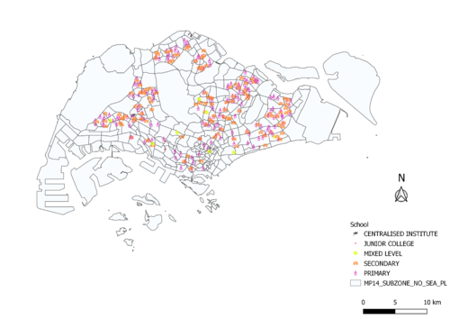
Distribution of public education institution by school types
Using the Pin Map to map out the distribution of public education will allow us to see the discrete data points on the map more vividly. By changing the Symbol Layer, employing relevant SVG marker to indicate different level of the educational institution, and giving different sizes to the different level of the educational institution, we will be able to identify the necessary school better.
Hierarchy of Road network system of Singapore
I have used the RoadSectionLine_Apr2019 data from LTA DataMall and I figure that using the column expression of the Symbology function allows me to perform categorization better. I made my reference to https://remembersingapore.org/2018/08/15/singapore-street-suffixes/ when I was categorizing the 3 different levels of road type. By assigning the expressway to a higher stroke width followed by major roads then the minor roads, I think it is easier for readers to identify the major landscape.
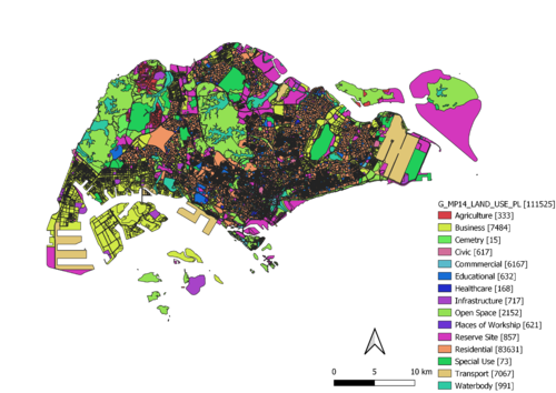
2014 Master Plan Landuse
Similar to the technique I use in the Hierarchy of Road network system of Singapore, I use the column expression function to classify the different land usage to their rightful functional group. By using https://en.wikipedia.org/wiki/List_of_building_types as my reference, I have randomized the color ramp to show the difference in the proportion of land use in Singapore. As we can see in the map, most of Singapore’s land use is for residential purposes.
Part 2: Choropleth Mapping
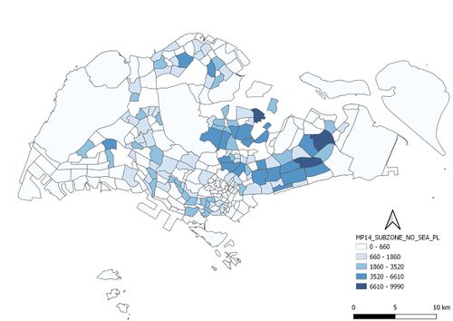
Aged population (+65) in 2010
Aged population (+65) in 2018
Proportional of aged population in 2010
Proportional of aged population in 2018
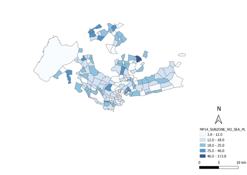
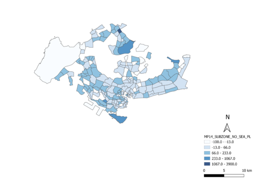
Percentage change of aged population between 2010 and 2018
When I was handling the Singapore residents data for 2010 and 2018, I have encountered 2 missing value from the geocoding process that arises from using MMQGIS. The 2 values are stored away and I think that relative to the larger data set, it is negligible.
I have utilized a plugin called Group Stats then allow me to drag and drop any fields from any layer to generate an aggregated new CSV file that I can import to QGIS later. After that, I am able to use the Open Field Calculator and perform a series of calculation needed. The formula listed below are the ones I employed to answer part 2:
1) Proportional of aged population (65 & above) in 2010 & 2018 2010: (Aged population in 2010) / Total Population in 2010 2018: (Aged population in 2018) / Total Population in 2018
2)Percentage change of aged population between 2010 & 2018 [(Aged population in 2018)-(Aged population in 2010)] / (Aged population in 2010) * 100
