SMT201 AY2019-20G1 EX1 Moh Qing Loong Darren
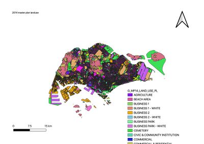
The 2014 master plan data use is from https://www.data.gov.sg/dataset/master-plan-2014-land-use. The various business location, communal spaces, urban development, etc are categorised respectively by their different colours. As there are too many types of buildings, the map is best expressed in this form.
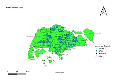
This is the general information of school and mp14 subzone web layer are derived from week 4 data where it was downloaded from data.gov.sg, inside a subfolder of the zipped shp file. The schools are categorised on the mp14 subzone. I used baby to represent primary school, books to represent school in general, darker tone of blue/black to mean secondary school, tertiary is identified by the graduation hat as it is more prominent that way. For the background map mp14 subzone layer, I used green to contrast against the labels, and left the region names to allow readers to know where these schools are located in generally.
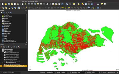
This is the road and expressway network, the major and minor roads are the red lines, whereas the blue lines represents the expressways.
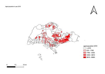
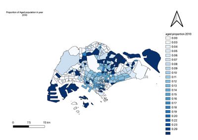
The mp14 planning subzone no sea pl has been merged with the agegroup 2010 file to retrieve the age group of those that are aged 65 and above. The legends indicate the total number of this group and the difference between each subregion( parts of singapore).
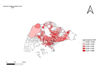
The AgeGroup 2018 file from the singstats data of Singapore residents by population/subzone age and gender is joined together using subzone_n and subzone to successfully derive the various age group data. The interested information of aged (+65) and over are put together. These indicates the total number of this group and the difference between each subregion( parts of singapore), as denoted by the legends. The disparity in the colours are graduated to distinctly show the difference in total number of elderly living in different parts of Singapore.
The higher proportion of elderly tend to live in areas further away from the city and these was probably considered as a better environenment as the cities and town hustle in the most widely accessible parts of Singapore, which is not only thought to be the central region, but also much economical centres, businesses can be found in the south mainly.
In 2018, as the agedgroup statistics is compared again with the masterplan 2014 landuse, there is significant change in the allocation of elderly living areas, more has been noticed to congregate nearer to the central and south of Singapore.This is perhaps due to outer areas of Singapore used for redevelopment or industrial planning, causing some to stay at another area and also contributes to those areas that were experiencing ageing population many years ago, these less prominent areas surfaced to become the highest aged proportion today.
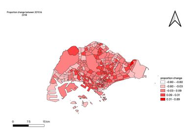
The proportion in population change between year 2010 & 2018 has been very similar to the aged population proportion in 2018, the same regions of the highest number of elderly difference in living population has been noted with drastic change from 31% to 89%, it explains a trend from the planning of aged people who have moved to these same areas which many has become the highest proportion in 2018.
