SMT201 AY2019-20G1 EX1 Linus Cheng Xin Wei
Contents
- 1 Q1) Thematic Mapping
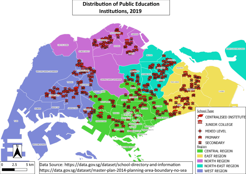
- 1.1 Q1a) Using school information from data.gov.sg, prepare a thematic map showing the distribution of public education institution by school types such as primary, secondary, etc.
- 1.2 Q1b) Using road GIS data of LTA, prepare a thematic map showing the hierarchy of road network system of Singapore such as expressway, major road, minor road, etc.
- 1.3 Q1c) Using master plan landuse GIS data from data.gov.sg, prepare a thematic map showing 2014 Master Plan Landuse.
- 2 Q2) Choropleth Mapping
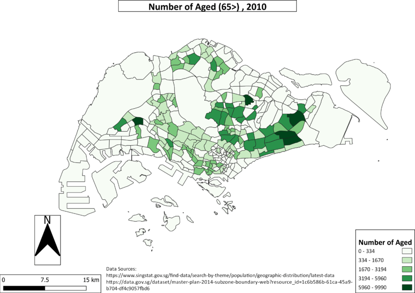
- 2.1 Q2a) 2010 Population Aged 65 >
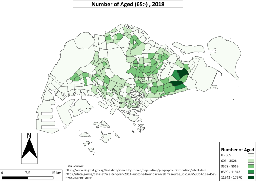
- 2.2 Q2a) 2018 Population Aged 65 >
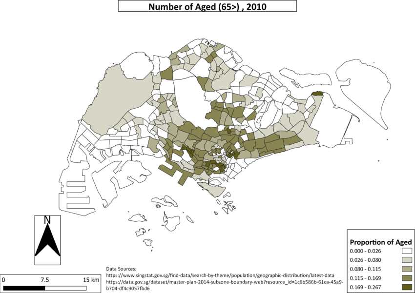
- 2.3 Q2b) 2010 Proportion Aged 65 >
- 2.4 Q2b) 2018 Proportion Aged 65 >
- 2.5 Q2C) Percentage Change From 2010 and 2018
- 2.6 In separate text describe the spatial patterns, if any, reveals by each of the choropleth maps prepared.
- 2.7 Explain the reasoning behind your classification choices, how you derived the new variables and handled missing values, and any other relevant judgments and assumptions. Please limit this discussion to a maximum of not more than 500 words.
Q1) Thematic Mapping
Q1a) Using school information from data.gov.sg, prepare a thematic map showing the distribution of public education institution by school types such as primary, secondary, etc.
I chose to give the same color to all the school types to signify equal importance between them, as someone that is searching for this information might be parents with a child, who are looking for areas to start their family. To further enhance this map, I split the area by region, so viewers can easily visualize where education clusters are. For example, we can see that the north region is lacking as compared to the other regions I chose pastel colors as it is light on the viewer's eyes, as well as enabling the red points to stand out.
Q1b) Using road GIS data of LTA, prepare a thematic map showing the hierarchy of road network system of Singapore such as expressway, major road, minor road, etc.
I derived the classification through the national map line(contains expressways, sliproads and major roads). I cross-referenced the national map line and assumed that roads not belonging in the national map line are minor roads. One technique I have used to show the hierarchy of roads is adjusting the thickness of the line for each class, the thicker the higher it is. I have select the colours by the intensity as well, a more "intense" colour signifies an important road. One thing I noticed is the large amount of minor roads cluttered around SMU, which is a pain to drive around.
Q1c) Using master plan landuse GIS data from data.gov.sg, prepare a thematic map showing 2014 Master Plan Landuse.
As there were many classes in this data set, I first binned the similar classes together to reduce the amount. I also changed the texture of the residential class, since it was a majority class and it was hard to understand if it was a normal fill texture like everything else. Something interesting is that the newly planned residential area, Tengah new town, stands out as an empty white polygon towards the west. We can also see that majority of the west region is used for business
Q2) Choropleth Mapping
Q2a) 2010 Population Aged 65 >
Q2a) 2018 Population Aged 65 >
Q2b) 2010 Proportion Aged 65 >
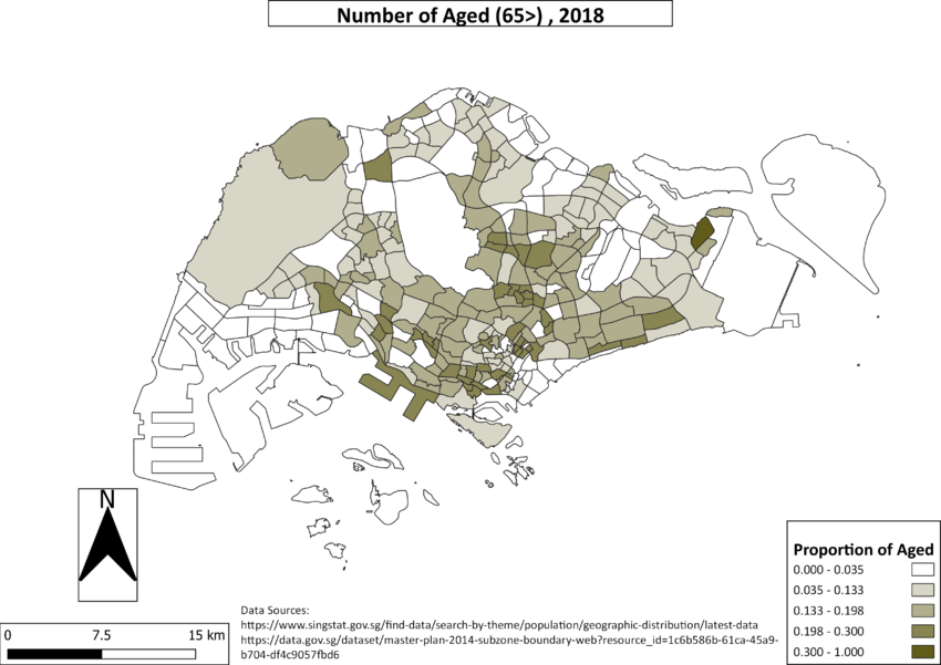
Q2b) 2018 Proportion Aged 65 >
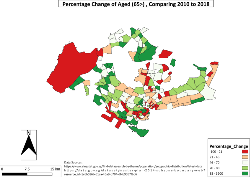
Q2C) Percentage Change From 2010 and 2018
In separate text describe the spatial patterns, if any, reveals by each of the choropleth maps prepared.
If we take a look at the location of the Aged group in the absolute values, it looks as if they are generally located in high amounts towards the east of Singapore. However, when we compare the absolute map to the proportion of Aged, we see that is not the case at all. This re-enforces the fact that we should be careful in using choropleth maps when using absolute values, as they tend to be misleading.
When we look at the absolute number of Aged, it almost seems as if the number has doubled from 2010 to 2018. This is also not the case when we look at the proportional increase, as a doubled absolute value does not mean we have double the Aged people in our population. It is, however, evident to see that we do have a general increase in the proportion of Aged, as Singapore is an aging population.
This is further backed up by the map showing the percentage change of Aged, in which a majority of areas have a percentage increase (signified by areas that are non-red).
Another point to note is that the majority of the places in red are considered prime estate in Singapore right now, which means it is possible that some people might have short-term rental in this area, and might be moving out to new residential areas with cheaper rent. It is also possible they are moving in with family, as the new BTO areas show a percentage increase in Aged as well.
Explain the reasoning behind your classification choices, how you derived the new variables and handled missing values, and any other relevant judgments and assumptions. Please limit this discussion to a maximum of not more than 500 words.
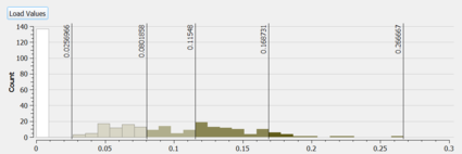
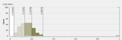
Most of the data for each question is skewed to the right and have some nice natural breaks, so I created groups by manually eyeballing the breaks in the data using the histogram function in QGIS.
I handled most missing values by filling them in with 0, with the exception of the calculation of the percetange distribution, as 0 wouldn't make sense in the formula
Here are the new variables that I dervied. I mainly used a combination of filtering in QGIS, SQL, Group Stats Plug in and Python to aggregate and check my work.
1. Total number of Aged > 65, I grouped all the classes that are above the age of 65 and debrived one for 2010, and one for 2018
2. Total number of residents, I grouped them all by year and summed them up, one for 2010 and one for 2018
3. Proportion, I took total number of Aged > 65 /Total number of residents
4. Percentage Change, I took (total number of Aged > 65 2018 - total number of Aged > 65 2010) / total number of Aged > 65 2010 * 100
