SMT201 AY2019-20G1 EX1 Jessica Low Hui Chen
Part One: Thematic Mapping
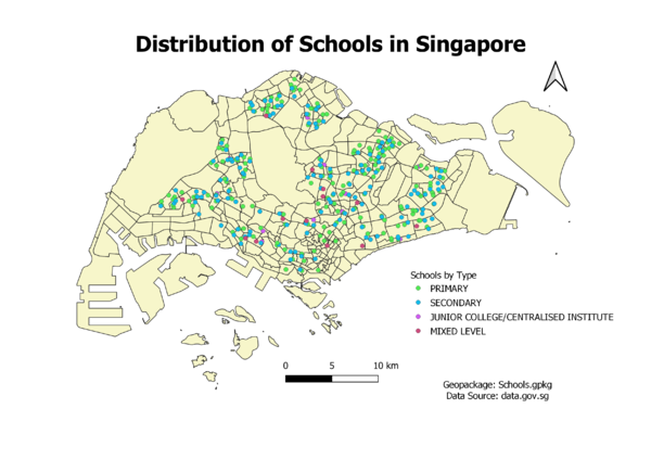
Distribution of Public Education Institutions by School Types
I classified the schools according to MOE’s classification system – Primary, Secondary, Junior College/Centralised Institute & Mixed Levels (schools with mixed Primary/Secondary or Secondary/ Junior College). I used different coloured circles to represent schools of each category.
MOE’s Classification System: https://sis.moe.gov.sg/SchoolDirectory.aspx
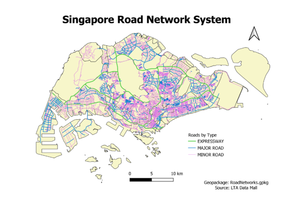
Hierarchy of Road Network System
I created a new field “RD_CLASS” & followed URA’s guidelines on road nomenclature to filter the data into the various road network hierarchies.
- Expressways – If they have ‘Expressway’ in their name
- Major roads – Cat 1 & 2 roads
- Minor roads – Cat 3-5 roads
I used different coloured lines to represent roads of each category. I changed the width of the roads according to the hierarchy, the expressways being the thickest & minor roads being the thinnest.
URA Handbook on Guidelines for Naming of Streets: https://www.ura.gov.sg/-/media/Corporate/Resources/Publications/Streets-and-Building-Names/SBNB_handbook_streets.pdf?la=en
2014 Master Plan Landuse
I largely followed URA’s Use Groups to zone the different sections of the map. I decided to partially detract from some of the groupings as I felt that the land uses were too distinct to put together.
- Eg. I kept ‘Reserve Site’ out of Use Group F and gave it a category of its own
I used categorised symbology to indicate different colours based on land use.
URA Purposes and Master Plan Zones Within Use Groups: https://www.ura.gov.sg/Corporate/Guidelines/Development-Control/Planning-Permission/Folder/DC-Charge-Rates/DC-rates/2000-2005/use-group-tables/u-groups2002-sep2004
Part Two: Choropleth Mapping
On obtaining the csv files from Singstat, I summed the number of residents aged 0 to 64 years old under the field ‘0-64’ and residents aged 65 and above to ‘65+’. Next, I summed the two newly created fields as ‘Total’ to indicate the total number of residents in each subzone planning region.
There were some regions in the files where there was a dash ‘-’ – I took this to indicate that there were no residents living in the region, and used the Excel replace function to create a blank cell so as to not confuse QGIS with regards to the data type. I altered both the 2010 & 2018 csv files in this manner, after which I uploaded them onto QGIS and named them Residents_2010 & Residents_2018 respectively.
I joined the Residents_2010 and/or Residents_2018 csv files (as the join layer/s) with the MP14_SUBZONE_NOSEA_PL layer, depending on which map I wished to create. Next, I joined the csv files & layer via Subzone name, then exported each of the joins as a new layer. There were a number of subzones in the MP14_SUBZONE_NOSEA_PL layer that did not join with the csv files – I took it that Singstat did not use the same categories as URA and continued making my Choropleth maps, disregarding the subzone areas that did not join with the csv files.
I used the following calculations for each map:
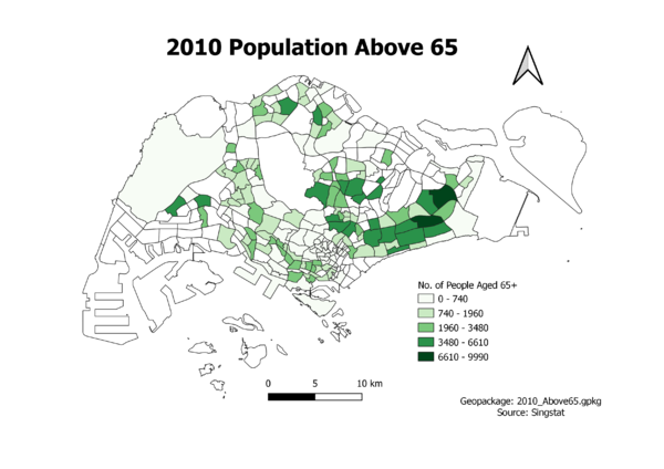
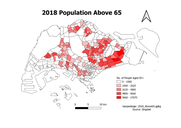
- Aged Population (+65) in 2010 and 2018 – No. of residents aged 65+ in each area. I took this value wholesale from the ‘65+’ field.
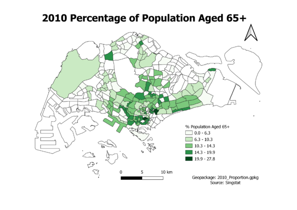
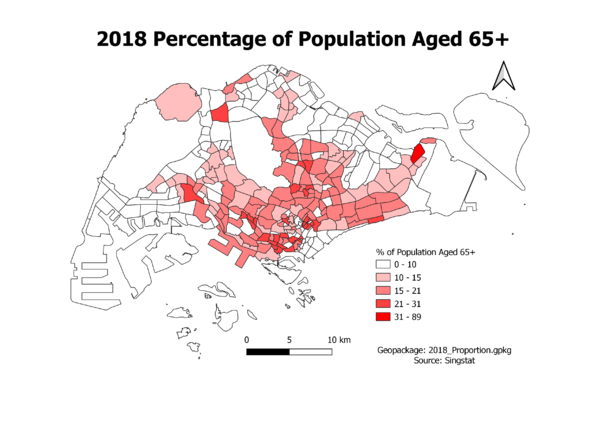
- Proportion of Aged Population in 2010 and 2018 – No. of residents aged 65+ divided by the total residents in each area * 100. I created a new field to input these calculations.
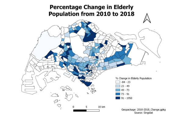
- Percentage Change of Aged Population Between 2010 and 2018 – (No. of residents aged 65+ in 2018 – No. of residents aged 65+ in 2010) / No. of residents aged 65+ in 2010 * 100. I created a new field to input these calculations.
I then used graduated classification to create a Choropleth map based on the calculated values stated above. I chose the classes for each map using the same criteria – whichever class gave a map that showed greater differentiation between each category.
- Aged Population (+65) in 2010 and 2018 – Natural Breaks (Jenks)
- Proportion of Aged Population in 2010 and 2018 – Natural Breaks (Jenks)
- Percentage Change of Aged Population Between 2010 and 2018 – Quantile (Equal Count)
Aged Population (+65) in 2010
Aged Population (+65) in 2018
Proportion of Aged Population in 2010
Proportion of Aged Population in 2018
