SMT201 AY2019-20G1 EX1 Aaron Lee Tian En
Part 1: Thematic Mapping
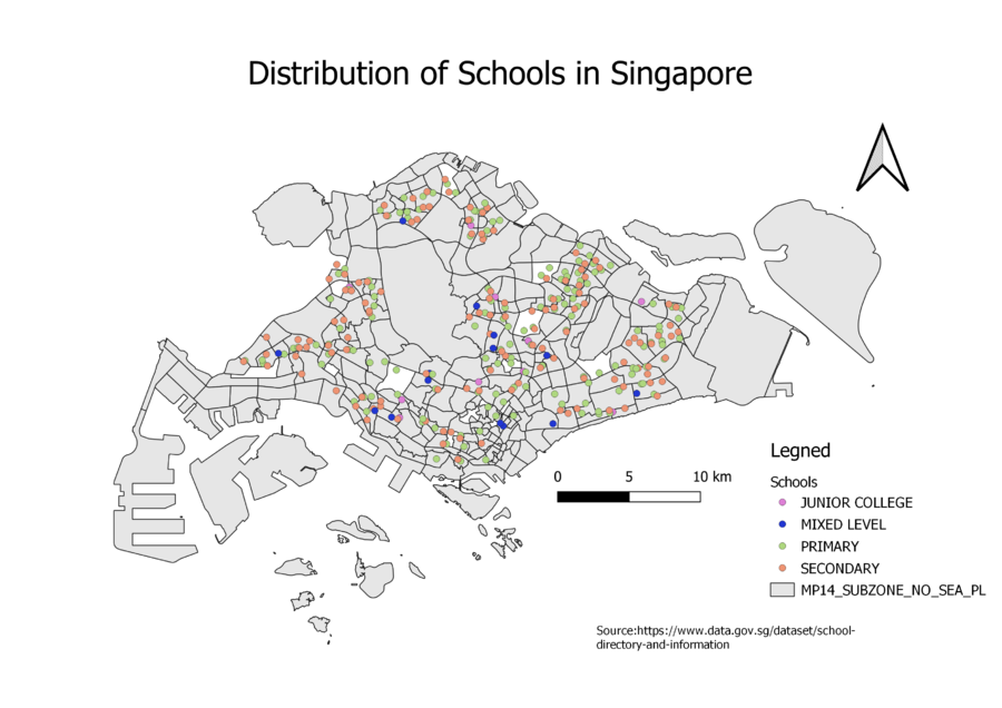
Distribution of Schools in Singapore
I used the category “mainlevel" to classify the different schools. From the map above, we can see the Mixed school number is a lot less than Secondary or Primary Schools. There is a good spread of all the schools around the island of Singapore which will provide more school opportunities to those who cannot travel further distances.
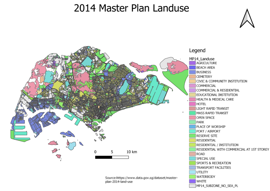
2014 Master Plan Landuse
I used the category "LU_DESC" for classification of landuse. I noticed there were multiple business facilities and I grouped all of them into a single category called "Business". This will clean up the legend and map a small bit. From the diagram, we can see that there are large open spaces at pulau tekong, coney island and in the west. We can see multiple large areas of ports and airports especially at changi, lim chu kang and tuas. The central has too many different landuses to be able to show on the map so it comes out grey.
Hierarchy of road network system of Singapore
I used the category "Road_Type" to classify the road network. I called all the roads with the name "road" as major road and those without are called minor roads. From the diagram, we can see the main expressway network spanning from the east to west and north to south of the country. There is a huge density of major roads within the city area shown by more orange lines. The number or minor roads looks evenly spread out across Singapore with some pockets of denser minor road networks in the central and east.
Part 2: Chloropleth Mapping
Aged population in 2010
Using equal intervals to classify the population, the darker red subzones in the map shows the higher number of Aged population above 65. We can see the darkest areas are in the central, south and the east while the lightest areas are in the west. The grey areas did not have data to use.
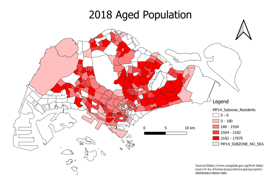
Aged population in 2018
Using equal intervals for 2018 again to make things constant, we can see that more dark areas are showing up in the west side in 2019. The central and east side seemed to have remained at a high aged population rate.
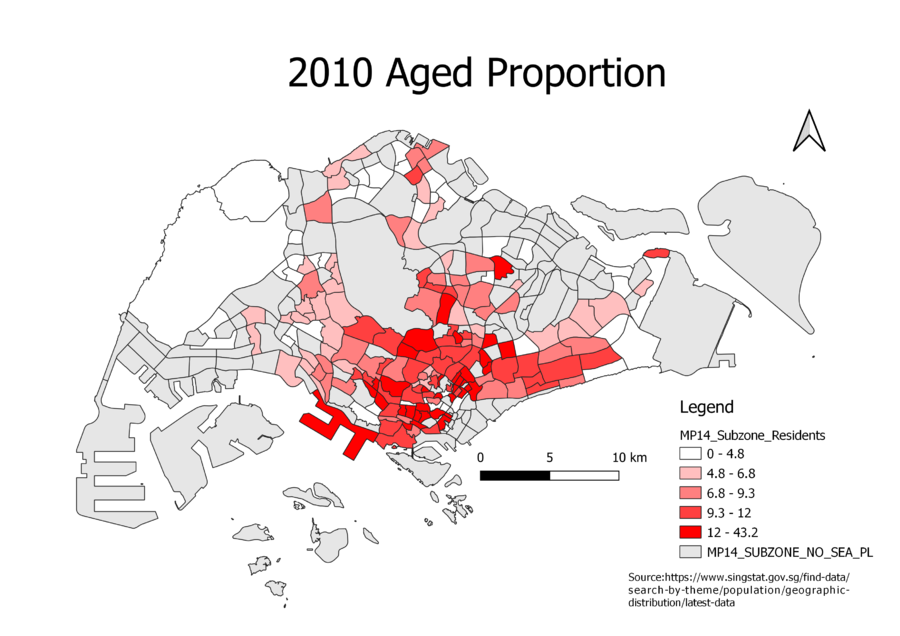
Proportional of aged population in 2010
The 2010 proportion is calculated using the aged population over the total population within each subzone. The darker red the subzone is means that there are more aged people than young people in that area. From the map, we can see the darkest areas are in the city. However, we do not have data for the grey areas in the map. This means that they could possibly have a high aged proportion as well.
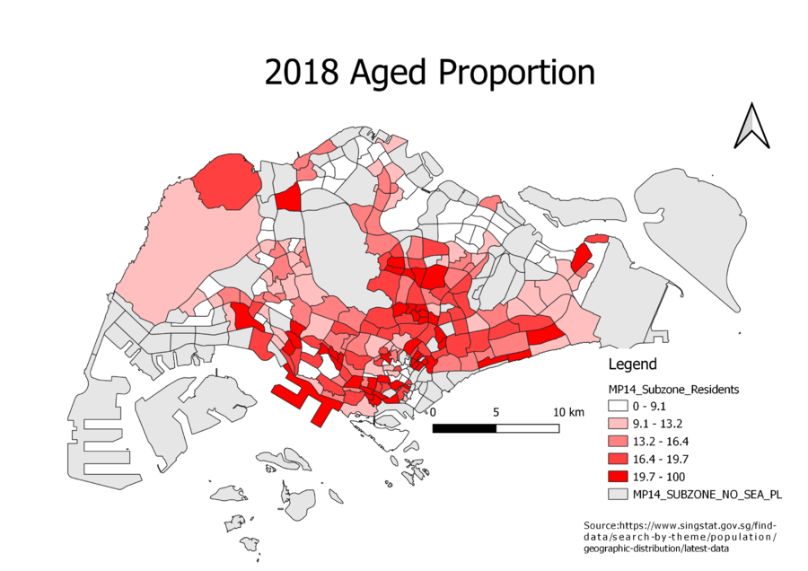
Proportional of aged population in 2018
Using the same way of calulating proportion as 2010 and also using equal interval, we can see that the darker areas are not as concentrated in the city as it once were. There is an increasing trend in aged people in more subzones in 2018 reflecting the ageing population in Singapore.
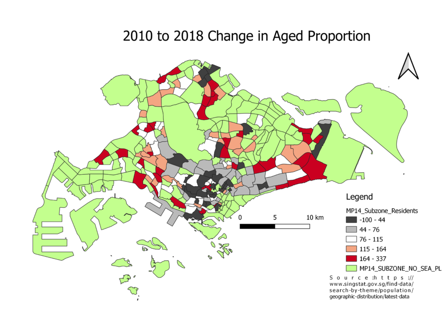
Percentage change of aged population between 2010 and 2018
The change is calculated by 2018 minus the 2010 proportion over the 2010 proportion. This is so that we can see which subzones has changed its proportion of aged people better. We can see many dark grey areas in the central, meaning the ratio of aged to young population has decreased. We can see some dark red areas in the east and west. This suggests that the ratio of aged to young population has increased.
