SMT201 AY2018-19T1 EX1 Lim Zhong Zhen Timothy
Part 1
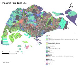
Thematic Maps: Land-Use
Changed "businesses" and "commercial" to variations of yellow, green for "parks", "Special-use" as black and "residential" as red. These colours are more intuitive to interprete.
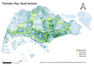
Thematic Maps: Section Road
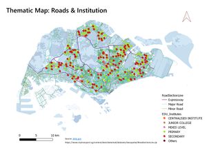
Thematic Maps: Education institutes
Thematic Maps: Combined
This merged format allows us to see the roads accessibility of various institutes.
Part 2
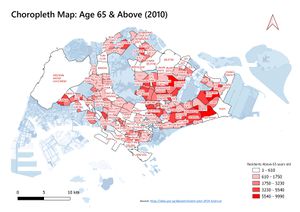
Choropleth Map: Age Above 65 2010
Getting data from SingStats, data from 2000-2018 came in the form of an excel. Extra cleaning had to be done such as:
- Additional data had to be filtered. E.g 2000-2009 and 2011-2017 data.
- there were multiple “total rows” and headers which had to be cleaned.
- ‘-‘ had to be replaced with 0 or else QGIS had problems reading.
- The Subzone name had to be fully upper-case as the QGIS was case-sensitive.
- As the population data used was 2010, the master-plan subzone map used had to be 2008.
To calculate the number of residents above age 65, I had to use the field calculator function and add a new field to the layer. Formula ("AgeGroup2010_AGE65-69" + "AgeGroup2010_AGE70-74" + "AgeGroup2010_AGE75-79" + "AgeGroup2010_AGE80-84"+ "AgeGroup2010_AGE85") Classification method: Natural Break (jenks) Assuming the data used is accurate. The more a subzone has an elderly aged above 65, the redder the colour of the subzone. Some Subzones are not in the map as they are either uninhabited or nobody there is above the age of 65.
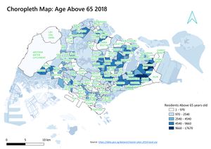
Choropleth Map: Age Above 65 2018
Classification method: Natural Break (jenks) The more a subzone has an elderly aged above 65, the darker the blue the colour of the subzone. Some Subzones are not in the map as they are either uninhabited or nobody there is above the age of 65.
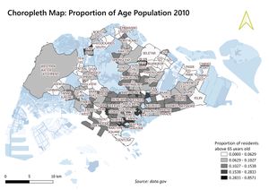
Choropleth Map: Proportion of Residents above 65 2010
To calculate the proportion of residents above age 65. Age above 65 in subzone / Total population in subzone. E.g 0.0629 value means that for every 100 residents 6 are elderlies. ("AgeGroup2010_65+ ") /(“AgeGroup2010_Total") Classification method: Natural Break (jenks) The bigger the proportion of elderly aged above 65 in 2010, the blacker the colour of the subzone. Some Subzones are not in the map as they are either uninhabited or nobody there is above the age of 65. White colour represents a low portion of the sub-zone is elderly. E.g 0.0629 value means that for every 100 residents, 6 are elderlies.
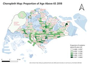
Choropleth Map: Proportion of Residents above 65 2018
To calculate the proportion of residents above age 65. Age above 65 in subzone / Total population in subzone. E.g 0.0997 (approx. 0.1) value means that for every 100 residents 10 are elderlies.
Classification method: Natural Break (jenks) The bigger the proportion of elderly aged above 65 in 2010, the darker the green colour of the subzone. E.g 0.30 value means that for every 100 residents 30 are elderlies.
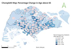
Choropleth Map: Percentage Change elderlies from 2010 to 2018
To calculate the rate of change of elderlies age 65 and above.
E.g -10.57 value means that there is a 10.57% decrease in elderlies in that subzone. ( "PropAge2018_65+" - "MP08_SUBZONEQ2_PropAge2010_65+" )*100
Classification method: Natural Break (jenks) If the rate of change in residents age above 65 is minimal, the colour will be white. Else the colour will gradually become bluer.
