SMT201 AY2018-19T1 EX1 Ho Xin Yi
Part 1: Thematic Mapping
Singapore Public Educational Institution by School Type
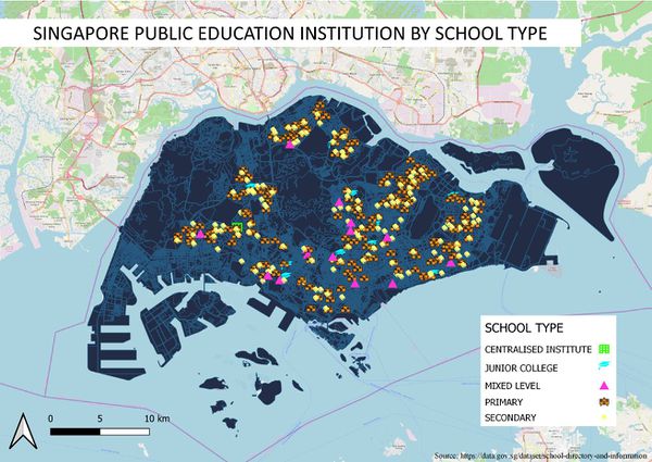

By reading through the data sourced from data.gov.sg, I find that the 'MainLevel' variable could be used since it classifies the data into many different types of school such as Centralised Institute, Junior college, Mixed level, Primary and Secondary school. Next, under symbology, I used categorized as it is best suited for school type which is under qualitative data. In addition, I chose to use SVG markers instead of simple markers to allow the different school type to be differentiated clearly. School type that is not dominated is also set with more striking colors symbol to allow the ease of locating them e.g. mixed level.
Singapore Road Network System


There is 5 different type of road in Singapore, namely, expressway, major road, minor road, primary access, and local access. I decide to group minor road and primary access together as they both contain the same street name descriptor, drive, road, and street. The street descriptor that contains crescent, garden, height, and bow etc are grouped under local access as by looking at the random road with those names, I find that all those roads fit into the description of the local access road. The Landuse map is also deliberately darkened and the road type is set to striking color to create a big contrast in order for a clearer view of the different road type.
2014 Master Plan Landuse
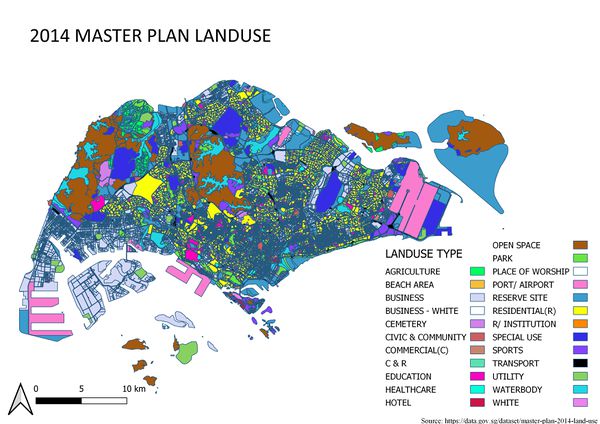

Legend of the subzone is cutted down, as some of the landuse type could be grouped together. For example, there used to be a Business 1 and Business 2 attributes but I group them together under the attribute Business. Next, I tried to play with the colours of the subzone by selecting a less striking color for the larger area and, vice versa. This way allow the land use type to be seen clearly with the map. Some words in the legend is cutted down as well in order to aid the ease of viewing the legend together with the map.
Part 2: Choropleth Mapping
Aged population (+65) in 2010 and 2018
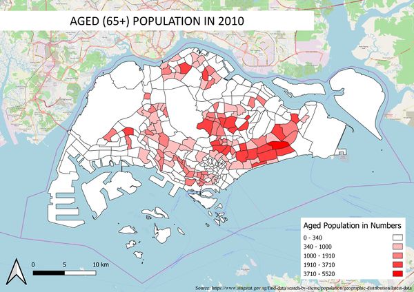
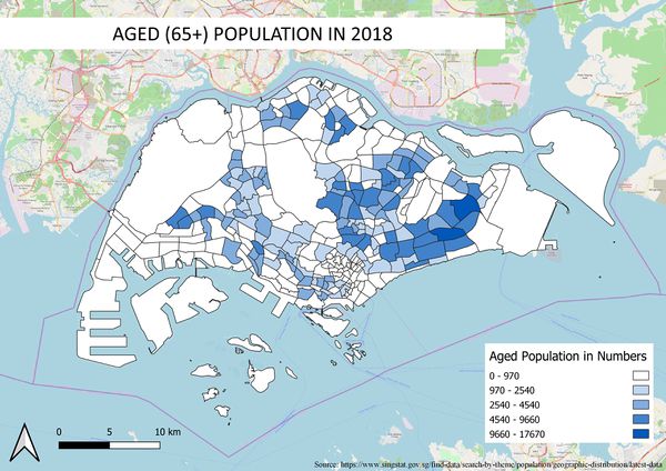


For both the year 2010 and 2018 aged population map: By relational joining the data on the population as well as the subzone map using the field "SUBZONE_N", I manage to merge both field list together. Afterward, I created a new field '65+' to filter out the population with age 65 years and above for each subzone using field calculator. Under symbology -> gradual, I chose to natural break(jerks) the data instead of equal breaking them so as to ensure that the histogram won't be too skewed. One problem that I actually occur in this part that is I realize my field name isn't in 'integer'. So by going to processing and with the help of toolbox, I manage to change the field type into an integer.
Proportional of aged population in 2010 and 2018
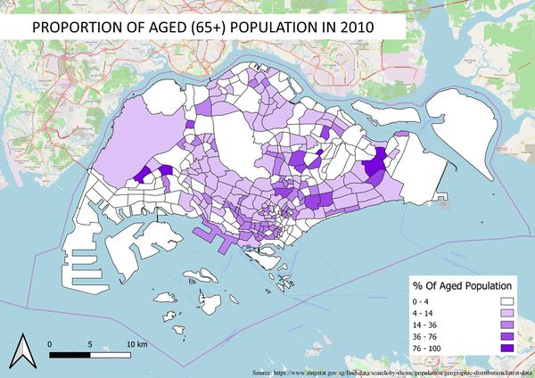
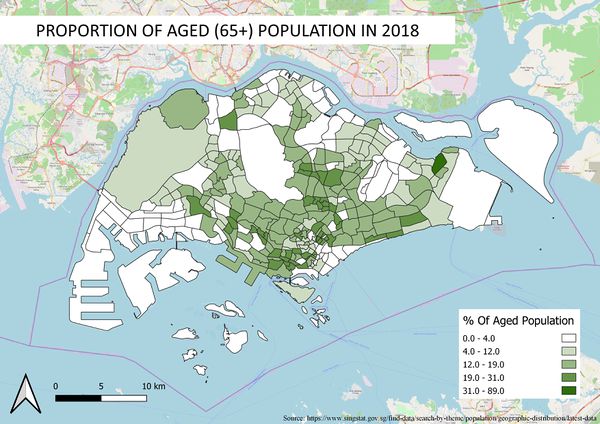


Same method for both proportional of aged population in 2010 and 2018 map: I used relational joining again, to join the field list of the 2010 and 2018 aged population using the field 'SUBZONE_N'. With the formula 'NumberOfAgedPopu/ TotalPopulation * 100", i manage to find the proportion of the aged population. With that, I use the same steps as I did for the aged population map in creating the symbology for the map.
Percentage change of aged population between 2010 and 2018
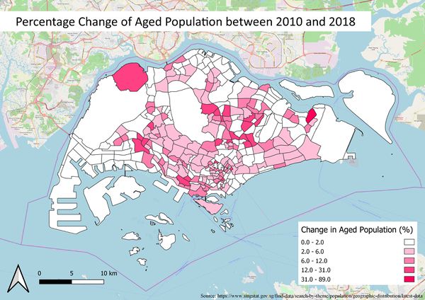

Initially to calculate the percentage change of the aged population between 2010 and 2018, I wanted to do it by recalculating the proportion of each year by changing the formula 'NumberOfAgedPopu/ TotalPopulation * 100" to 'NumberOfAgedPopu/ (TotalPopulationOfBothYear/2) * 100', but I conclude that it will not give the right proportion as the population of both years is not the same and hence, might lead to unreliable proportion for both years. So, I took the proportion (%) I calculated in both 2010 and 2018 and subtracting them from each other to find the differences. In order to prevent negative value for appearing in my proportion change, in the attribute tables, I selected the year which the % is higher to subtract the year which the % is lower using field calculator.