SMT201 AY2018-19T1 EX1 Fernanda Tan Qian Xuan
Part1: Thematic Mapping
Thematic map showing the distribution of public education institution by school type
For this thematic map, I added the school information layer and categorised by school types using categorised labels under layer properties. To make it more obvious that the categories represent the different school types in Singapore, I changed the marker to a book SVG marker. Under school_info, Centralised Institutes are represented by a blue book, Junior College by a yellow book, Mixed Level by a purple book, Primary by a red book and Secondary by a green book. I used OpenStreetMap so that it is clear what types of schools can be found in a particular area.
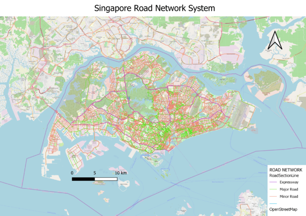
Thematic map showing the hierarchy of road network system of Singapore
Using the RoadSectionLine GIS data from LTA, I categorised the data by the road types attribute (RD_TYPE). As seen from the map, expressways are represented by the purple lines, major roads by the green lines and minor roads by the red lines. I added in OpenStreetMap instead of CoastalOutline as OpenStreetMap is able to show clearly the different areas in Singapore and hence we can see the different road types in various areas.
Thematic map showing 2014 Master Plan Landuse
With the MasterPlan Landuse GIS data, I used a categorized symbology on LU_DESC to display the various types of landuses using different colours. Since there are many types of businesses, I decided to merge them together to form “BUSINESSES” and did the same for business parks which is renamed as “BUSINESS PARKS” in the legend.
Part2: Choropleth Mapping
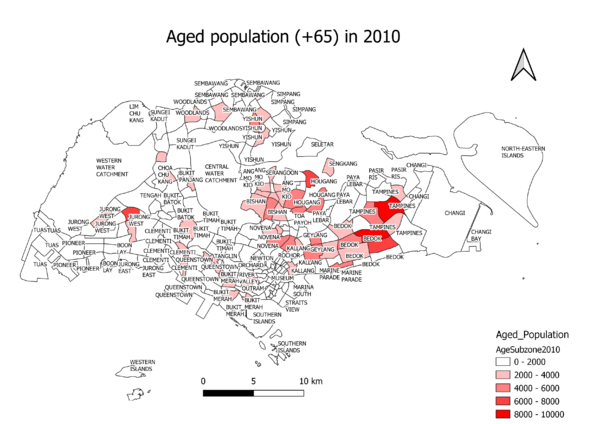
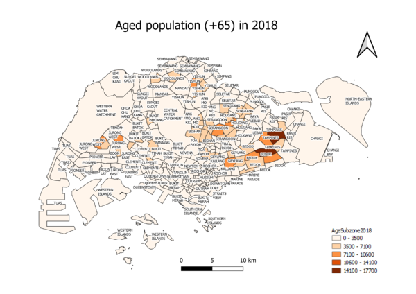
Choropleth maps showing aged population (+65) in 2010 and 2018
Under the group Aged_Population, there are three layers: AgeSubzone_2010, AgeSubzone_2018 and MP14_SUBZONE. The MP14_SUBZONE layer is the planning subzone GIS data, whereas AgeSubzone_2010 and AgeSubzone_2018 contains data about the concentration of aged population in different areas of Singapore. For both layers, I created a new attribute field called Age65+ which sums up the number of aged individuals for each subzone. Using graduated markers on the Age65+ column, it can be seen that in 2010, areas including Tampines, Bedok, Hougang and Jurong West have the highest concentration of Singapore residents aged 65 years and above.
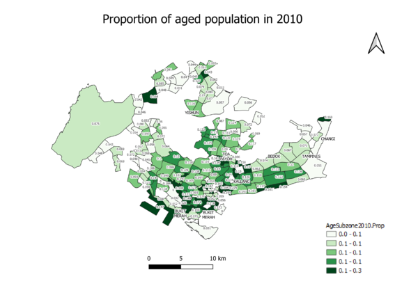
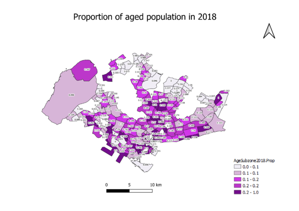
Choropleth maps showing the proportion of the aged population in 2010 and 2018
Under the group Aged_Proportion, there are two new layers: AgeSubzone2010.Prop and AgeSubzone2018.Prop which each have a newly created attribute field called PROP_2010 and PROP_2018 respectively. These fields are created by taking the sum of all aged individuals and dividing by the grand total, to get a proportion of people aged 65 years and above for each subzone. These are shown by the labels of PROP_2010 and PROP_2018. From the results obtained, the subzone with the highest proportion of aged individuals is Kampong Glam in Rochor (0.267).
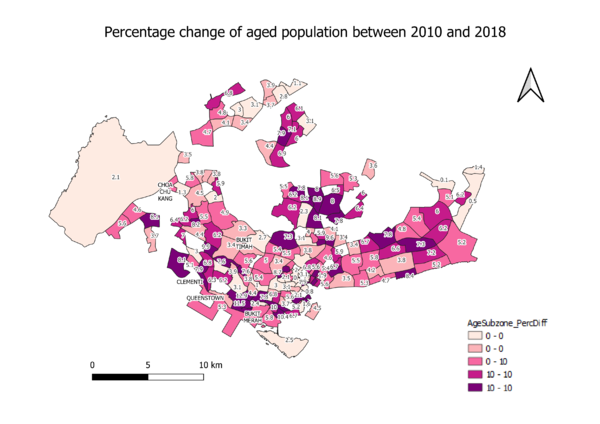
Choropleth map showing percentage change of aged population between 2010 and 2018
Under the group Aged Perc Diff Btw 2018 and 2010, I combined the layers AgeSubzone2010.Prop and AgeSubzone2018.Prop on the OBJECT_ID attribute to calculate the change in aged population between 2010 and 2018. I created a new attribute field called PERC_DIFF which takes PROP_2018 – PROP_2010 and multiply by 100 to get a percentage difference. From the map, we can see that the subzone with the greatest difference is Queensway (12.9%), followed by Kent Ridge (11.5%) and China Square (11.5%).

