IS428 AY2019-20T1 Assign Lee Cheng Leng Visualisation 3
Jump to navigation
Jump to search
 VAST 2019 MC2: Citizen Science to the Rescue
|
|
|
|
|
|
|
|
|
|
|
|
|
Contents
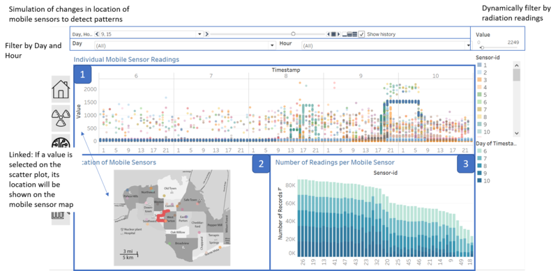
Dashboard 3: Detailed Analysis of Mobile Sensor Data

Component 1: Scatter Plot of Individual Sensor Readings
Purpose
- Shows the radiation concentration levels over time by hourly basis for readings from the citizens' mobile sensors.
- Allows study of uncertainty of the mobile sensor data
- Allows identification of any spikes or trends in radiation levels recorded by mobile sensors.
Description
- User can view the individual sensor readings, which is more accurate than taking an aggregate measure of the radiation readings. This is because taking an aggregate measure such as average might reduce the possibility of identifying data outliers.
- Colour palette used to differentiate the radiation readings originating from different sensors.
- User can filter the range of values for the visualisation. This is because of the large outlier in sensor-id 12, which causes the scatter plot scale to be skewed such that no further analysis can be derived. With the filter, the user would be aware of the existence of the large outlier, which indicates an anomaly, but also is able to study the readings without it being affected by the outlier.
- If the user selects a reading from the scatter plot, the other visualisations would be updated to show the relative position of that sensor in the specific timestamp. This is important as the locations of the mobile sensors are always changing, and the most updated location based on the timestamp should be used for analysis.
Component 2: Mobile Sensor Locations Over Time
Purpose
- Provides a visual representation of the locations of which each mobile sensor is located on an hourly basis.
- Allows user to study spread of radiation levels in order to identify any sensors which are contaminated.
- Allows the user to associate the radiation levels to its relative location in St. Himark.
Description
- User is able to click on one of the locations on the map, and the corresponding sensor's readings will be highlighted on the scatter plot. This would be useful in helping them to obtain a closer look at the behaviour of a particular sensor based on its location.
- The neighbourhood in which the sensor id is, will be indicated in the tooltip to ensure that the user obtains an accurate representation of the sensor location, especially in cases where the sensor is travelling along the border of two neighbourhoods.
Component 3: Number of Radiation Readings Recorded by Each Sensor
Purpose
- Allow comparison between the uptime of each mobile sensor based on the number of readings recorded
Description
- Using a stacked bar graph, we would be able to see the part-whole relationship of the number of records obtained per day in the simulation, as a part of the total number of readings obtained.
- This would allow us to compare the reliability of different sensors based on the number of readings collected. This would allow us to identify any sensors which might have been turned off, or may have left the city.
- Since the uncertainty of the mobile sensors are very high, we would have to identify those sensors which are too uncertain to trust. This visualisation would be able to quantify the uncertainty in terms of the number of readings taken by the sensor. If there are large gaps in the number of readings taken compared to other sensors, it can be said that this sensor is more uncertain.