IS428 AY2019-20T1 Assign Lee Cheng Leng Visualisations
|
|
|
|
|
|
|
|
|
|
|
|
|
Welcome to the Visual Analysis Tool for Radiation in St. Himark! Link to Tableau Public Dashboard: https://public.tableau.com/profile/cheng.leng.lee#!/vizhome/LeeChengLeng_Assignment_v2/0-Homepage
When the user opens the visualisation tool, they are first greeted by the Homepage.
The homepage provides an introduction to the background context for the visualisation tool, such as the nature of the static and mobile network sensors. It also links the homepage to each of the different dashboards.
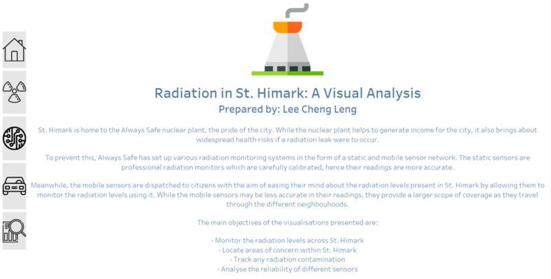
The interactive visualisations are organised in the following dashboards:
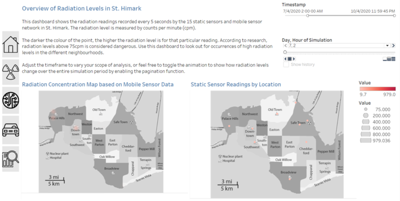
Dashboard 1 - Overview of Radiation Levels in St. Himark
This dashboard allows the user to obtain an overview of the radiation levels in St. Himark. It consists of a radiation density map for readings collected from mobile sensors across St. Himark, and a point map showing static sensor locations and their corresponding radiation readings.
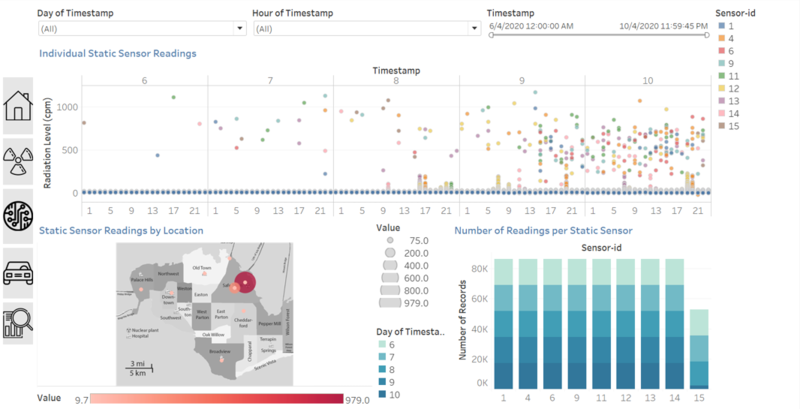
Dashboard 2 - Detailed Analysis of Static Sensor Data
This dashboard allows the user a more detailed look at the individual sensor readings in order to discover any trends or patterns from the static sensor data. It also shows the number of readings taken by each sensor, to check the reliability of the sensors and see if they are functioning normally.
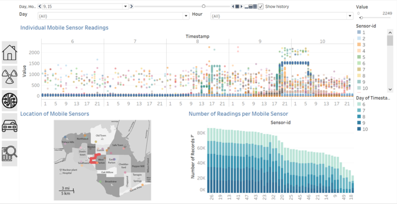
Dashboard 3 - Detailed Analysis of Mobile Sensor Data
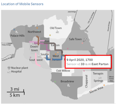
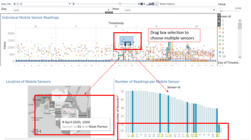
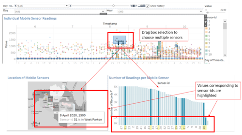
This dashboard allows the user a more detailed look at the individual sensor readings in order to discover any trends or patterns from the mobile sensor data. It also shows the number of readings taken by each sensor, to check the reliability of the sensors and see if they are functioning normally.
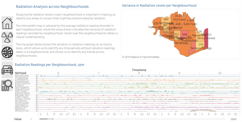
Dashboard 4 - Radiation Analysis Across Neighbourhoods
This dashboard shows the radiation levels experienced by each neighbourhood. The user can also visually infer the variance and average levels of radiation from the chloropleth map of St. Himark.

