IS428-AY2019-20T1 Group09-Proposal-v1
Contents
PROBLEM STATEMENT
According to the Thomson Reuters Foundation Annual Poll, India is ranked as the world’s most dangerous country for women. This is not surprising, as India has had a long-standing history of violence against women, which is deeply rooted in certain cultural practices such as female infanticide and acid attacks.
Even with the increasing public outcry regarding such discrimination and the enactment of laws protecting women, the number of crimes committed against women is increasing steadily over the years.
MOTIVATION
India is one of the world’s fastest growing economies. It is currently the seventh richest country in the world, and is projected to be the third largest economy in the world. Despite its rapid growth and development, women in India still suffer from long-standing gender inequality and are the victims to brutal and inhumane crimes. Hence, there is a need to analyse various socioeconomic factors to garner insights on the root causes for crimes against women to understand why this phenomenon is so.
OBJECTIVES
Our objectives of this project are as follows:
- Provide an overview of the issue of crimes against women in India
- Draw comparisons to study the differences in crime rates between different states
- Study the effect of various socioeconomic factors on the number of crimes committed against women
We hope to achieve these objectives by developing interactive visualisations which can help us to understand the increasing trend of crimes against women, and what factors may contribute to such crime rates.
DATA SOURCES
We have obtained the following datasets for this research:
| Dataset/Source | Data Attributes | Purpose |
|---|---|---|
(Click to View Data) District-wise Crimes Committed Against Women, 2014 (Click to View Data) |
|
|
(Click to View Data) dstrCAW_1 (2001-2012) (Click to View Data) |
|
|
(2000 - 2015) (Click to View Data) |
|
|
(2001 - 2011) (Click to View Data) |
|
|
(1993 - 2011) (Click to View Data)(1993 - 2011) (Click to View Data) |
|
|
(1993 - 2011) (Click to View Data) |
|
|
(1990 - 2014) (Click to View Data) |
|
|
LITERATURE REVIEW
| Reference of Other Interactive Visualization | Learning Point |
|---|---|
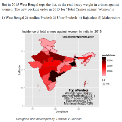
Title: Crime Map of India Source:https://tvganesh.shinyapps.io/crimesAgainstWomenInIndia/ |
|
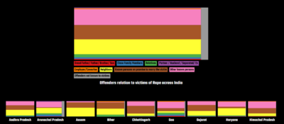
Title: RAPE IN INDIA: A visual exploration of systemic rape culture |
|
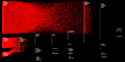
Title: RAPE IN INDIA: A visual exploration of systemic rape culture |
|
CONSIDERATION & VISUAL SELECTION
Below are a few visualizations and charts we considered making for our projects.
| Visual Considerations | Insights / Comments |
|---|---|
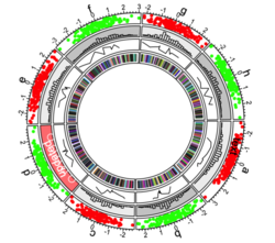
Title: Chromosome-based Circos Plot |
|
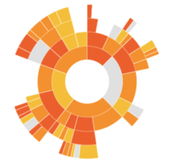
Title: Sunburst Diagram |
|
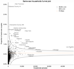
Title: Funnel Plot |
|
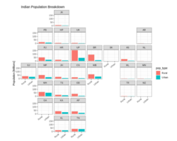
Title: Geofacet Plot |
|
PROPOSED STORYBOARDS
Storyboard 1 - Overview - Introduction to Crimes Against Women in India
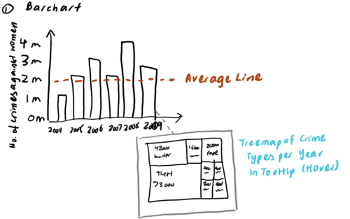
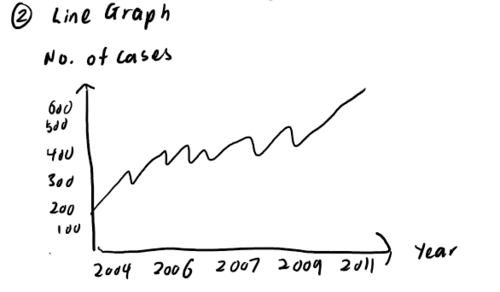
Visualisation 1: Bar Graph with Treemap
- Aims to show the yearly increasing trend of number of crimes against women
- Upon hovering over a particular year, the treemap showing the breakdown of crime types will be shown for that year.
- Shows the trend for the individual crime type across the years
Storyboard 2 - State-Level Comparison of Crime Rates
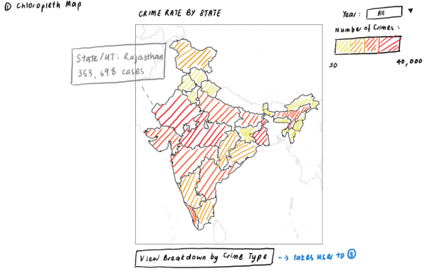
- Shows comparison of crime rates across different states
- Usage of colour scale for easy identification of crimes with higher crime rates
- Allows user to filter by year in order to visualise changes in crime rates over the years.
- Clicking on the button at the bottom would direct the user to Visualisation 3 to view the crime breakdown per state.
- Would be displayed side by side with Visualisation 1
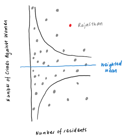
- If the user clicks on a particular state on the chloropleth map, its relative position on the funnel plot will be highlighted
- Usage of the funnel plot allows us to account for differences in population size within each state, as we would be able to plot Population size vs. Number of Crimes against Women for each State.
- Allows us to identify states with abnormally low/high crime rates for further analysis to be done.
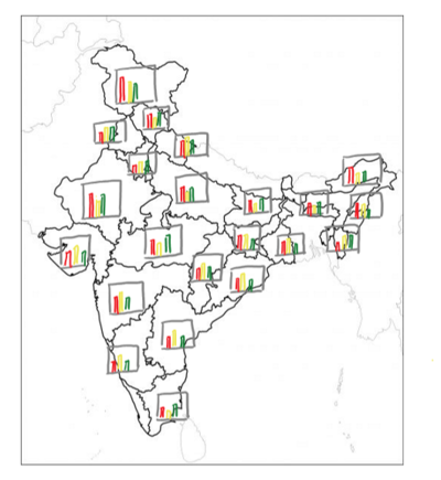
- Bar Graph in each state shows occurrence of each crime type in each state
- Allows easy comparison across states for which crime type is most common
- Each cell in the grid shows the distribution of crime type versus just a single value, unlike the chloropleth map
Storyboard 3 - Analysis of Socioeconomic Factors in contributing to Crime Rate Against Women
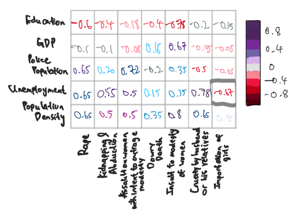
Visualisation 1: Correlation Matrix
- Shows the correlation between each socioeconomic factor and the different type of crime against women.
- Color scale highlights if correlation is positive or negative
- Individual values show how strong the correlation is
- Clicking on a individual value will highlight the corresponding point on the Correlation heatmap as shown in Visualisation 3-2
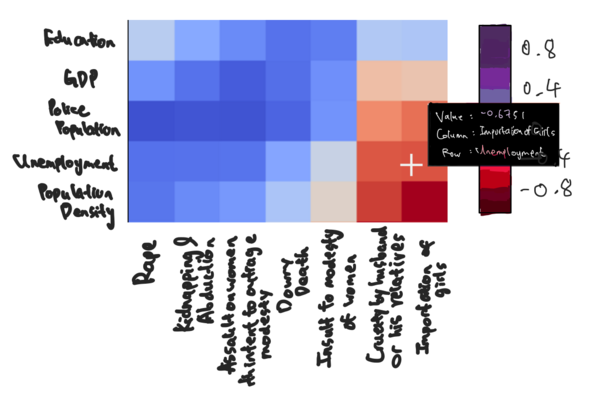
- Shows the correlation between each socioeconomic factor in a more visually appealing manner
- Color scale highlights how correlated each variables are to one another
- Clicking on a individual box will highlight the corresponding point on the Correlation matrix as shown in Visualisation 3-1
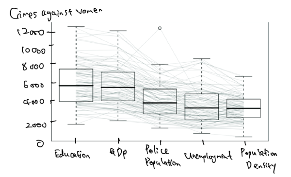
- Compares the socio-economic factors with one another and helps visualise the relationship they have with one another
- Shows how respective socio-economic factors affect each other with respect to the crime rates against women
- Boxplot helps determine if the different factors are in the lower or upper range
TECHNOLOGIES
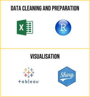
The tools we will be using for this Project is as follows:
CHALLENGES
| Challenges | Mitigation Plan |
|---|---|
|
Lack of proficiency in using R and R Shiny |
|
|
District Crime Rates are in separate files, with different data attributes. |
|
|
Difficulty in understanding some of the data attributes due to its local context, such as the different acts for protection against women found in some of our datasets. |
|
|
Difficulty in finding socioeconomic factors by state level |
|
|
The socioeconomic factors identified may not be indicative of the crime rate against women in India, as there may not be a relationship between the two. |
|
TIMELINE
COMMENTS
Feel free to leave us any comments!
| No. | Name | Date | Comments |
|---|---|---|---|
| 1. | Insert your name here | Insert date here | Insert comment here |
| 2. | Insert your name here | Insert date here | Insert comment here |
| 3. | Insert your name here | Insert date here | Insert comment here |

