IS428 AY2019-20T1 Assign Goh Jia Xian
Vast Challenge 2019, Mini-Challenge 1: Crowdsourcing for Situational Awareness
Contents
Overview
St. Himark has been hit by an earthquake, leaving officials scrambling to determine the extent of the damage and dispatch limited resources to the areas in most need. They quickly receive seismic readings and use those for an initial deployment but realize they need more information to make sure they have a realistic understanding of the true conditions throughout the city.
In a prescient move of community engagement, the city had released new damage reporting mobile application shortly before the earthquake. This app allows citizens to provide more timely information to the city to help them understand damage and prioritize their response.
Objective
With emergency services stretched thin, officials are relying on citizens to provide them with much-needed information about the effects of the quake to help focus recovery efforts. By combining seismic readings of the quake, responses from the app, and background knowledge of the city, help the city triage their efforts for rescue and recovery.
- Emergency responders will base their initial response on the earthquake shake map. Use visual analytics to determine how their response should change based on damage reports from citizens on the ground. How would you prioritize neighbourhoods for response? Which parts of the city are hardest hit? Limit your response to 1000 words and 10 images.
- Use visual analytics to show uncertainty in the data. Compare the reliability of neighbourhood reports. Which neighbourhoods are providing reliable reports? Provide a rationale for your response. Limit your response to 1000 words and 10 images.
- How do conditions change over time? How does uncertainty in change over time? Describe the key changes you see. Limit your response to 500 words and 8 images.
- The data for this challenge can be analyzed either as a static collection or as a dynamic stream of data, as it would occur in a real emergency. Describe how you analyzed the data - as a static collection or a stream. How do you think this choice affected your analysis? Limit your response to 200 words and 3 images.
Useful information from “St. Himark - About Our City”
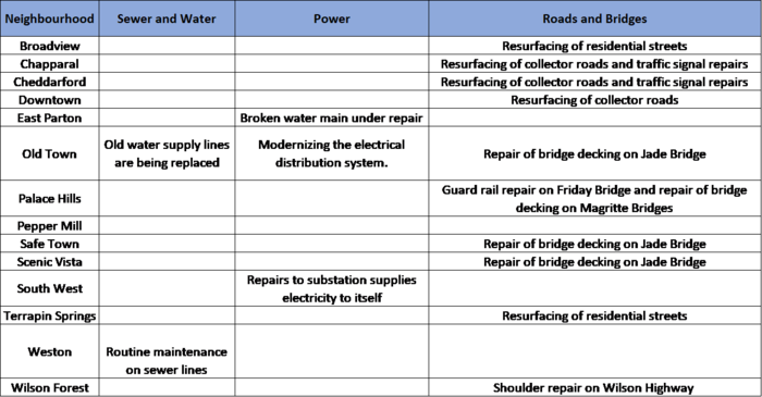
From the description about St. Himark, we can come to gather some useful information about the city’s infrastructure. These are the on-going projects in the following neighbourhoods to improve its infrastructure:
The above-mentioned projects may affect the scores on damages reported by the citizens on the mobile application.
Data Preparation
Upon looking through mc1-reports-data.csv, the file simply contains the scale of the damage (Building, Medicine, Sewage and Water, Power and Roads and Bridges) and Shake Intensity reported by a Rumble user from a specific neighbourhood specified as location (integer). The data provided is ‘user-friendly’ for me to work with but I will need to create new columns in the data file to provide more information to the charts.
| Problem #1 | No Unique Identifier |
|---|---|
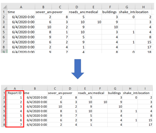
| Issue | Each row in mc1-reports-data.csv is a unique report received from Rumble mobile application’s user. However, each row does not contain a Unique Identifier (ID) to distinguish each report. Without an ID, it may result in data inaccuracy as I proceed to data manipulation or chart creation. |
| Solution |
| Problem #2 | Poor Location Description |
|---|---|
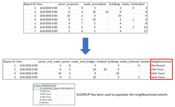
| Issue | The data file provided identifies each location via Location (number) which is not human-readable in understanding where the location, it lacks a name description about the neighbourhood. |
| Solution |
| Problem #3 | St. Himark Shapefile Provided Does Not Fill Background Map |
|---|---|
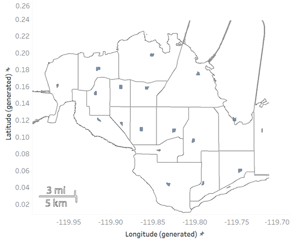
| Issue | Having tried to use the shapefile that has been provided in mini-challenge 2 together with a background image, the polygon does not fully fill the image and it looks like points on the map as shown below.
StHimarkNeighborhoodMapNoLabels.png from MC2 has been redesigned to achieve the above background
|
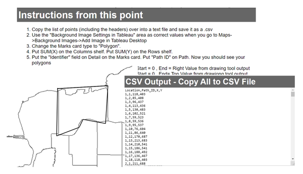
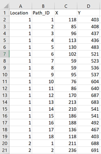
| Solution | Using this HTML tool downloaded from https://github.com/bryantbhowell/tableau-map-pack/blob/master/draw_tableau_polygons_on_background_image.html, I have managed to manually plot the polygons and generated a 'Neighbourhood Polygon.csv'. Now, the polygons have successfully fill in the background map.
Screenshot of the downloaded tool
Snippet of the csv generated
|
Importing Data into Tableau
Data Files to be Imported:
I will be working with the following data files:
- mc1-reports-data.csv - Data of damage/shake intensity reported by Rumble users with updated fields
- Neighbourhood_Polygon.csv - Data containing the polygon of each neighbourhood
Connecting the data files
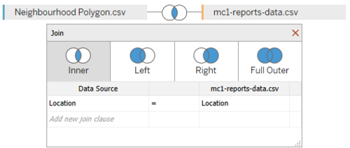
Before I may begin using the data to plot to generate my charts and dashboards, I need to import the above-mentioned data files and create a relationship between these data sources in Tableau (as shown below).
Data Transformation in Tableau
| Measure Created | Purpose |
|---|---|
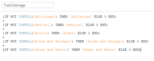
| Total Damage (Measure) | To distinguish the neighbourhood that has been hit the hardest across |
