IS428 AY2019-20T1 Assign Ho Jue Hong Question
MINI-CHALLENGE 2: CITIZEN SCIENCE TO THE RESCUE
Question 1
Visualize radiation measurements over time from both static and mobile sensors to identify areas where radiation over background is detected. Characterize changes over time.
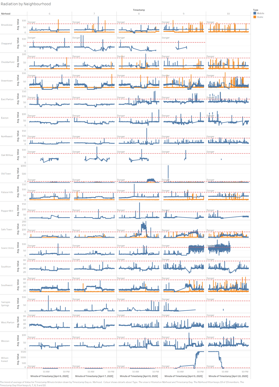
Given the question, I have plotted every minute of each day in the data provided. With the merger of the dataset with the Neighbourhood data, this is the level of radiation plotted over a 5 Days period. There are two types of sensors used to pick up the readings, the line denoted in blue is by the mobile sensor and the line in orange is picked up by static sensors. Across every graph plotted, there is a dotted red line. The red line is set at a value of 75 CPM, which means that any data point plotted above that value means that the radiation is very dangerous.
On the 6th April, we can see that the radiation across all neighbourhoods is relatively safe, with some spikes in the data point which lasts less than a minute. Hence there is nothing out of the blue on the 6th April.
On the 7th April, everything was similar to the 6th of April, everything is relatively safe with some random spikes in the data. Hence everything seems normal on 7th April.
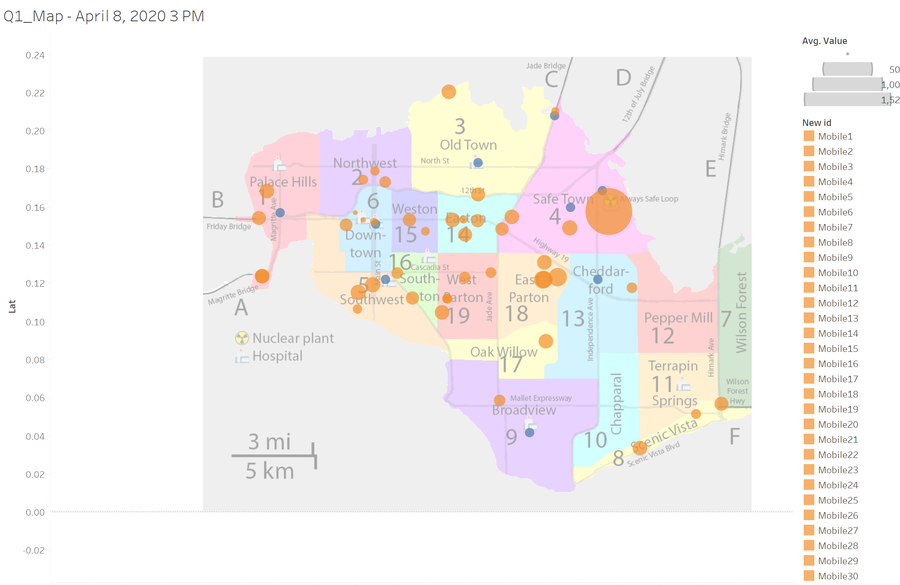
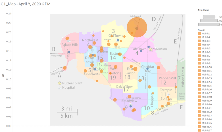
On the 8th April, we can see a sharp spike in the radiation levels at Safe Town from 1:21 P.M. to 4:30 P.M. before Old town had a similar spike at 4:55 P.M. all the way to 9:28 P.M. Other then this two towns which has a prolong period of unhealthy radiation, the rest of the town seemed ok. Coincidentally, the nuclear powerplant is located at Safe Town and Old Town is situated right beside Safe Town. We can generally summarise that winds were blowing westwards.
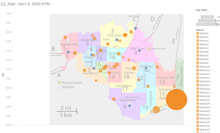
On 9th April, we can see Safe Town has a sudden spike in radiation, tending towards the unhealthy zone and the neighbourhood Scenic Vista had a huge fluctuation of radiation alternating between the healthy and unhealthy range. The place that took the worst hit was the Wilson forest with an average of 1,093 CPM for the day. The radiation was 14 times over the unhealthy limit. From the two town hits on the 9th April, we could say the wind was travelling in a curved shape.
On 10th April, We can see that the only two towns still being affected by unhealthy radiation are, Wilson forest and Scenic Vista.
Question 2
Use visual analytics to represent and analyze uncertainty in the measurement of radiation across the city.
Compare uncertainty of the static sensors to the mobile sensors. What anomalies can you see? Are there sensors that are too uncertain to trust?
Which regions of the city have greater uncertainty of radiation measurement? Use visual analytics to explain your rationale.
What effects do you see in the sensor readings after the earthquake and other major events? What effect do these events have on uncertainty?
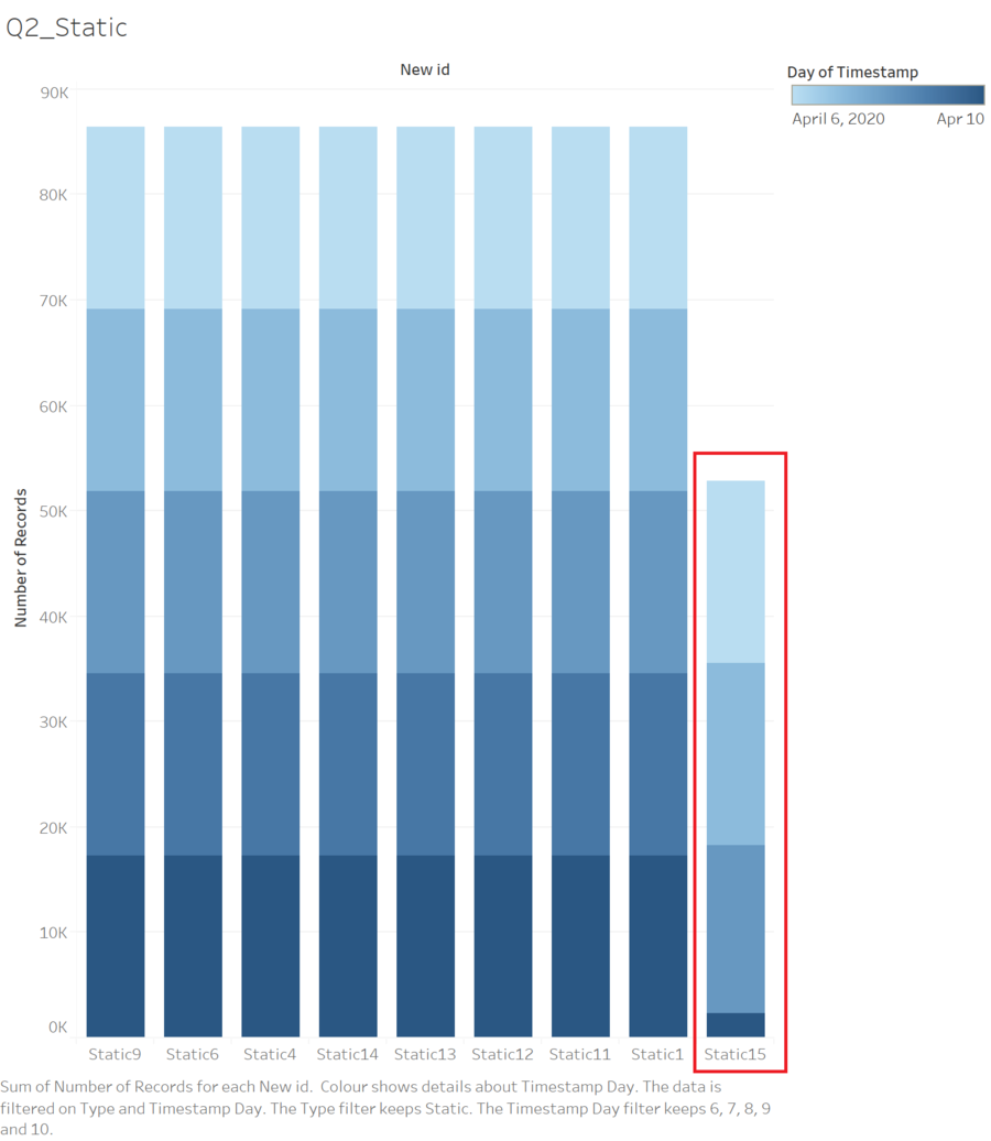
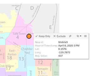
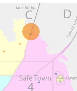
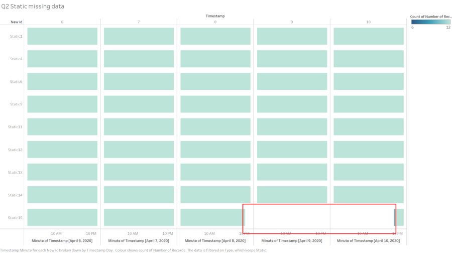
From the picture above we can tell that Static Sensor 15 had a loss of data on the 9th and 10th of April. We could concur that an earthquake struck the Nuclear Powerplant on the 8th April that period and it damaged the infrastructure. We could assume that Static Sensor 15 was damaged in the process. We could also tell that Mobile 9 was in the vicinity of the Nuclear Power plant and picked up a high level of nuclear radiation on 8th April. Hence it could be clear that sensor 15 was trustable till the point of the Earthquake strike.
Furthermore, I would like to elaborate on Static Sensor 12 and Static Mobile 10, we could tell that there we major discrepancy, at 8th April 7 PM, mobile sensor 10 picked up a huge spike in radiation but, the static sensor 12 which was in the same area did not show any spike in data. Hence it was very confusing on which sensor to believe in.
Lastly, Static sensor 13 did not show any response to the Nuclear Power plant being struck by an earthquake, it maintained its regular readings without any spike through the period of 8th April to 10th April which makes it even more confusing. These are the three major anomalies that question the reliability of the data.
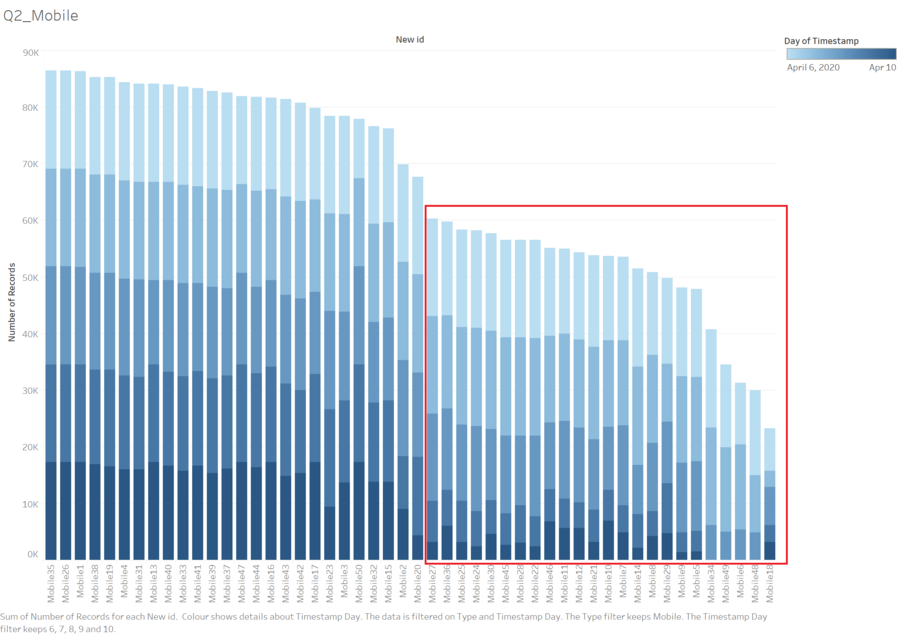
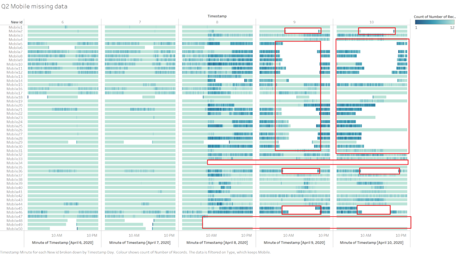
Comparing the amount of data collected we can tell that Static sensor, collects more complete data as compared to mobile sensors. There are huge chunks of missing data in mobile sensors, hence in terms of completeness, I would trust Static Sensors more. Given the case that the Earthquake might have disrupted the Static Sensors readings, mobile Sensors might be the readings we want to rely on.
To visualise the amount of data we are missing, I used a calendar heat map to show the total amount of data missing, as We can see that only for static15 sensor, there was a loss of data from around 8th April 10 PM to 10th April 10 PM. The completeness of dataset could be reiterated by the Calendar Heatmap. Compared to mobile sensors. The mobile sensors have a huge chunk of missing data on both 8th, 9th and 10th. Hence it is quite inconsistent and making it very uncertain if the radiation is really spiking. Hence the effects of the earthquake could be clearly seen here, mobile sensors are missing large chunks of data because infrastructure might be damaged, people might be injured hence the lack of data, whereas static data provides us with a more complete view of what is happening throughout the entire event.
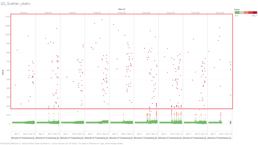
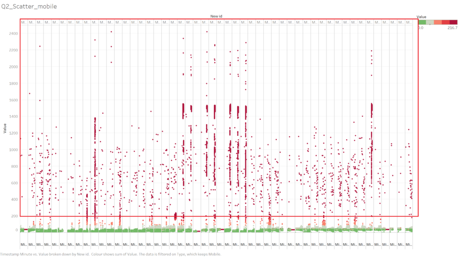
Lastly, by using the scatter chart we are able to pick up readings that are totally off. But firstly we can compare the randomness of how each sensor picks up data. As seen above we can see that Static sensors have a less random distribution of picking up spikes in radiation level, there is usually a built up as compared to Mobile Readings.
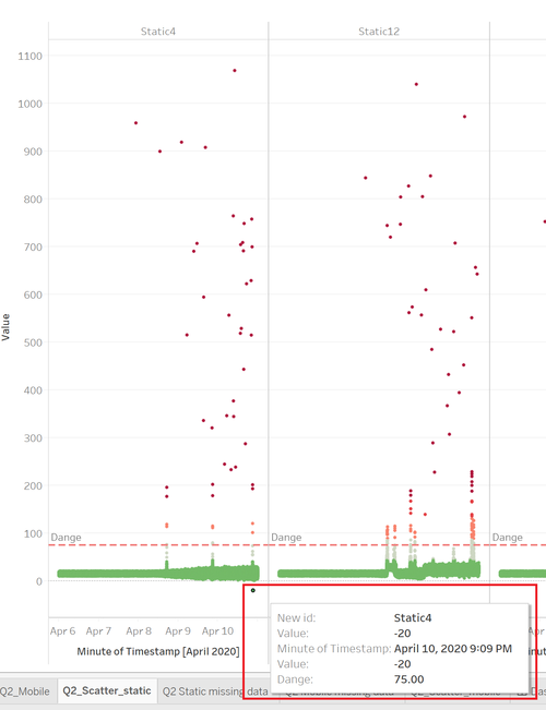
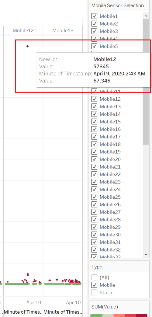
The two outliers we are able to pick up are from static sensor 4 and mobile sensor 12. Static Sensor 4 picked up a negative value in radiation hence it is impossible, we could deem that there was something wrong with the equipment. Mobile Sensor 12 picked up a reading of 57,345 CPM which is also most likely impossible hence making the readings inconsistent.
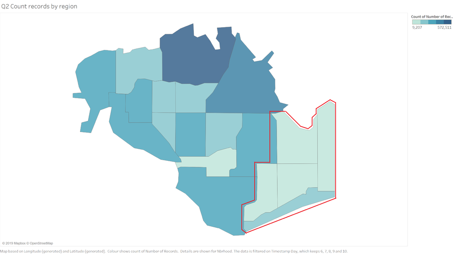
Lastly, I plotted the map using the number of records as we can see the colours that are denoted in light blue means it has lesser records, hence the more uncertain the data is. The area highlighted in red has totally no static sensors, if the mobile sensors move out of range, there will be totally zero readings in that area, hence I would say these are the most uncertain area.
Question 3
Given the uncertainty you observed in question 2, are the radiation measurements reliable enough to locate areas of concern?
Highlight potential locations of contamination, including the locations of contaminated cars. Should St. Himark officials be worried about contaminated cars moving around the city?
Estimate how many cars may have been contaminated when coolant leaked from the Always Safe plant. Use visual analysis of radiation measurements to determine if any have left the area.
Indicated where you would deploy more sensors to improve radiation monitoring in the city. Would you recommend more static sensors or more mobile sensors or both? Use your visualization of radiation measurement uncertainty to justify your recommendation.
