IS428 AY2019-20T1 Assign Lee Cheng Leng Visualisation 4
Revision as of 15:34, 13 October 2019 by Cllee.2017 (talk | contribs)
|
|
|
|
|
|
|
|
|
|
|
|
|
Dashboard 4: Visualising Radiation Levels by Neighbourhood
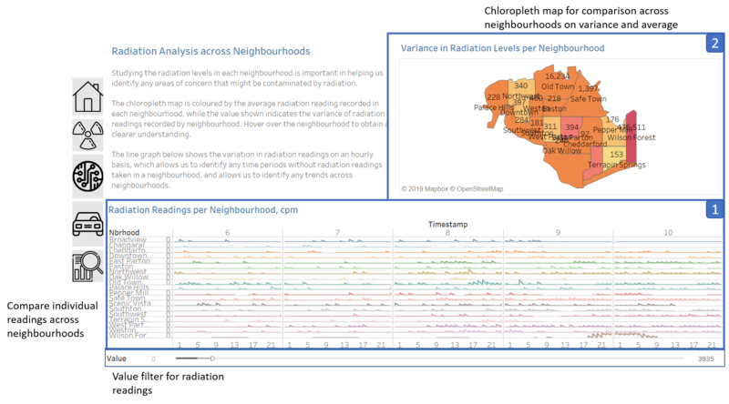
Component 1: Line Graph
Purpose
- Shows the radiation concentration levels over time, with the radiation levels reflected from the mobile sensor data.
- Allows user to identify neighbourhoods with high radiation concentration
Description
- Mobile sensor data was chosen for this visualisation as it had higher coverage over the various St. Himark neighbourhoods
- Usage of a line graph helps us to study the variation in the readings
- Missing sensor readings can be easily identified from the line graph, which is important as the user would be interested in the number of readings taken for each neighbourhood. If there are few readings, then one would know that these neighbourhoods might have higher uncertainties in their radiation readings.
Component 2: Chloropleth Map
Purpose
- Allows user to draw comparisons across neighbourhoods in St. Himark based on different aggregated measures.
Description
- Mobile sensor data was chosen for this visualisation as it had higher coverage over the various St. Himark neighbourhoods
- Usage of a chloropleth map would indicate the differences in readings clearly due to the usage of the colour scale.
- The colour scale is used to indicate the average readings in each neighbourhood
- Meanwhile, the values labelled correspond to the variance in readings recorded by the sensors within the neighbourhood.
- The combination of the two would allow the user to identify neighbourhoods with high uncertainty, and are prone to higher radiation readings in one visualisation.

