IS428 AY2019-20T1 Assign Lee Cheng Leng Visualisations
|
|
|
|
|
|
|
|
|
|
|
|
|
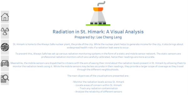
Welcome to the Visual Analysis Tool for Radiation in St. Himark!
When the user opens the visualisation tool, they are first greeted by the Homepage.
The homepage provides an introduction to the background context for the visualisation tool, such as the nature of the static and mobile network sensors. It also links the homepage to each of the different dashboards.
The interactive visualisations are organised in the following dashboards:
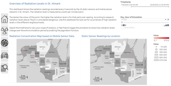
Dashboard 1 - Overview of Radiation Levels in St. Himark
This dashboard allows the user to obtain an overview of the radiation levels in St. Himark. It consists of a radiation density map for readings collected from mobile sensors across St. Himark, and a point map showing static sensor locations and their corresponding radiation readings.
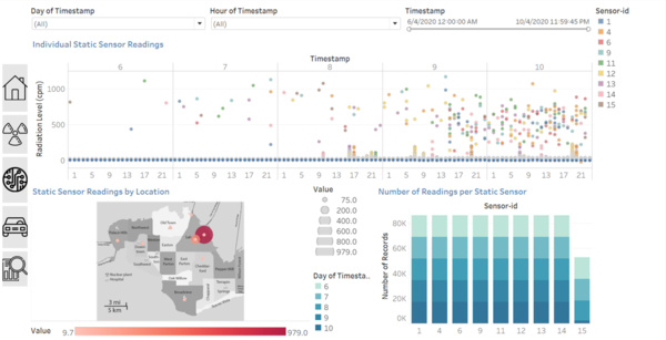
Dashboard 2 - Detailed Analysis of Static Sensor Data
This dashboard allows the user a more detailed look at the individual sensor readings in order to discover any trends or patterns from the static sensor data. It also shows the number of readings taken by each sensor, to check the reliability of the sensors and see if they are functioning normally.
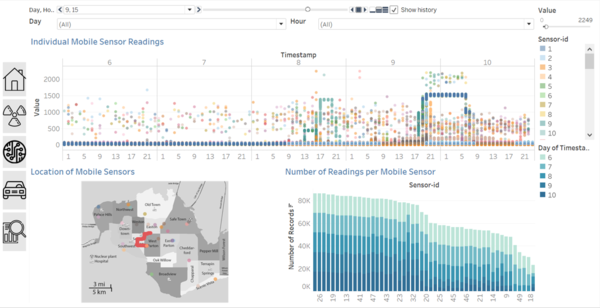
Dashboard 3 - Detailed Analysis of Mobile Sensor Data
This dashboard allows the user a more detailed look at the individual sensor readings in order to discover any trends or patterns from the mobile sensor data. It also shows the number of readings taken by each sensor, to check the reliability of the sensors and see if they are functioning normally.
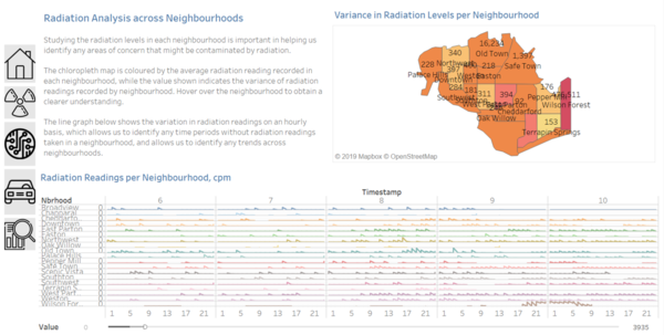
Dashboard 4 - Radiation Analysis Across Neighbourhoods
Interactive Visualisation Techniques Used
| S/N | Description | Image |
|---|---|---|
| 1 | Select: Pointer
When a user clicks on the navigation icon, they will be directed to the corresponding dashboard. |
|
| 2 | Select: Hover
When a user hovers over a data point, a tooltip will be shown with more information. This allows the user to obtain a better understanding |
Example |
| 3 | Select: Brush
A user can use a drag-box to select multiple data points on the scatter plot. The selected data points will then be reflected on the sensor location map, in order for the user to map these sensors of interest to their locations easily. |
Example |
| 4 | Select: Highlight
On the dashboard, if the user selects a data point pertaining to a certain sensor-id, its position on the scatter plot will be highlighted, above the positions of all the other sensors present during that timeframe. |
Example |
| 5 | Select: Slicer
User can select the desired timeframe from the date range in order to analyse the data at different timeframes. |
Example |
| 6 | Reconfigure: Aggregation
The user can toggle between different parameters for aggregation on the chloropleth map, such as variance and average. |
Example |
| 7 | Filter
The user can filter by the day and hour desired, and the relevant results will be populated on the visualisation. |
|
| 8 | Pagination
The user is able to animate the movement of mobile sensors and its radiation concentration levels with the pagination feature, which goes through the timeframe on an hourly basis. |
|
| 9 |

