<--- Go Back to Project Groups
Problem and Motivation
Objectives
Selected Dataset
The Data Sets we will be using for our analysis and for our application is listed below:
| Dataset/Source
|
Data Attributes
|
Rationale Of Usage
|
| Visitor Arrivals Statistics
(2007 January - 2018 September)
(https://kto.visitkorea.or.kr/eng/tourismStatics/keyFacts/KoreaMonthlyStatistics.kto )
|
- Number of Visitor Arrivals
|
This dataset will be used to understand the number of visitors to South Korea from 2007 January to 2018 June. This will allow us to understand the inflow of visitors and see the trend (seasonal trend) of when the visitors come in.
|
| International Visitor Survey
(2007 - 2018 )
(https://kto.visitkorea.or.kr/kor/notice/data/statis/tstatus.kto)
|
|
This dataset will be used to understand the most popular tourist attraction in the different major cities in Korea. We will also be able to gain insights on the Number of visitors to each attraction and also if they are local and foreigner visitors which will allow us to see the difference between locals and foreigners.
|
| Entry by nationality by age
(2007 - 2018)
(Click to View Data)
|
|
This data set will be used to understand the general demographic of international visitors coming to Korea from 2007 - 2018. We will be able to gain descriptive insights on the visitor demographics by Age Range.
|
| Entry by nationality by Sex
(2007 - 2018)
(Click to View Data)
|
|
This data set will be used to understand the general demographic of international visitors coming to Korea from 2007 - 2018. We will be able to gain descriptive insights on the visitor demographics by Gender.
|
| Entry by nationality by Purpose
(2007 - 2018)
(Click to View Data)
|
|
This data set will be used to understand the general demographic of international visitors coming to Korea from 2007 - 2018. We will be able to gain descriptive insights on the visitor demographics by Purpose of Visit.
|
BACKGROUND SURVEY
Before we embarked on this project, we did some basic background research on this topic to see if there were any visualizations or dashboards we could drive inspirations from or make it better. Below are a few visuals we found:
| Reference of Other Interactive Visualization
|
Learning Point
|
|
Title: Monthly Number of Individual Travelling Visitors (2016)
Source:https://www.data.go.kr/visual/content/577
Background Survey
| Visual Considerations
|
Insights / Comments
|
|
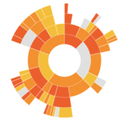
Title: Sunburst Diagram
Source:https://bl.ocks.org/mbostock/4348373
|
- Pros:
- Aims to show various sub-components of a particular category
- Can drill down to multiple divisions to observe the distribution by percentages
- May be useful to analyze tourism receipts by components and country
- Cons:
- Difficult to break down the huge number of markets
- Does not provide a comprehensive time-series comparison
|
|
Title: Treemap
Source:https://www.theinformationlab.co.uk/2015/02/10/show-treemaps/
|
- Pros:
- Effective visualisation to organise multivariate data by hierarchy
- We can effectively see the purpose of visit for the top 10 visiting countries to Korea.
- Cons:
- It would be hard to compare between years and months for different countries.
- The hierarchy will only be 2 levels so the interaction would not be as much.
|
|
Title: Chord Diagram
Source:https://beta.observablehq.com/@mbostock/d3-chord-diagram
|
- Pros:
- Effective visualisation to see the influx of Visitors from and to Korea.
- We will be able to easily spot the country with the most travelers to Korea.
- Cons:
- This chart will make it harder to spot trends in the visiting pattern.
- We will not be able to see every single country as the size of the chord diagram is limited.
|
Brainstorming Sessions
Proposed Storyboard
Tools and Technologies Used
Challenges
Timeline
|


