HomeIntel
<--- Go Back to Project Groups
Contents
Problem and Motivation
Did you know that 82% of Singaporeans actually lives in HDB flats? Everyone wants to own their dream house! Our group members are all currently at the age where friends talk about housing prices in the hope of securing their dream house soon. For young adults who are looking to start their own family, it is always a huge financial commitment to buy a new house. Hence, this make resale houses a considerable worthwhile choice to look towards..
Many people are always worried about not getting the best price for their dream house and there are just too much information all over the internet which take hours to read up on. To make it easier for resale flat buyers, our team aims to come out with visualization that best represent the current resale flat industry, allowing people to understand the market better. We hope that through these visualizations, potential HDB resale flat buyers are able to better analyse and compare the costs of owning a flat across different towns, prioritize what is important to them before deciding on their dream home.
Objectives
The objectives we hope to address through this project are as follows:
- Allow users to gain overall insights on resale price trends over the last 5 years (2015-2019)
- Understand the key factors that affect resale prices (resale price, floor level, floor area, flat type)
- Gain insight on the town area which has the highest investment potential for housing flat
Selected Dataset
The Data Sets we will be using for our analysis and for our application is listed below:
| Dataset/Source | Data Attributes | Rationale of Usage |
|---|---|---|
Resale Flat Price (Jan 2015 - Aug 2019)
|
|
This dataset will be used to understand the resale transacted price and see the price trend change over year. |
Background Survey
Our team did background research on the topic before creating the storyboards. It will expose us to the different types of charts and graphs that we can use for the project and consider how we can make it better. Some of the visualisations that we draw inspiration from are as follows:
| Reference of Other Interactive Visualization | Learning Points |
|---|---|
|
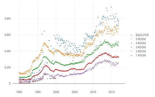
Title: Historical Average of HDB Resale Prices in Ang Mo Kio
|
|
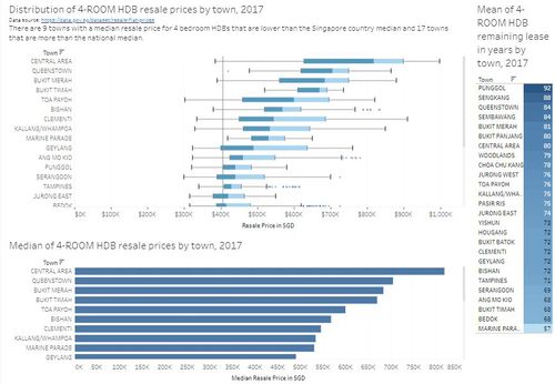
Title: Distribution of 4-Room HDB Resale Prices By Town |
|
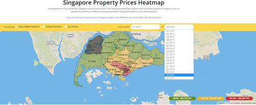
Title: Singapore Property Prices Heatmap Source: https://www.greyloft.com/singapore/property-prices-heatmap |
|
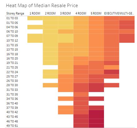
Title: Heat Map of Median Resale Price Source: https://public.tableau.com/profile/darrick8462#!/vizhome/HDBResaleAnalysisDDO/HDBRESALEDASHBOARD |
|
Brainstorming Sessions
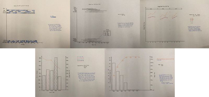
To come up with the storyboard, our group met up several times to try and come up with a visual. The five charts shown above are visual that we considered making for our project. Firstly, the bar and line charts are used to view the relationships between different factors against price. For the boxplot diagram, we feel that is a good visual to achieve our goal of seeing the seasonal trend of the resale price over the past five years. Lastly, the heatmap visual, our goal is to see the fluctuation of price per square meter to examine the profitability for investment or purchase a flat in a specific location.
After much brainstorming sessions, we came up with our final storyboard designs which are listed below.
Proposed Dashboard
Our group has proposed the following storyboard in our Visual Application:
| Dashboards | Rationale |
|---|---|
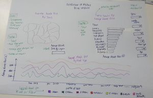
Storyboard 1: Overview of Resale Price Trends |
As this is the 1st storyboard, we would like to provide the reader with the big picture of resale prices before narrowing down the scope. The aim of this dashboard is to show the resale price trends and to allow the user to identify areas that are more expensive. Users can filter by year/month, region, town, flat type and age. When the user hovers over the map, the average floor area in sqm, the average price per sqm and the number of transactions will be displayed. |
|
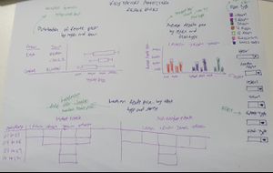
Storyboard 2: Key Factors Affecting Resale Prices |
The aim of this dashboard is to find out if variables such as flat type, storey range, and region can influence the resale price. The same filters used in the previous storyboard can be used for this storyboard. |
|
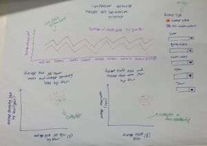
Storyboard 3: Comparison Between Mature and Non-Mature Estates |
There are pros and cons in buying a new home in a mature and non-mature estate. Towns that have been around for more than 20 years are deemed mature. The aim of this dashboard is to make comparisons between the 2 estate types and see if there are any distinct differences in terms of pricing and floor area. The user can also see the seasonal trend of people selling their homes |
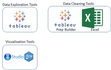
Tools and Technologies Used
Challenges
| Challenges | Description | Mitigation Plan |
|---|---|---|
Unfamiliarity of Visualization Technologies such as Tableau, R,Rshiny etc. |
We are new to R and RShiny and we are not sure of its capabilities |
|
Data visualization |
It is challenging to determine what type of chart to use and we also have to consider if the user can gain useful insights from the chart and interpret it easily |
|
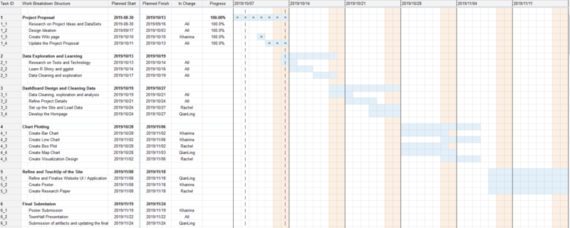
Timeline
Comments
| Name | Comments |
|---|---|
|
Your Name |
|
|
Your Name |
|

