IS428 AY2019-20T1 Assign Ng Kai Ling Bernice Visualization

From Visual Analytics for Business Intelligence
Revision as of 12:32, 10 October 2019 by Bernice.ng.2016 (talk | contribs)
(diff) ← Older revision | Latest revision (diff) | Newer revision → (diff)
Jump to navigation Jump to search

Title ng kai ling bernice va.png


Interactive Visualization

The Interactive Radiation Assessment System (IRAS) can be accessed here (view using desktop only): https://public.tableau.com/views/MiniCase2Assignment-Bernice/Introduction?:embed=y&:display_count=yes&publish=yes&:origin=viz_share_link

The following sections are divided into individual dashboard pages to elaborate on the interactivity.

Introduction Page

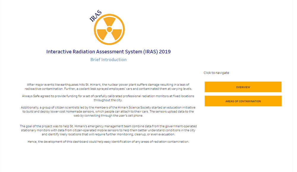
There is a large amount of data captured in the datasets provided. Furthermore, due to the many possible insights that can be driven from the dataset, it is not wise to put all the visual analytics into a single page dashboard. It will also be easier to divide the charts and visual analytics into meaning categories or pages to provide clarity. Flexibility has to be provided for navigation due to multiple pages of the dashboard. To do so, an "Introduction" page is created with a brief introduction and 2 different navigation categories: (1) Overview and (2) Areas of Contamination.

The following shows the introduction dashboard page:

Dashboard - intro ng kai ling bernice.png

Filters/Interactive Feature Rationale
Navigation button To provide users the ease in moving from one dashboard page to another.
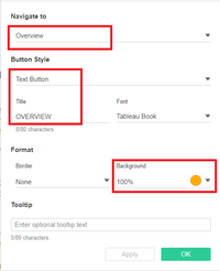
  1. Create a dashboard sheet in tableau
  2. Drag "Button" object into the design area
  3. In the popup, change button type to "Text Button", title to "OVERVIEW", change the navigation to overview dashboard page and change the colour under the "Background" field.

Implementation steps - intro page ng kai ling bernice.png

Overview Page

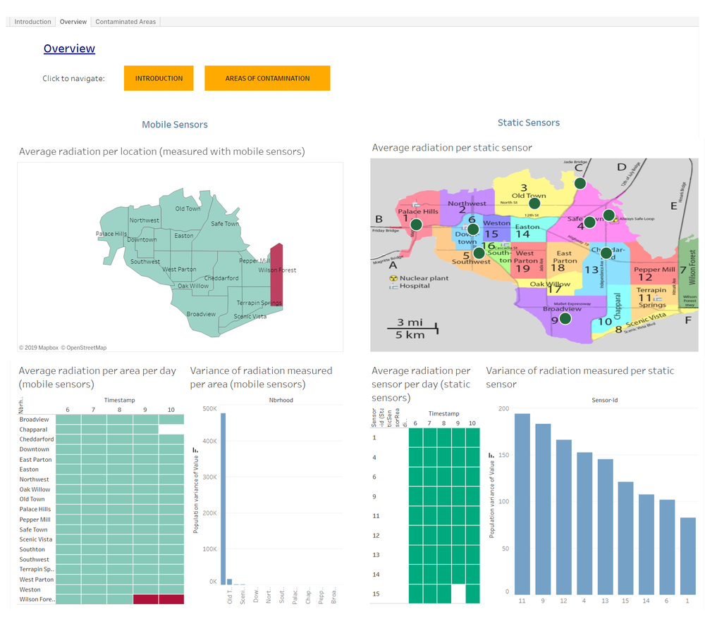
Below depicts the overview dashboard page, showing insights for both static and mobile sensors as follows:

  • Area of contamination across the available time period.
  • Contaminated areas shown per day.
  • Variance of the radiation measurements throughout the whole period of time.

Dashboard - overview ng kai ling bernice.png

Filters/Interactive Feature Rationale Implementation Steps
Navigation button To provide users the ease in moving from one dashboard page to another.

Refer to Home Dashboard for implementation steps

Areas of Contamination Page

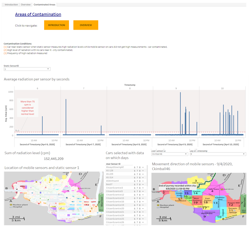
Dashboard page shown below allows users to identify the locations and cars contaminated by radiation in detail.

Dashboard - aoc ng kai ling bernice.png

Filters/Interactive Feature Rationale Implementation Steps
Navigation button To provide users the ease in moving from one dashboard page to another.

Refer to Home Dashboard for implementation steps

Filter Radiation per Sensor chart by each sensor

Feature - static sensor filter ng kai ling bernice.png

To allow users to analyze radiation levels for each static sensors, helping them to better identify areas of concern for the government to take actions.
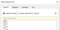
  1. Drag SensorID field from static sensor data to the filter pane.
  2. Select only the first option in the popup.

Implementation steps - aoc filter static sensor 1 ng kai ling bernice.png

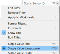
  1. Click on the arrow and select show filter.
  2. On the filter, click on the top right arrow and select drop down list.

Implementation steps - aoc filter static sensor ng kai ling bernice.png

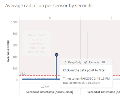
Filter locations of cars at a particular time Feature - chart timestamp filter ng kai ling bernice.png

To allow users to identify whether cars are contaminated or not in the other chart while using static data to support it.
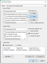
  1. Click on the "Worksheet" menu in tableau and select "Actions"
  2. Click on "Add Action" followed by "Filter".
  3. Rename the filter action.
  4. In the source sheet section, choose "Contaminated Areas" dashboard and click on "Average radiation per sensor per second" sheet.
  5. In the target sheet section, choose "Contaminated Areas" dashboard and click on "Car location at specific time" sheet.
  6. Change run action to "Select" and add filter with seconds of the timestamp (with the calendar icon).
  7. Click "OK" to save.

Implementation steps - aoc chart filter ng kai ling bernice.png

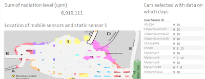
Filter cars in the particular area by selecting area Feature - filter cars in particular location ng kai ling bernice.png

To allow users to identify which cars are in which location at which day to assist in showing whether car has left the area or not.
  1. Click on the "Worksheet" menu in tableau and select "Actions"
  2. Click on "Add Action" followed by "Filter".
  3. Rename the filter action.
  4. In the source sheet section, choose "Contaminated Areas" dashboard and click on "Car location at specific time" sheet.
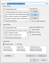
  5. In the target sheet section, choose "Contaminated Areas" dashboard and click on "Car selected and date" sheet.
  6. Change run action to "Select" and add filter with seconds of the timestamp (with the calendar icon) and add user sensor ID (a calculated field to join user ID and sensor ID).
  7. Click "OK" to save.

Implementation steps - aoc filter cars ng kai ling bernice.png

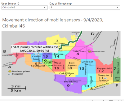
Filter cars on specific day Feature - aoc filter cars leaving ng kai ling bernice.png

To help users identify whether contaminated cars have left the area and through which route.
  1. Drag user sensor ID (a calculated field that joins user ID and sensor ID) and timestamp to the filter pane.
  2. Select the first option for the user sensor ID.

Implementation steps - aoc car leaving filter 1 ng kai ling bernice.png

  1. Select day of timestamp with the "#" icon.
  2. Repeat step 2 for timestamp.
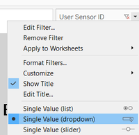
  3. Click on the arrow on the right side of user sensor ID in filter pane and select "Show Filter".
  4. On the filter that appeared on the right side, click on the arrow an choose drop down list.
  5. Repeat step 4 and 5 for timestamp filter.

Implementation steps - aoc car leaving filter 3 ng kai ling bernice.png