IS428 AY2019-20T1 Assign Lee Hui Xin Anne
Contents
- 1 Problem & Motivation
- 2 Information Gathering
- 3 Data Analysis & Transformation Process
- 4 Data set Import Structure & Process
- 5 Interactive Visualization
- 6 Interesting & Anomalous Observations
- 6.1 Q1: Emergency Responders’ prioritzed neighbouroods response based on Visualized damaged reports and parts of that City that are hardest hit.
- 6.2 Q2: Use visual analytics to show uncertainty in the data. Compare the reliability of neighborhood reports and identify which neighborhoods are providing reliable reports.
- 7 Conclusion
- 8 References
Problem & Motivation
St. Himark has been hit by an earthquake, leaving officials scrambling to determine the extent of the damage and dispatch limited resources to the areas in most need. They quickly receive seismic readings and use those for an initial deployment but realize they need more information to make sure they have a realistic understanding of the true conditions throughout the city.
In a prescient move of community engagement, the city had released a new damage reporting mobile application shortly before the earthquake. This app allows citizens to provide more timely information to the city to help them understand damage and prioritize their response. In this mini-challenge, use app responses in conjunction with shake maps of the earthquake strength to identify areas of concern and advise emergency planners. Note: the shake maps are from April 6 and April 8 respectively.
With emergency services stretched thin, officials are relying on citizens to provide them with much needed information about the effects of the quake to help focus recovery efforts.
By combining seismic readings of the quake, responses from the app, and background knowledge of the city, help the city triage their efforts for rescue and recovery.
Task Questions:
- Emergency responders will base their initial response on the earthquake shake map. Use visual analytics to determine how their response should change based on damage reports from citizens on the ground. How would you prioritize neighborhoods for response? Which parts of the city are hardest hit?
- Use visual analytics to show uncertainty in the data. Compare the reliability of neighborhood reports. Which neighborhoods are providing reliable reports? Provide a rationale for your response. Limit your response to 1000 words and 10 images.
- How do conditions change over time? How does uncertainty in change over time? Describe the key changes you see. Limit your response to 500 words and 8 images.
Information Gathering
ss
Data Analysis & Transformation Process
The datasets usually requires cleaning and transformation before it can be sensibily analyzed. It is important to have a proper understand of the Data, knowing whether the numbers are Categorial or Continuous data and to ensure that it is in the right format. This section will elaborate on the dataset analysis and transformation process before it can be imported for Interactive Visualization analysis.
The Data was collected using the Rumble App which crowd sources damage reporting, by collecting information about reporting time, location and different area’s shake intensity with 0 being the lowest and 10 being the highest.
The following section illustrates the issues faced in the data analysis phase leading to a need to transform the data into specificed format.
Issue 1
Issue: The report data provided the shake intensity of various facilities in their specific rows, making analysis by various facilities difficult.
Solution: Data cleaning was performed to pivot the various facilities into a single column called Area using Tableau Prep. By doing so, the shake intensity can be filtered and visualized according to the various areas.
Issue 2
Issue 3
Data set Import Structure & Process
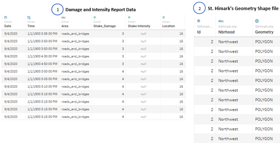
With the dataset analysis and transformation phase completed, the following files will have to be imported into Tableau for analysis:
Each of the data file is added as a data source in Tableau. The relationship defined between each data source is the id or locations in the city. This will allow analysis to be conducted across all the data sources.
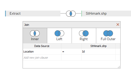
Additional processing was perform on both data sources: • Import the Damage and Intensity Report Data • Add new data connections to the Damage and Intensity Report Data. The new data connection file will be St. Himark’s Geometry Shape file • Perform inner join between both data sources using Damage and Intensity Report Data’s Location and St. Himark shape file’s ID. This will create a relationship between the Geometry provided with the locations. The following shows the configuration of the join:
Interactive Visualization
The interactive visualization can be accessed here:___
For the best experience, adjust your screen resolution to full screen by enabling full screen on the browser. Throughout all the different dashboards, useful guides and tips are provided to help users navigate through the different filters and actions to increase the efficiency of their analysis. The following elements are used through out all the dashboards to maintain consistency:
| Interactive Technique | Rationale | Brief Implementation Steps |
|---|---|---|
| Filter dates with the use of time range slider |
To provide flexibility for analysts to choose the time period which they are interest in analysing.
The use of checkboxs or radio boxes is time-consuming as it requires analysts to check or uncheck the box. |
|
| Filter data source by Area types using a single selection drop down list |
To allow analysts to concentrate on the data collected from each Areas with the use of a single selection.
The use of a drop downlist also allows analysts to easily view all the selection choices and select the area type that they are interested to analyse. |
|
| Filter Locations with the use of range slider |
To provide flexibiltiy for analysts to select a few locations that they are interest to analyse. | # Adding the location Measures into the filter field
|
Home Dashboard
To have an in-depth analysis on all the data attributes provided, it will not be possible to display all the attributes in a single dashboard.
To allow flexibility and easy to understand in navigation, the following interactive techniques and instructions have been employed:
| Interactive Technique | Rationale | Brief Implementation Steps |
|---|---|---|
| Navigate across dashboards with buttons | To provide users with the flexibility of moving across dashboards using a simple and easy to understand user interface. |
|
| Display tooltips when user hovers over each button | To provide users with contextual information about the dashboard and the expected information and chart they will look at after selection. |
|
Dispatch Priority Dashboard
The following shows the Damage and and Shake Intensity Dashboard of St. Himark.
To allow flexibility and easy to understand in navigation, the following interactive techniques and instructions have been employed:
| Interactive Technique | Rationale | Brief Implementation Steps |
|---|---|---|
| Filter dates with the use of time range slider |
To provide flexibility for analysts to choose the time period which they are interest in analysing.
The use of checkboxs or radio boxes is time-consuming as it requires analysts to check or uncheck the box. |
|
| Filter data source by Area types using a single selection drop down list |
To allow analysts to concentrate on the data collected from each Areas with the use of a single selection.
The use of a drop downlist also allows analysts to easily view all the selection choices and select the area type that they are interested to analyse. |
# Adding the Area Dimension into filter field # Configure the filter selection to be single selection drop down list |
| Highlight Locations upon hover | To highlight information that are related to the location hovered, indicating the information that are of interest to the analyst. |
|
| Additional information display on Geometric map |
To provide users with additional visual and contextual information to aid with their analysis. | Annotate Area and entering the information to be displayed. |
Earthquake Occurrence Dashboard
Uncertainties Analysis Dashboard
Interesting & Anomalous Observations
Using the dashboard as a platform for investigation and analysis, the following aims to provide answers to the question posed.
Q1: Emergency Responders’ prioritzed neighbouroods response based on Visualized damaged reports and parts of that City that are hardest hit.
| Patterns | Visualization |
|---|---|
| Example | Example |


