Macao Travels-Proposal
Contents
Problem Statement
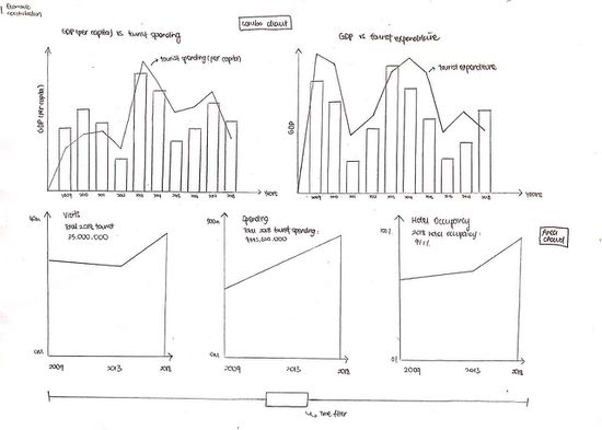
Macao’s tourism industry has always been one of the most important industries driving economic progress, with visitor arrivals in Macao reporting around 35 million visitors in 2018 and tourism revenues in Macao reached an all-time high of 18,352 MOI Million in the third quarter in 2018. Another key aspect of tourism in Macao is its gaming industry. The gaming industry is the major driving force for Macao’s economy. The most densely populated region in the world heavily relies on the popularity of being a gambling destination - 40% of Macao’s GDP comes from the gaming industry and more than 70% of tax revenues are collected from casinos. Despite the rapid growth, the Macao SAR Government has the vision to build it into a World Centre of Tourism and Leisure in the next 15 years.
Motivation
Ever since the establishment of the Macao Special Administrative Region (Macao SAR), special emphasis has been placed on the development of the city’s tourism industry, which has been a catalyst for continued growth over the last decade.
Our main motivation is to address the lack of a convenient and comprehensive platform to study the correlation and trends amidst Macao’s most important industry to their financial growth. The current visualization tool employed by Macao’s Government is inadequate and difficult to visualize trends and uncover patterns for the tourism industry. The Macao Government Tourism only provides market report and basic info-graphics on tourist arrivals and hotel statistics. Furthermore, the Macao’s government does not have a proper visualization tool for its gaming industry, which is a huge component of the tourism industry in Macao.
This project provides an interactive visualization to better analyze Macao’s tourism industry, consisting of lodging, gaming and tourism spending. Through our visualization, we aim to identify the relation between the tourism industry, and its two biggest components: hotel and gaming industry, as well as to uncover trends and patterns that the Government of Macao can utilize to further boost their economy by optimizing marketing campaigns. We aim to answer questions such as how much resources should be allocated to Macao’s tourism industry, or where do most of Macao’s main contributors to its tourism industry come from?
Objectives
This project aims to provide insights into the following:
- Gain insights on the monthly/yearly visitor arrivals to Macao over the past 10 years
- Identify tourist preference for accommodation and hotel's occupancy rate
- Breakdown of tourists’ expenditure to find out which country is spending the most in Macao and which area they are spending the most on (e.g. Shopping, F&B)
- Gain insights on Macao’s gaming industry and which country contributes most to the gaming industry
| Visualizations | Insights and Explanation |
|---|---|
|
|
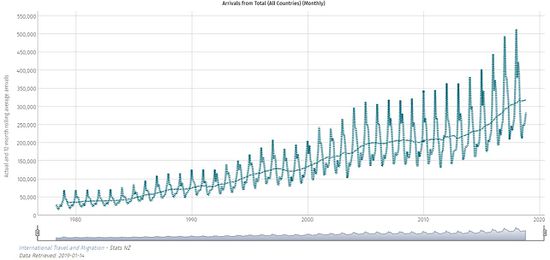
This visualization allows users to find out how many international tourists are coming into Macao every year. Furthermore, the plotting of both a 12-month rolling average and observation on the same graph enables us to have a quick and clear overview. However, one drawback of the visualization is that it does not allow us to plot different countries on the same graph. Hence, this visualization is only limited to viewing the overall incoming tourist into Macao and users are unable to visualize the incoming number of tourists from each country individually. To overcome this drawback, my team will have a similar line chart that allow users to view the incoming tourist from each country. |
|
|
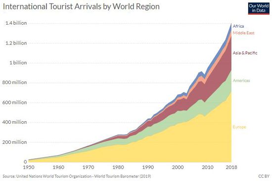
The used of an area chart is an effective way of displaying the total international tourist arrivals by region. The area allows users to see the tourist arrivals breakdown for each region – each colour on the chart represents a specific region. This allows users to get a rough gauge of the number of tourists coming from different region just by looking at the area on the chart. |
|
|
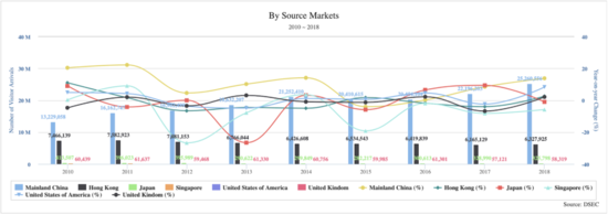
This visualization is a combo chart that comprises of two charts in one - a time-series line chart, and a bar chart, which compares the international visitor arrival with the year on year change of each country. However, this visualization looks confusing (as there are too many lines displayed on the same graph) and it is hard to compare the visitor arrivals across the different countries. One possible way to show the number of international visitors arriving from each region (e.g. Asia, Europe) and subsequently break this down the regions and enable users to visualize the yearly visitor arrivals of each country (e.g. France, Spain, Germany). |
Design Inspirations
| Visualizations | Explanation |
|---|---|
| Treemap
|
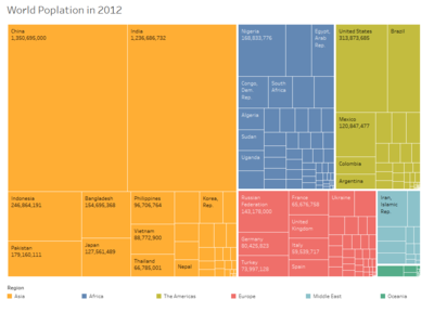
Treemap diagrams can be used to visualize hierarchical and part-to-whole relationships very effectively. We can use it to visualize the number of tourists coming from different regions and countries and the total spending by different visitor into Macao. One advantage of using a treemap is that we can easily derive the top 3 visiting counties to Macao. However, it does not provide us with time series analysis, and it is hard to compare the arrival of tourists across the different years. Furthermore, the hierarchy of the treemap has only 2 levels. As such, the level of details and interaction maybe limited. |
| Radar Chart
|
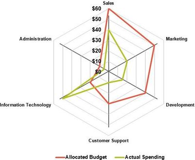
Radar chart is used to compare multiple quantitative variables and it is useful to identify variables with similar values and outliers amongst each variable. For our project, we can make use of the radar chart to display the breakdown of tourist spending into different categories (e.g. shopping, F&B etc). The ability to overlay the spending of different countries allows us to easily compare and identify countries with the highest spending in Macao. However, having too many overlays on a chart may cause the chart to be complicated and tedious to visualize. As such, our team may consider splitting the countries based on their region. |
| Map
|
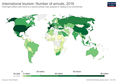
By using a map, we can better represent and display geographical locations data. The world map also allows us to visualize where tourists are coming from and the distance to get to Macao. Furthermore, it uses colors and legend to differentiate between the allocated budget and actual spending. We can use a similar approach where each color represents the spending of each country. |
| Heatmap
|
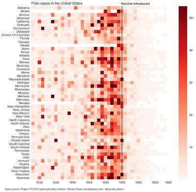
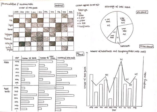
Heatmap are graphical representations of data that utilize color-coded systems to allow users to better visualize the volume of events and it serves the purpose of directing user’s attention towards areas on the visualization that matter most. Our team has decided to incorporate the use of the heatmap to identify tourist preference for the different accommodation type (e.g. 5-star, 4-star etc) as it allows us to instantly understand tourists’ behaviors and patterns. |
Proposed Storyboard
| Visualizations | Explanation |
|---|---|
| Storyboard 1 - Economic Contribution
|
|
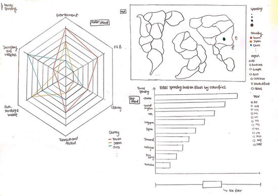
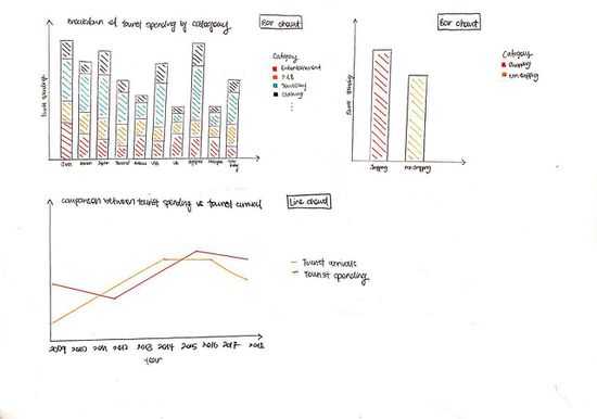
| Storyboard 2 - Tourist Spending
|
|
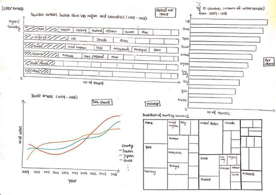
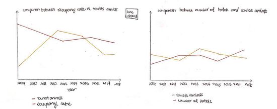
| Storyboard 3 - Tourist Arrivals
|
|
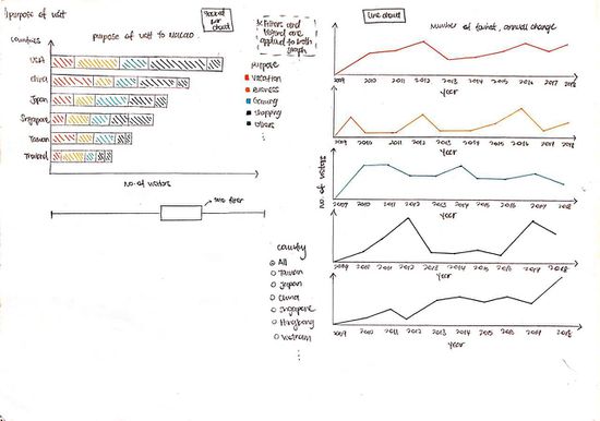
| Storyboard 4 - Purpose of Visit
|
|
| Storyboard 5 - Accommodation
|
|
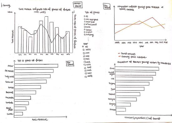
| Storyboard 6 - Gaming
|
|
Datasets
We have obtained the following datasets for this research:
| Dataset/Source | Data Attributes | Purpose |
|---|---|---|
| Gaming Statistics (CEIC)
(2009 - 2018) |
|
This dataset will allow us to see the popular games in the casinos. This can be joined with other datasets to draw a relation with the tourists that are driving the popular games. |
| Hotel Statistics(CEIC)
(2009 - 2018) |
|
This dataset will allow us to determine the various statistics of hotel occupancy, which can be used to analyse visitor preference for hotels based on conditions such as price and star ratings. |
| Visitor Arrivals (CEIC)
(2009 - 2018) |
|
This dataset will let us see the arrivals of tourists and whether it is overnight or same day arrivals. |
| Resident Departures (CEIC)
(2009 - 2018) |
|
This dataset will be used to determine how residents depart, and to which country. |
| Visitor per Capita Spending (CEIC)
(2009 - 2018) |
|
This dataset will allow us to determine what do tourists from each country spend in Macao. |
| Visiting Purposes (Data plus)
(2009 - 2018) |
|
This dataset will be used to understand the purpose of visit by the tourists into Macao. |
Tools/Libraries
Architectural Design
Technical Challenges
| Key Technical Challenges | Solution |
|---|---|
| Lack of experience in visualizing the data and implementing interactivity and animated designs in visualization application. |
To overcome this challenge, our team conducted background research on this topic (tourism) and gathered some design inspirations that we can consider using for our visualization. After which, we started planning out how the visualization will look like and learn how to integrate different charts and enhance the interactivity by creating storyboards. |
| Unfamiliarity with visualisation tools such as R and RShiny |
To address this challenge, the team will focus on learning more about R and RShiny from online tools such as Datacamp (independent learning). We will also seek help from our Prof. Kam, fellow peers, YouTube tutorials and make use of Google for any queries. |
| Data Cleaning and transformation of data |
The current datasets must be cleaned as the data is messy and the format is not proper. Since our project requires a total of 26 datasets, we will face key issues in preparing the data for visualisation. Our team plans to split up the data cleaning work into different segments and work on it individually, before coming together to check the datasets together, and promptly proceed to merge them if needed. |
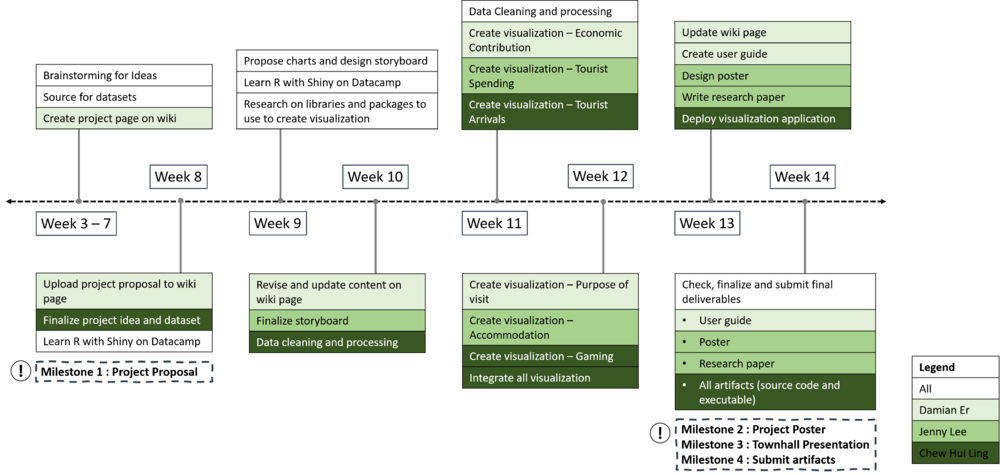
Timeline
References
Macao Data:
- CEIC Database: https://insights-ceicdata-com.libproxy.smu.edu.sg/Untitled-insight/views
- Data Plus: https://dataplus.macaotourism.gov.mo/Indicator/VisitorsSummary/SummaryBar?lang=E
Macao Tourism Industry Development Master Plan: https://masterplan.macaotourism.gov.mo/home-en/index.html
Data Cleaning:
- Reading and Importing Excel Files into R: https://www.datacamp.com/community/tutorials/r-tutorial-read-excel-into-r

