Difference between revisions of "IS428 AY2019-20T1 Assign Tan Sok Yi DataTransformation"
| Line 70: | Line 70: | ||
|- | |- | ||
| Solution || To solve this problem, we have to grow our own filled maps and transform them into an appropriate geographic coordinate reference system for Tableau to use. Such implementation can be found in https://community.tableau.com/thread/116369. | | Solution || To solve this problem, we have to grow our own filled maps and transform them into an appropriate geographic coordinate reference system for Tableau to use. Such implementation can be found in https://community.tableau.com/thread/116369. | ||
| + | The 2 CSV file that was created via the method provided in the link was kindly provided by my classmate on elearn discussion forum. | ||
|} | |} | ||
Latest revision as of 22:06, 13 October 2019
|
|
|
|
|
Contents
Data analysis and cleaning process
Before creating the visualisation, analysis of the dataset is done to understand the different variables and attributes. One dataset, containing reports of shake intensity and the intensity of the damage in the different areas (buildings, medical, power, road and bridges, sewer and water) in the various neighbourhood, in an interval of 5 minutes. Shake maps were also provided which allowed a better understanding of the coverage of the earthquake.
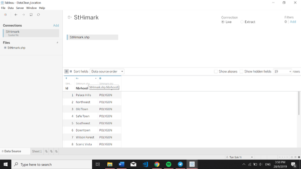
Geographical data is available in MC2 where a shp file showing the coordinates of the different neighbourhood. This dataset would be useful in creating the visualisation for MC1. For the datasets given, it needs to be clean and process first to prepare the data for the visualization.
Data Cleaning
1. Getting the coordinates of the different locations
| Problem 1 | Getting the coordinates of the different locations |
|---|---|
| Issue | Geographical data is needed to create a map visualisation which will be useful in analysing the dataset. However, the exact location of the neighbourhood cannot be plotted as the coordinates of the different locations are not available in the dataset. |
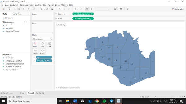
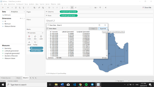
| Solution | To solve this problem, the data is available as a shp file in MC2 can be used to retrieve the coordinates for the different location. After retrieving the coordinates, a polygon on a map can be created.
|
2. Size of polygons
| Problem 2 | Size of polygon |
|---|---|
| Issue | Size of polygon shrinks when background image is added and becomes a a centroid instead |
| Solution | To solve this problem, we have to grow our own filled maps and transform them into an appropriate geographic coordinate reference system for Tableau to use. Such implementation can be found in https://community.tableau.com/thread/116369.
The 2 CSV file that was created via the method provided in the link was kindly provided by my classmate on elearn discussion forum. |
3. Transposing of the data
| Problem 3 | Transposing of the data |
|---|---|
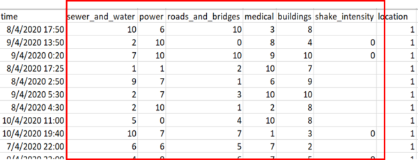
| Issue | The dataset provides multiple responses collected from different users at the different timestamp. However, based on the structure of the data, it is difficult to analyse the data and apply filters on the visualisation based on the different damage area. |
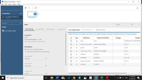
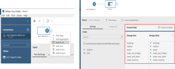
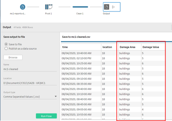
| Solution | To solve this issue, we will make use of Tableau Prep to transpose the different columns (buildings, medical, power, roads and bridges, sewer and water and shake intensity) into one column for better analysis.
|
Dataset Import Structure & Process
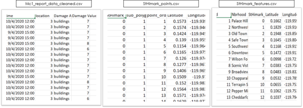
The 3 datasets that we are using to create the visualisations are as follows:
The datasets are joined together using its common features as shown below.
With these, we are now able to create the visualisations necessary to perform the required analysis.
