Difference between revisions of "IS428 AY2019-20T1 Assign Greg Tan Boon Kit Interactive Dashboard"
Jump to navigation
Jump to search
(Created page with "<div style=background:#aec6cf border:#A3BFB1> 153px|left <b><font size = 6; color="#43464b"> VAST Challenge 2019 Mini-Challenge 1:<br>Crowdsourcing for...") |
|||
| Line 29: | Line 29: | ||
| | | | ||
|} | |} | ||
| + | |||
| + | {| class="wikitable" | ||
| + | |- | ||
| + | ! Technique !! Rationale & Implementation | ||
| + | |- | ||
| + | | Interactive Technique 1: Filter for the use of time range slider | ||
| + | [[File:filter.png|frameless|center]] | ||
| + | || Adding a filter option allows the person using the dashboard to instantly narrow down the dates that he/she wishes to focus on. Employing the use of a slider also allows the user to specify a range of dates that he/she might wish to analyse. This works best with the date option as analysing a range of dates might allow the user to discover new insights. | ||
| + | |||
| + | From a usability standpoint, having a slider allows the user to easily select the range of the time period wanted. This step is easier than using a checkbox/list, which requires multiple unnecessary clicks to achieve the same effect. | ||
| + | |||
| + | '''Implementation:''' | ||
| + | |||
| + | To achieve this slider filter function, simply do the following steps: | ||
| + | # Add the ‘Time’ dimension to the filter | ||
| + | # Select the range of dates to be included in the visualisation | ||
| + | # Show the filter | ||
| + | |- | ||
Revision as of 01:55, 13 October 2019
|
|
|
|
|
|
| Technique | Rationale & Implementation |
|---|---|
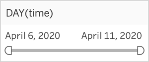
| Interactive Technique 1: Filter for the use of time range slider | Adding a filter option allows the person using the dashboard to instantly narrow down the dates that he/she wishes to focus on. Employing the use of a slider also allows the user to specify a range of dates that he/she might wish to analyse. This works best with the date option as analysing a range of dates might allow the user to discover new insights.
From a usability standpoint, having a slider allows the user to easily select the range of the time period wanted. This step is easier than using a checkbox/list, which requires multiple unnecessary clicks to achieve the same effect. Implementation: To achieve this slider filter function, simply do the following steps:
|

