IS428 AY2019-20T1 Assign Greg Tan Boon Kit Task Questions & Answers
|
|
|
|
|
|
Contents
Question 1
Emergency responders will base their initial response on the earthquake shake map. Use visual analytics to determine how their response should change based on damage reports from citizens on the ground. How would you prioritize neighborhoods for response? Which parts of the city are hardest hit? Limit your response to 1000 words and 10 images.
I would prioritize the neighbourhoods for response based on 4 main criteria:
- Average Infrastructure Damage based on Quantitative Score and Instrumental Intensity
- Distance of Neighbourhood from earthquake origin
- Average Shake Intensity of the Neighbourhood
- Number of Reports from residents in the neighbourhood
The rationale for prioritising Infrastructure Damage is to ensure that places with high damage to infrastructure such as Buildings or Medical are quickly attended to as there might be casualties stuck within the infrastructure due to the damage.
The distance of the neighbourhood would matter as it can be
Prioritising Shake Intensity is also important as this are live tremors felt by the residents of the neighbourhood and could very well imply the proximity of their neighbourhood to the epicentre of the earthquake itself.
Lastly, taking into consideration the nature of the Rumble app, flooding of reports from residents of a neighbourhood could potentially mean that they are currently experiencing the full brunt of the earthquake itself. Hence, efforts should be immediately channelled there to ensure that help is efficiently rendered.
| Index | Analysis | Image |
|---|---|---|
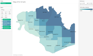
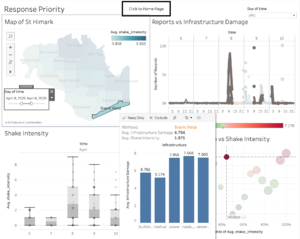
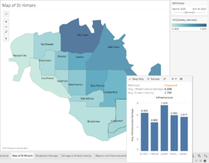
It can be seen from the map graph that the hardest hit neighbourhoods based on color gradient (The darker the color tone, the more severe the infrastructure damage) are mainly:
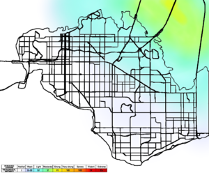
This analysis is made by comparing the average infrastructure damage of each neighbourhood. Based on the analysis, the above 4 neighbourhoods were the most heavily hit during the course of the past 6 days from 6th to 11th, with the brunt of the damage coming in on the 8th. When comparing the visualisation to the actual earthquake map on the right, it is also justified as the actual earthquake epicentre is very close to these 4 neighbourhoods. |
||
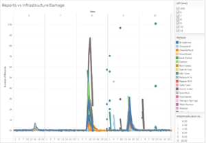
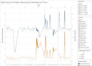
| From the line graph, we can infer that the number of reports correspond positively with the infrastructure damage. An example would be about Old Town, one of the hardest hit neighbourhoods, which reported a high number of reports from citizens on the 8th, which is the day when the earthquake struck. This is also further proven by a very high infrastructure damage for those areas, as signalled by thicker lines using the 'size' filter. | ||
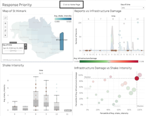
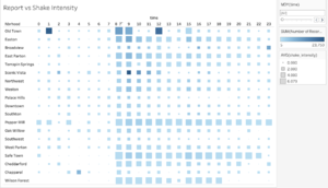
| One interesting observation is that residents from Scenic Vista sent out the highest number of reports, despite not being one of the hardest hit neighbourhoods. This can be seen from their average infrastructure damage and shake intensity, which were all not as high as the top 4 most hardest hit neighbourhoods.
An analysis into the demographic of Scenic Vista might shed some light on the profile of the residents. As Scenic Vista is home to some of the city's elite and powerful, a moderate tremor might lead them to be very worried. This might be one of the reasons which led to the flooding of reports from citizens of Scenic Vista. Therefore, it might be necessary for the analyst to take into account demographic profiles of the neighbourhood before rushing in to take action. Based on my analysis, it is recommended to follow the infrastructure damage and shake intensity as the proper guideline to determine which neighbourhoods to help first. |
||
| Another interesting observation is that while Wilson Forest was one of the hardest hit neighbourhoods, there was a record low amount of reports that came from the citizens during the entire period. This might be due to the fact that Wilson Forest is a relatively new neighbourhood for young couples. Hence, there might be a low number of residents in the area to begin with.
Therefore, as per mentioned above, it is necessary for the analyst to take into account demographic profiles. |
||
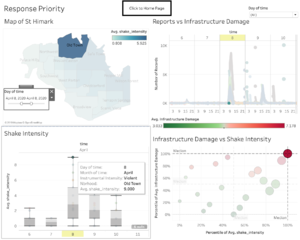
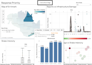
| From the color gradient on the graph, as well as the box plot charts, we can infer that Old Town has been the hardest hit, and hence requires immediate attention. However, there seems to be a disconnect with regards to the number of reports coming in. On the 8th, there were very low reports, followed by a sudden increase, before another short hiatus followed by another burst of readings.
After careful analysis, this could have been due to the upgrading of the electrical distribution system, which caused power outages. Hence, it's important for the analyst to take such conditions into consideration. |
Question 2
Use visual analytics to show uncertainty in the data. Compare the reliability of neighbourhood reports. Which neighbourhoods are providing reliable reports? Provide a rationale for your response.
When comparing the uncertainty in the data sets, I primarily look to compare and analyse 3 main sets of information
- Infrastructure Damage
- Shake Intensity
- Number of Reports
By actively comparing and analysing the relationship between the 3 sets of data, there would be certain insights that can be generated such as:
- Mismatch between number of reports and shake intensity
- Relation between shake intensity and infrastructure damage
- Demographic understanding of citizens within a particular neighbourhood
| Index | Analysis | Image |
|---|---|---|
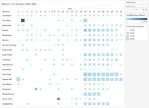
| One uncertainty that was detected within the data set was the sudden drop off in the number of reports by Old Town. On the 8th, where the earthquake struck, most neighbourhoods that were hit reported frequently, yet Old Town had a huge drop off in the number of reports despite being one of the hardest hit neighbourhoods. Compared to Pepper Mill, who had regular reports throughout the entire day of the 8th, Old Town's sudden drop off in data might be baffling to the analyst.
This was followed up by a sudden spike in reports at approximately 1am on the 9th. This increases the uncertainty as it's hard for the analyst to accurately determine the reason for the sudden drop off and spike and help might either be dispatched to a less needy neighbourhood or too late. This could have been due to the power outage from the electrical upgrade. Hence, it is important for the analyst to take into account certain situational factors while trying to determine the right neighbourhoods to dispatch help to.
|
||
| Another uncertainty is the fact that Chapparal had very few reports, followed by a drop off entirely. It might be necessary to research further into such a scenario as Chapparal did suffer infrastructure damage despite not experience as intense of shake intensity.
Furthermore, given Chapparal's profile as a rural area, the residents might not be savvy enough to truly use the Rumble App. Hence, it might be necessary to ensure that residents are proficient in using the application as well to ensure that information sent over is not inaccurate.
|
||
| When comparing the relationship between the number of records as compared to the shake intensity and damage to infrastructure, it has a positive relationship in general. This makes sense as an increase in shake intensity should naturally result in an increase in reports from citizens through the application. Apart from a few anomaly cases mentioned above, the general trend sticks to a positive relationship, which makes logical sense. |
Question 3
How do conditions change over time? How does uncertainty in data change over time? Describe the key changes you see.
| Index | Analysis | Image |
|---|---|---|
| The number of reports primarily fluctuate according to the shake intensity, coupled with demographical differences within each particularly neighbourhood. If we were to disregard the aspect of differences in demographics (eg. Old Town having power outages), it can be seen that with higher shake intensity, there will be more reports, and vice versa. | ||
| The infrastructure damage levels need not necessarily be directly proportionate to the shake intensity levels. This can be seen by how Scenic Vista suffered relatively severe high infrastructure damage despite low shake intensity throughout the period of the earthquake.
This could be due to certain neighbourhoods having infrastructure that is not meant to withstand earthquake structures. Hence, this might add to the level of complexity and uncertainty when evaluating the datasets. |
