Difference between revisions of "IS428 AY2019-20T1 Assign Chew Hui Ling Data Preparation"
Hlchew.2017 (talk | contribs) (Created page with "<div style=background:#D3D3D3 border:#696969> 165px <b><font size = 6; color="#8B4513"> VAST Challenge 2019 MC 1: Crowdsourcing for Situational Aw...") |
Hlchew.2017 (talk | contribs) |
||
| Line 7: | Line 7: | ||
| style="font-family:Century Gothic; font-size:100%; solid #000000; background:#D3D3D3; text-align:center;" width="25%" | | | style="font-family:Century Gothic; font-size:100%; solid #000000; background:#D3D3D3; text-align:center;" width="25%" | | ||
; | ; | ||
| − | [[IS428_AY2019-20T1_Assign_Chew_Hui_Ling|<b><font size=" | + | [[IS428_AY2019-20T1_Assign_Chew_Hui_Ling|<b><font size="2"><font color="#BC8F8F">Background</font></font></b>]] |
| style="font-family:Century Gothic; font-size:100%; solid #1B338F; background:#D3D3D3; text-align:center;" width="25%" | | | style="font-family:Century Gothic; font-size:100%; solid #1B338F; background:#D3D3D3; text-align:center;" width="25%" | | ||
; | ; | ||
| − | [[IS428_AY2019-20T1_Assign_Chew_Hui_Ling_Data_Preparation|<b><font size=" | + | [[IS428_AY2019-20T1_Assign_Chew_Hui_Ling_Data_Preparation|<b><font size="4"><font color="#8B4513">Data Analysis and Preparation</font></font></b>]] |
| style="font-family:Century Gothic; font-size:100%; solid #1B338F; background:#D3D3D3; text-align:center;" width="25%" | | | style="font-family:Century Gothic; font-size:100%; solid #1B338F; background:#D3D3D3; text-align:center;" width="25%" | | ||
| Line 31: | Line 31: | ||
<br/> | <br/> | ||
<font size="3"><font color="#8B4513">'''Mini-challenge 1 Reports'''</font></font> | <font size="3"><font color="#8B4513">'''Mini-challenge 1 Reports'''</font></font> | ||
| + | <br/><br/> | ||
| + | [[File:C1-2019.jpg|500px]] | ||
<br/> | <br/> | ||
| − | [[File: | + | |
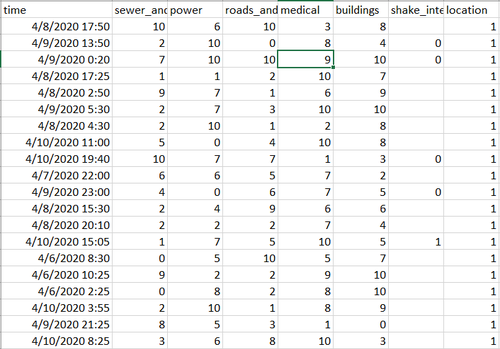
| + | Within the report, it shows the time, damage taken by the different components, shake intensity and location. This provides minimal information for data visualization. Hence, in order to improve the current data that we have, I will be doing the following changes: | ||
| + | # For each component: power, medical buildings. It would be hard to see all the values together. This is because either you must put 5 graphs together or you will have to create a calculated field to add all the 5 values together. Instead of doing that, pivoting will help to generate 1 column for the component name and 1 column for the component value. And with filter it will allow the user to view all or the components separately. | ||
| + | # For each value within the component, there is no specific name attached. The user only knows that 10 is the highest and 0 is the lowest. But for user experience, it is much better to attach something to the value such as 0 = Weak, etc. | ||
| + | # Within the report, there is no specific name for each location and to solve the problem. I will be using the shp file to integrate the location number and name together. | ||
| + | |||
| + | <br/> | ||
| + | <font size="5"><font color="#8B4513">'''Data Preparation'''</font></font> | ||
| + | <br/> | ||
| + | Through the 3 points that was mentioned, I have created this flow within tableau prep. | ||
| + | |||
| + | [[File:C2-2019.jpg|500px]] | ||
| + | |||
| + | <font size="3"><font color="#8B4513">'''Idea 1'''</font></font> | ||
<br/> | <br/> | ||
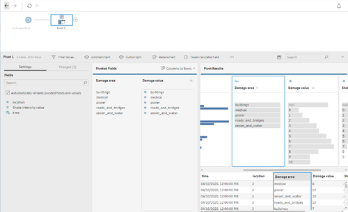
| + | For the first idea for pivoting the table. Using tableau prep, click on the “Plus” icon next to the mc1-reports document and click on “Pivot”. The following screen will be shown, drag the fields that needs to be pivoted into the “Pivoted Fields” column. It will then automatically pivot those field, and after pivoting rename the columns within the “Pivoted Fields” column as shown below. | ||
| − | + | [[File:C3-2019.jpg|500px]] | |
| − | |||
| − | |||
| − | |||
Revision as of 22:29, 14 October 2019
|
|
|
|
|
Data Analysis
Before the analysis began, the dataset given is analysed to identify its respective format and attributes. There was only 1 csv file provided in the assignment which meant that there was minimal amount of information that can be analysed. Hence, I will be taking the shp file from mini challenge 2 as well as creating one csv file called connection to do my transformation process for each dataset.
Within the report, it shows the time, damage taken by the different components, shake intensity and location. This provides minimal information for data visualization. Hence, in order to improve the current data that we have, I will be doing the following changes:
- For each component: power, medical buildings. It would be hard to see all the values together. This is because either you must put 5 graphs together or you will have to create a calculated field to add all the 5 values together. Instead of doing that, pivoting will help to generate 1 column for the component name and 1 column for the component value. And with filter it will allow the user to view all or the components separately.
- For each value within the component, there is no specific name attached. The user only knows that 10 is the highest and 0 is the lowest. But for user experience, it is much better to attach something to the value such as 0 = Weak, etc.
- Within the report, there is no specific name for each location and to solve the problem. I will be using the shp file to integrate the location number and name together.
Data Preparation
Through the 3 points that was mentioned, I have created this flow within tableau prep.
Idea 1
For the first idea for pivoting the table. Using tableau prep, click on the “Plus” icon next to the mc1-reports document and click on “Pivot”. The following screen will be shown, drag the fields that needs to be pivoted into the “Pivoted Fields” column. It will then automatically pivot those field, and after pivoting rename the columns within the “Pivoted Fields” column as shown below.


