Difference between revisions of "IS428 AY2019-20T1 Assign He Yicheng: Observations"
| Line 25: | Line 25: | ||
<!-- Header End --> | <!-- Header End --> | ||
| − | <div style="font-weight:300;padding: 10px 13px 20px 13px; line-height: | + | <div style="font-weight:300;padding: 10px 13px 20px 13px; line-height:30px;font-family:HelveticaNeue-Light, Helvetica Neue Light, Helvetica Neue, Helvetica, Arial, Lucida Grande, sans-serif;font-size:40px">Observations<br></font></div> |
== <div style="font-weight:300;padding: 10px 13px 20px 13px; line-height:30px;font-family:HelveticaNeue-Light, Helvetica Neue Light, Helvetica Neue, Helvetica, Arial, Lucida Grande, sans-serif;font-size:25px">Question 1</font></div>== | == <div style="font-weight:300;padding: 10px 13px 20px 13px; line-height:30px;font-family:HelveticaNeue-Light, Helvetica Neue Light, Helvetica Neue, Helvetica, Arial, Lucida Grande, sans-serif;font-size:25px">Question 1</font></div>== | ||
Revision as of 02:55, 13 October 2019
Question 1
Visualize radiation measurements over time from both static and mobile sensors to identify areas where radiation over background is detected. Characterize changes over time.
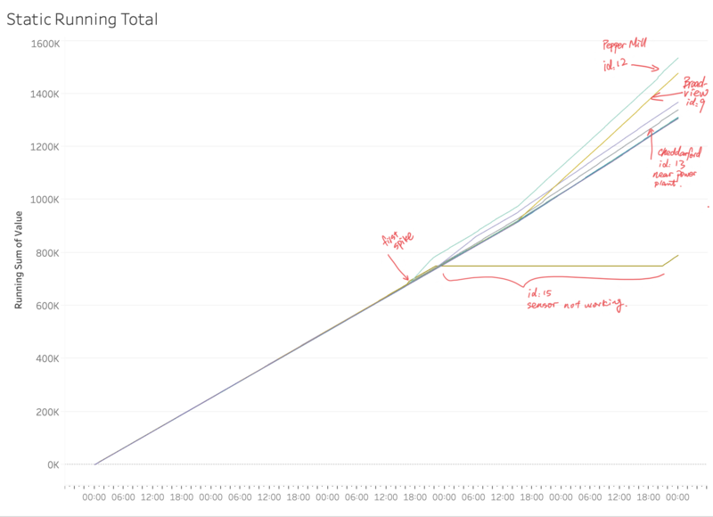
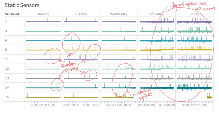
Before Wednesday afternoon, the static sensors’ readings remained calm with some random spikes from time to time. There were signs of more frequent reading spikes from sensors 12, 13, 14 and 15. Sensor 12, near the Power Plant shows ever increasing readings from 18:00 onwards. This is followed by increased readings at sensor 11 (Broadview Community Hospital) and Sensor 9 (Broadview). Sensor 15 (Weston) stopped working after 22:06 on Wednesday.
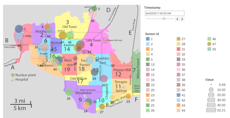
The graph above shows the mobile sensor readings on Thursday at 7:59. From the graph, we can see big bubbles such as Sensor 39, 42, 33 and 35 which surround the Power Plant. Surprisingly, Sensor 1, which is far away from the plant, is having a reading as high as those sensors that are closer to the plant.
Question 2
2a. Compare uncertainty of the Static sensor to the Mobile sensor. What anomalies can you see? Are there sensors that are too uncertain to trust?
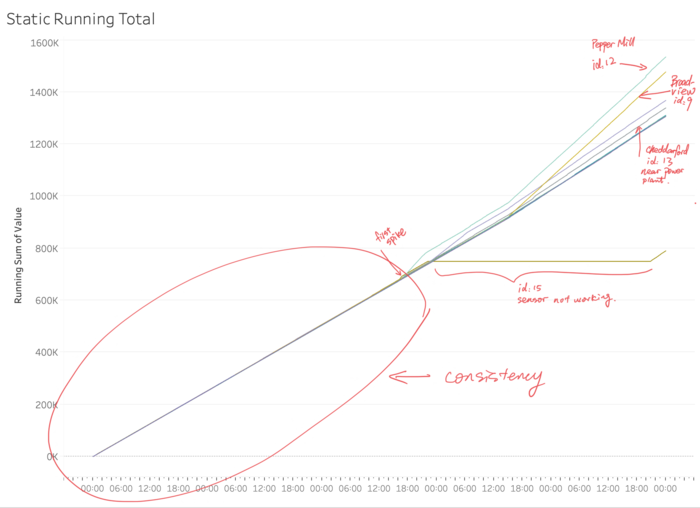
For the static sensors, the sensors are generally consistent in the readings. However, Sensor 15 stopped working from Wednesday 22:00 to Friday 21:00. Despite the random spikes from time to time, the overall readings from all sensors seem in sync. From the running total graph above, we can see the ultimate consistency of readings across all the static sensors from Monday to Evening of Wednesday. Afterwards, readings from sensor 12 and 11 and 9 started to raise faster than rest sensors, standing out in the running total graph. Interestingly, sensor is relatively far from the plant yet having readings that grow faster than many other sensors.
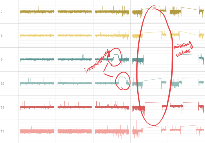
For the mobile sensors, it is obvious to spot the huge inconsistency across the 50 sensors with many irregular readings as well as missing readings.
Take the sensor 5 and 6 as an example. From the graph above, we can spot obvious differences in their patterns.
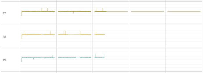


The graphs above shows that those sensors have missing readings with unknown reasons.
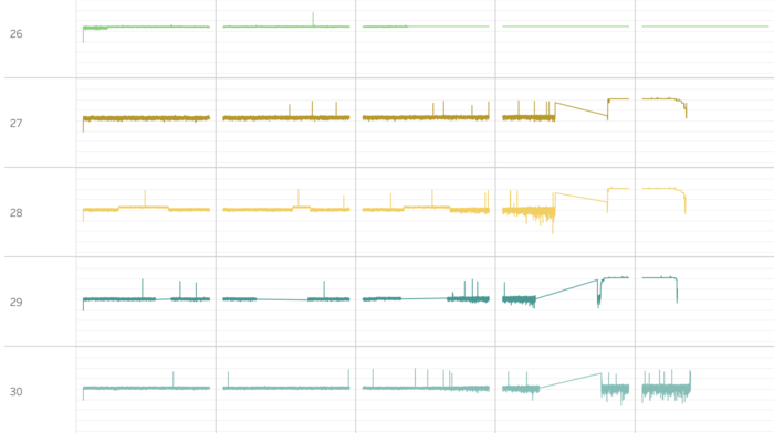
Sensor 27, 28 and 29 have similar consistent readings, but end with missing readings as well.

Sensor 18 has one of the most irregular readings with many pauses of readings across the week.
Sensors mentioned above should be treated with caution.
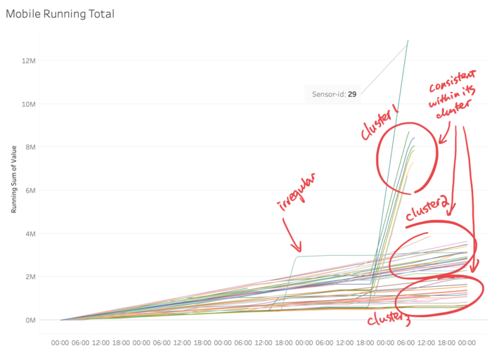
From the running total graph above, we can see some patterns across the sensors with 3 clusters and a few outliers.
2b. Which regions of the city have greater uncertainty of radiation measurement? Use visual analytics to explain your rationale.
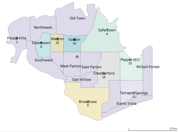
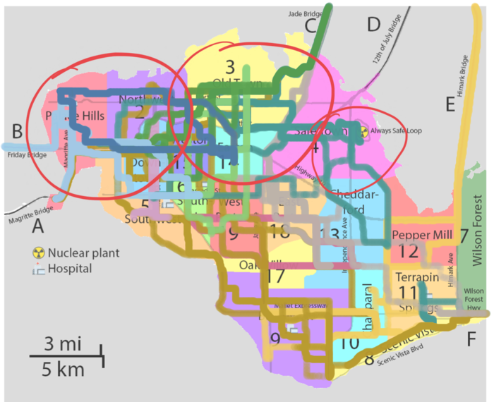
To see the regions with high uncertainty, filter the sensors on the map to only show those with high uncertainty patterns.
Referring to the map graph above, the areas that may have greater uncertainty will be around the North East of Safe Town, near the power plant, North region such as Old Town as well as West region such as Northwest and Palace Hills.
2c. What effects do you see in the sensor readings after the earthquake and other major events? What effect do these events have on uncertainty?
As mentioned in Question 1, for static sensors, most of the readings remained calm until frequent spikes started to appear from sensor 12, 13, 14 and 15. This happened on Wednesday afternoon, hinting that a quake might have happened during that time.
For the mobile sensors, various sensors such as those found in the graph above, have irregular readings and missing values all happened at the same time. This raise up the doubt regarding the reliability of the mobile sensors.
Question 3
Given the uncertainty you observed in question 2, are the radiation measurements reliable enough to locate areas of concern?
Question 4
Summarize the state of radiation measurements at the end of the available period. Use your novel visualizations and analysis approaches to suggest a course of action for the city. Use visual analytics to compare the static sensor network to the mobile sensor network. What are the strengths and weaknesses of each approach? How do they support each other?
Question 5
The data for this challenge can be analyzed either as a static collection or as a dynamic stream of data, as it would occur in a real emergency. Describe how you analyzed the data - as a static collection or a stream. How do you think this choice affected your analysis? Limit your response to 200 words and 3 images.


