IS428 AY2019-20T1 Assign He Yicheng: Visualisation
Interactive Dashboard
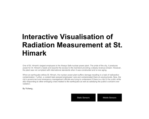
A simple and clean Home page explains the purpose of the dashboard. It brings users to Static Sensors or Mobile Sensors by clicking the respective button.
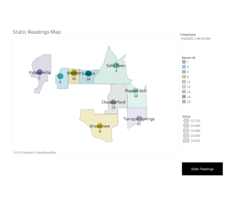
The Static Readings Map vividly showcase the distribution of all the static sensors in the town. With the slider filter, user can easily see the relative radiation size of each sensor given the exact time.
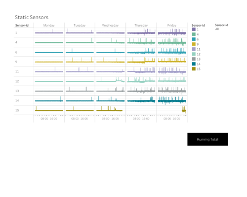
An detailed plot of the readings of all sensors is shown in this graph. It enables users to spot irregularities easily. It is useful when a user tries to identify inconsistency among the sensors and spot faulty sensors.
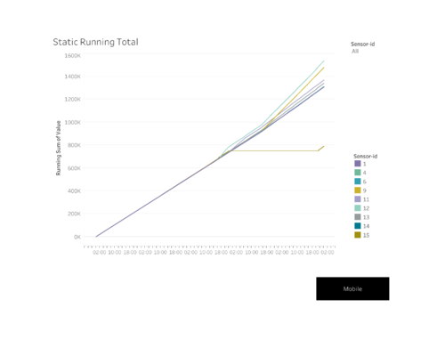
A running total graph, as known as CUSUM graph enables the user to spot inconsistency among the sensors.
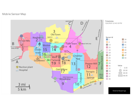
Similar to the map for static sensors, the Mobile Sensor Map showcased all 50 sensors across the town with varying sizes according to the exact time, which can be adjusted with the slider filter. When used without a filter, this also displays the trace of each car. This greatly helps us to identify possible contaminated cars.
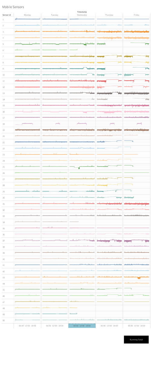
An detailed plot of the readings of all 50 sensors is shown in this graph. It helps spot irregularities, identify inconsistency and spot faulty sensors.
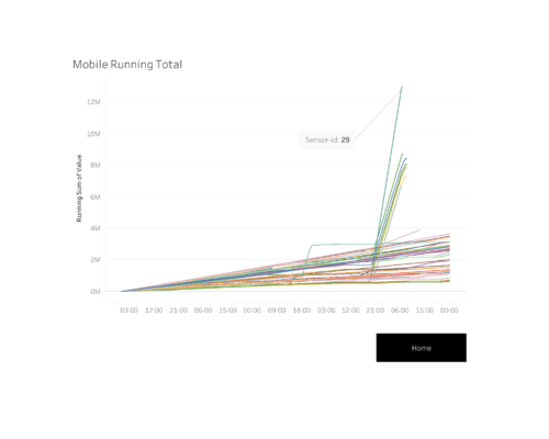
Similar to the CUSUM graph for static sensors, a Running Total Graph enables the user to spot inconsistency among the sensors. This comes in handy when a user tries to spot contaminated cars with irregular readings.
