Difference between revisions of "IS428 AY2019-20T1 Assign He Yicheng: Observations"
| Line 33: | Line 33: | ||
Visualize radiation measurements over time from both static and mobile sensors to identify areas where radiation over background is detected. Characterize changes over time. | Visualize radiation measurements over time from both static and mobile sensors to identify areas where radiation over background is detected. Characterize changes over time. | ||
| + | [[File:yc mc q1 00.png|800px]]<br> | ||
| + | [[File:yc mc q1 01.png|800px]]<br> | ||
| − | + | Before Wednesday afternoon, the static sensors’ readings remained calm with some random spikes from time to time. There were signs of more frequent reading spikes from sensors 12, 13, 14 and 15. Sensor 12, near the Power Plant shows ever increasing readings from 18:00 onwards. This is followed by increased readings at sensor 11 (Broadview Community Hospital) and Sensor 9 (Broadview). Sensor 15 (Weston) stopped working after 22:06 on Wednesday. | |
| + | [[File:yc mc 00.png|800px]]<br> | ||
| + | |||
| + | The graph above shows the mobile sensor readings on Thursday at 7:59. From the graph, we can see big bubbles such as Sensor 39, 42, 33 and 35 which surround the Power Plant. Surprisingly, Sensor 1, which is far away from the plant, is having a reading as high as those sensors that are closer to the plant. | ||
</div> | </div> | ||
Revision as of 01:03, 13 October 2019
Question 1
Visualize radiation measurements over time from both static and mobile sensors to identify areas where radiation over background is detected. Characterize changes over time.
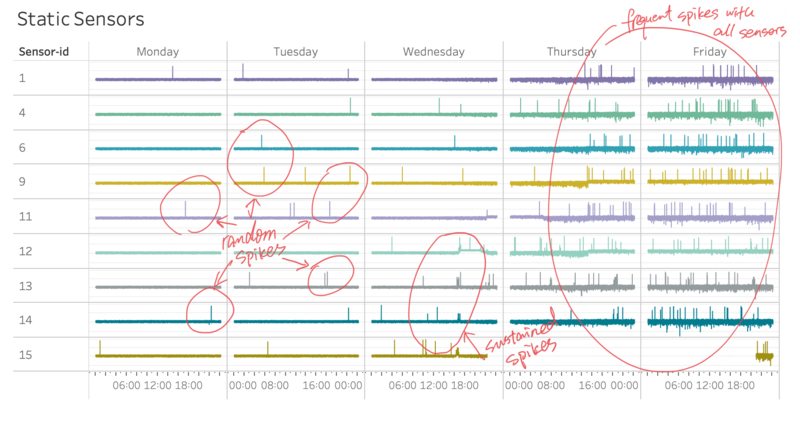
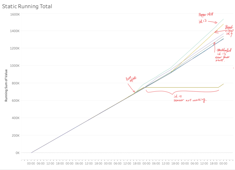
Before Wednesday afternoon, the static sensors’ readings remained calm with some random spikes from time to time. There were signs of more frequent reading spikes from sensors 12, 13, 14 and 15. Sensor 12, near the Power Plant shows ever increasing readings from 18:00 onwards. This is followed by increased readings at sensor 11 (Broadview Community Hospital) and Sensor 9 (Broadview). Sensor 15 (Weston) stopped working after 22:06 on Wednesday.
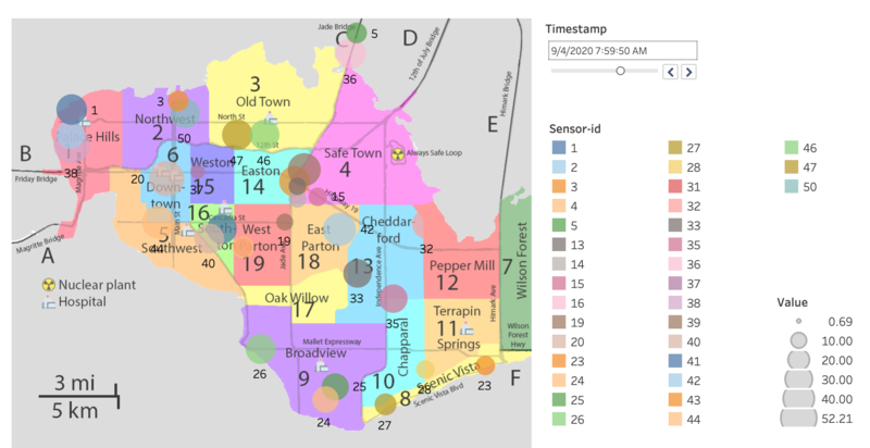
The graph above shows the mobile sensor readings on Thursday at 7:59. From the graph, we can see big bubbles such as Sensor 39, 42, 33 and 35 which surround the Power Plant. Surprisingly, Sensor 1, which is far away from the plant, is having a reading as high as those sensors that are closer to the plant.
Question 2
Use visual analytics to represent and analyze uncertainty in the measurement of radiation across the city.
Question 3
Given the uncertainty you observed in question 2, are the radiation measurements reliable enough to locate areas of concern?
Question 4
Summarize the state of radiation measurements at the end of the available period. Use your novel visualizations and analysis approaches to suggest a course of action for the city. Use visual analytics to compare the static sensor network to the mobile sensor network. What are the strengths and weaknesses of each approach? How do they support each other?
Question 5
The data for this challenge can be analyzed either as a static collection or as a dynamic stream of data, as it would occur in a real emergency. Describe how you analyzed the data - as a static collection or a stream. How do you think this choice affected your analysis? Limit your response to 200 words and 3 images.


