Difference between revisions of "IS428 AY2019-20T1 Assign Tan Sok Yi Dashboard"
| Line 24: | Line 24: | ||
; | ; | ||
[[IS428_AY2019-20T1_Assign_Tan_Sok_Yi_Conclusion| <font color="#FFFFFF">Conclusion</font>]] | [[IS428_AY2019-20T1_Assign_Tan_Sok_Yi_Conclusion| <font color="#FFFFFF">Conclusion</font>]] | ||
| + | | | ||
| + | |} | ||
| + | <br> | ||
| + | == Dashboards == | ||
| + | For this assignment, 3 dashboards (a home page, real-time damage report and an overview of the damage report) have been created. Each serves a different purpose which will be explained in the following sections. | ||
| + | === Homepage === | ||
| + | As there are more than 1 dashboard, the home page provides users the flexibility to switch between different dashboards. A brief introduction has been given to provide more information for the users before they navigate to other dashboards. | ||
| + | [[File: Home.PNG|800px|center]] | ||
| + | |||
| + | <center> | ||
| + | {| class="wikitable" | ||
| + | |- | ||
| + | ! Interactive Visualisation || Rationales | ||
| + | |- | ||
| + | | Buttons to navigate to different dashboards <br/><br/> [[File: Buttons.png|600px|center]] || Give users convenience and flexibility to navigate to different dashboards. | ||
| + | |- | ||
| + | |} | ||
| + | </center> | ||
| + | |||
| + | === Real-Time Damage Report === | ||
| + | This dashboard shows the average damage value collated from the responses collected from the neighbourhood messaging app for different damage area. Using this dashboard, emergency responders would be able to see the degree of damage in different areas at one glance and make the necessary decisions. | ||
| + | |||
| + | The below explain the different charts included and the different interactive techniques used in the dashboard | ||
| + | [[File: Page1.png|800px|center]] | ||
| + | |||
| + | <center> | ||
| + | {| class="wikitable" | ||
| + | |- | ||
| + | ! Interactive Visualisation || Rationales | ||
| + | |- | ||
| + | | Time Animation <br/><br/> [[File: time.png|200px|center]] || Allow user the flexibility to choose the timestamp they want to view. Also, the time can be automatically played to show the changes in the damage value at the different timestamp. | ||
| + | |- | ||
| + | | Highlighting of hovered location in the neighbourhood map <br/><br/> [[File: page1_hover.png|600px|center]] || Make it easier for users to see the degree of damage in different areas and the shake intensity based on the location they want to see | ||
| + | |- | ||
| + | | Filtering the line chart based on the location selected on the neighbourhood map <br/><br/> [[File: page1_select.png|600px|center]] || Allow user to see the specific changes in the total number of responses received for a specific location | ||
| + | |- | ||
| + | |} | ||
| + | </center> | ||
Revision as of 00:00, 11 October 2019
|
|
|
|
|
|
Dashboards
For this assignment, 3 dashboards (a home page, real-time damage report and an overview of the damage report) have been created. Each serves a different purpose which will be explained in the following sections.
Homepage
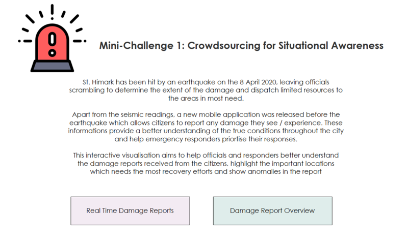
As there are more than 1 dashboard, the home page provides users the flexibility to switch between different dashboards. A brief introduction has been given to provide more information for the users before they navigate to other dashboards.
| Interactive Visualisation | Rationales |
|---|---|
| Buttons to navigate to different dashboards |
Give users convenience and flexibility to navigate to different dashboards. |
Real-Time Damage Report
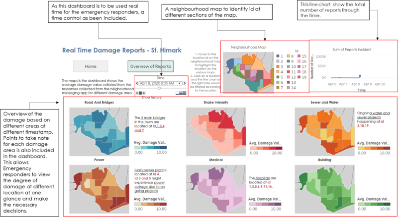
This dashboard shows the average damage value collated from the responses collected from the neighbourhood messaging app for different damage area. Using this dashboard, emergency responders would be able to see the degree of damage in different areas at one glance and make the necessary decisions.
The below explain the different charts included and the different interactive techniques used in the dashboard
| Interactive Visualisation | Rationales |
|---|---|
| Time Animation |
Allow user the flexibility to choose the timestamp they want to view. Also, the time can be automatically played to show the changes in the damage value at the different timestamp. |
| Highlighting of hovered location in the neighbourhood map |
Make it easier for users to see the degree of damage in different areas and the shake intensity based on the location they want to see |
| Filtering the line chart based on the location selected on the neighbourhood map |
Allow user to see the specific changes in the total number of responses received for a specific location |


