Difference between revisions of "Tasks and Comments"
| Line 4: | Line 4: | ||
| style="font-family:Century Gothic; font-size:100%; solid #000000; background:#2B3856; text-align:center;" width="25%" | | | style="font-family:Century Gothic; font-size:100%; solid #000000; background:#2B3856; text-align:center;" width="25%" | | ||
; | ; | ||
| − | [[ | + | [[IS428_AY2019-20T1_Assign_Li_Xiaohang| <font color="#FFFFFF">Challenge Overview</font>]] |
| style="font-family:Century Gothic; font-size:100%; solid #1B338F; background:#2B3856; text-align:center;" width="25%" | | | style="font-family:Century Gothic; font-size:100%; solid #1B338F; background:#2B3856; text-align:center;" width="25%" | | ||
Revision as of 21:30, 13 October 2019
Mini-Challenge 1: Crowdsourcing for Situational Awareness
|
|
|
|
|
Contents
Tasks
Task 1
Emergency responders will base their initial response on the earthquake shake map. Use visual analytics to determine how their response should change based on damage reports from citizens on the ground. How would you prioritize neighborhoods for response? Which parts of the city are hardest hit? Limit your response to 1000 words and 10 images.
| Visualization #1 | Earthquake Shake Map with Location |
|---|---|
| Visualization | |
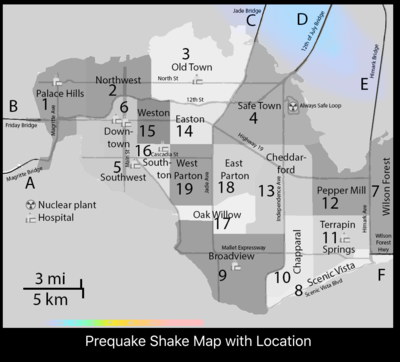
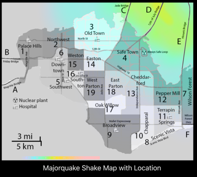
| Insight | Based on the pre-quake shake map and major quake shake map, the emergency responders will start with location 3 and location 4, as they are the first two areas affected by the earthquake. Area 2, 14, 18, 13, 12, 11 and 7 are affected during major quake subsequently. The level of damage is not clear and needs to be investigated with the damage reports from citizens. Additionally, there are three bridges fall into the area of the earthquake: the Jade Bridge, the 12th of July Bridge, the Himark Bridge. |
| Visualization #2 | Comparison of the Neighborhood Report with Shake Maps |
|---|---|
| Visualization |
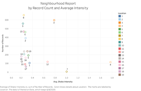
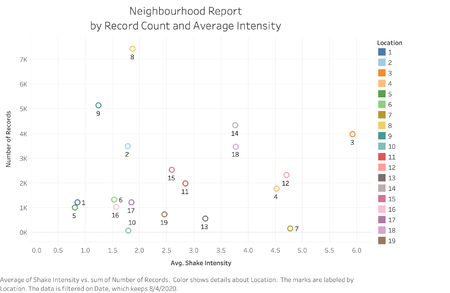
As the pre-quake shake map and the major quake shake map are generated on 6th and 8th April, a comparison should be done between the shake maps and the neighborhood report on the same two days. To get a general overview, the number of records for each location is plotted against the average shake intensity reported. |
| Insight |
From the first visualization, it is shown that on 6th April, the average shake intensity reported is very high for location 4, and relatively high for location 3, 7 and 12. This aligns with the pre-shake map. |
| Visualization #3 | General Overview of the Neighbourhood Report |
|---|---|
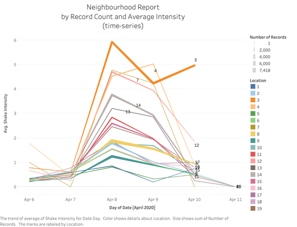
| Visualization | |
| Insight | From the time series visualization, it is observed that location 3 -- the old town, was hit the hardest. Safe town(location 4), Wilson Forest(location 7) and Pepper Mill(location 12) should be investigated for resource allocation priority. |
| Visualization #4 | Detailed Damage Investigation for Target Locations |
|---|---|
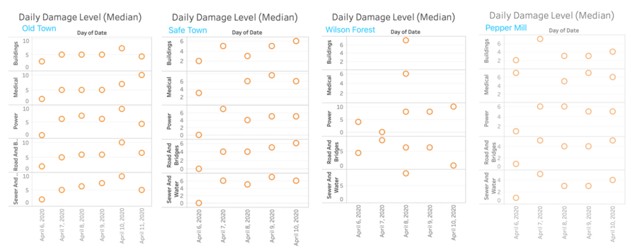
| Visualization | |
| Insight | By Comparing the four locations, it is observed that the Old Town is hit the hardest for all facilities. For Safe Town, there is constant high rating damage report throughout the whole period for all facilities; |
With the above investigation, it is concluded that the highway condition at Wilson Forest needs to be examined first, as possible damage will delay the resources and rescue team to enter St.Himark. This is the first priority.
The old town needs immediate action taken as there are a large community of people being affected by the earthquake, the reported damage rating is also the highest among all locations;
Immediate but fewer resources should be allocated to the safe town and Pepper Mill, as the situation is less severer.
However, as the Always Safe nuclear facility is located at the safe town, specialists should be sent there immediately to examine possible nuclear leakage -- This could cause potentially more damage.
The Wilson Forest lacks data points as there are fewer citizens living in that area. Power and Road need to be fixed, but with lower priority.
Task 2
Use visual analytics to show uncertainty in the data. Compare the reliability of neighborhood reports. Which neighborhoods are providing reliable reports? Provide a rationale for your response. Limit your response to 1000 words and 10 images.
| Visualization #1 | General Overview of Uncertainty |
|---|---|
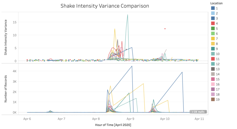
| Visualization | |
| Insight | By computing the variance for shake intensity reported by each location, it is observed that the variance can be as high as 18.00. This shows the uncertainty present in the data, as in every minute, the data reported by citizens can vary by a large scale. It is also observed that with a higher volume of reports, the variance increases. |
| Visualization #2 | Neighbourhoods with Reliable Reports |
|---|---|
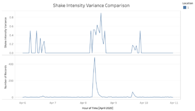
| Visualization | |
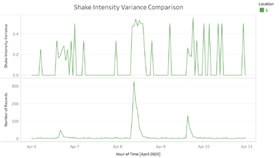
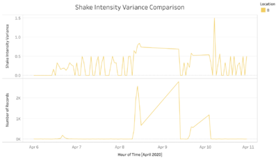
| Insight | After looking into the variance line chart for all locations, three locations are found with considerable amount of data, and relatively low variance. The locations are Palace Hills (Location 1), Southwest (Location 5) and Scenic Vista (Location 8). |
Task 3
How do conditions change over time? How does uncertainty in change over time? Describe the key changes you see. Limit your response to 500 words and 8 images.
| Visualization #1 | Condition Change Over Time |
|---|---|
| Visualization | |
| Insight | From the visualization, it is observed that there is a small pre-quake on 6th April, which hit the safe town the hardest. There is a stronger shock the next day. On 8th April, the major shock happens and all locations can feel the earthquake.
The conditions get better for the next three days, with an abnormal rise for the old town on 10th April. This indicates a possible aftershock for the old town on 10th April. |
| Visualization #2 | Uncertainty Change Over Time |
|---|---|
| Visualization | |
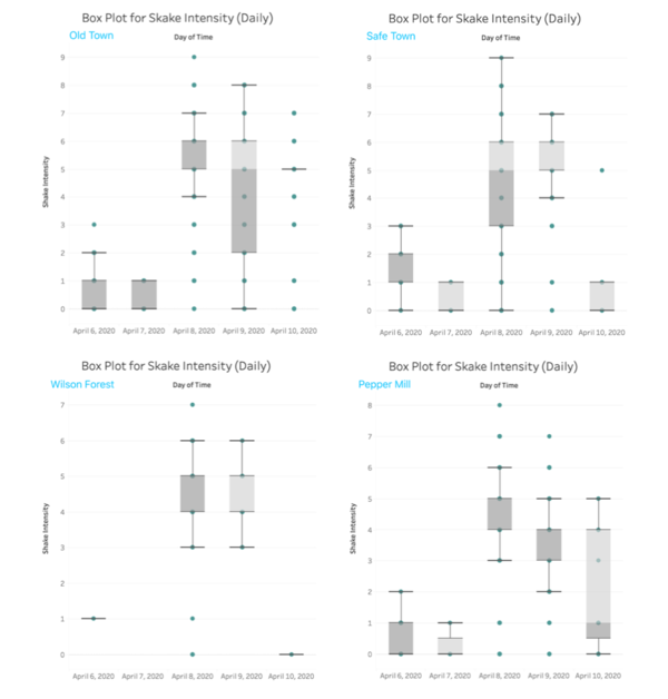
| Insight | The distribution for reported shake intensity for major affected locations are compared. From the visualization, it is observed that the uncertainty is the highest during and after the major shock, with a large distribution for reported shake intensity. |
Comments
Please leave some comments for possible improvements!
