Interactive Visualization and Reference
Mini-Challenge 1: Crowdsourcing for Situational Awareness
|
|
|
|
|
Interactive Visualization
The interactive visualization can be accessed at:
https://public.tableau.com/profile/li.xiaohang#!/vizhome/IS428Assignment-LiXiaohang/Dashboard0?publish=yes
| Page 1 | Home Page |
|---|---|
| Dashboard Content | |
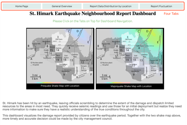
| Rationale | The home page explains the reason for this dashboard, together with the shake maps provided. Analysis should be done by combining both the shake maps and the neighborhood report data. |
| Page 2 | General Overview |
|---|---|
| Dashboard Content | |
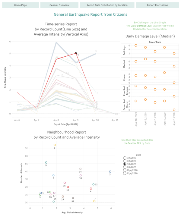
| Rationale | The general overview page summarises the report information provided by the citizens. The Shake Intensity is chosen as a representative measure for the level of the severeness of the earthquake at different locations. By clicking on the time-series line graph, the scatter plotted is updated for the selected location. The scatter plot displays the daily damage level reported for different indicators. This allows the city management team to gauge how facilities at different locations are affected by the earthquake. The median value for each day is chosen as it represents the average value without being affected by extreme values. |
| Page 3 | Report Data Distribution by Location |
|---|---|
| Dashboard Content | |
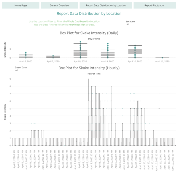
| Rationale | To understand the distribution of the neighbourhood report, two scatter plots are provided for daily and hourly time-series. These two plots show how the reported data varies across a day or the whole earthquake period. |
| Page 4 | Report Fluctuation |
|---|---|
| Dashboard Content | |
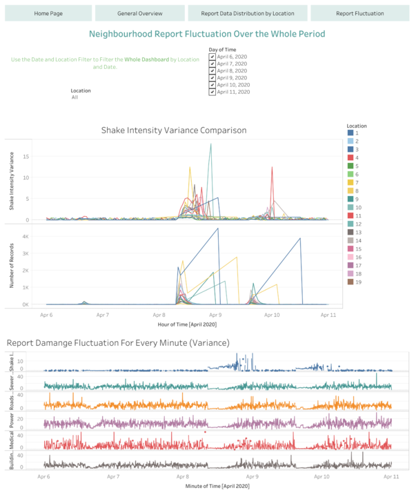
| Rationale | Variance is a good indicator to measure uncertainty. Low variance might be due to lack of data points, hence a line graph for record count is needed as well. A multi-line graph is plotted, with a filter provided to investigate specific locations. Another line graph is plotted to show the variance fluctuation for other damage measures for different locations. |
Visualisation Software
Polarr Photo Editor
Tableau Desktop
Pages - docucment editor
References
- VAST Challenge 2019 - Mini-Challenge 1: https://vast-challenge.github.io/2019/MC1.html
- Tableau Community Forum: https://community.tableau.com/community/forums
- Use Tableau to Show Variance and Uncertainty: https://www.rittmanmead.com/blog/2017/06/using-tableau-to-show-variance-and-uncertainty/
- Various Views of Variability: http://www.storytellingwithdata.com/blog/2019/2/21/various-views-of-variability


