Task Force 428: Proposal
Problem
Terrorism has been a salient topic since the 9/11 terrorist attack on New York City’s World Trade Center. This terrorist act has altered the security landscape and prompted governments to increase their efforts in tackling the threat of global terrorism. Acts of terrorism have since become more frequent, with the formation of certain terrorist groups such as the Islamic State of Iraq and Syria (ISIS) and Al-Qaeda. Even with heavy investments in efforts to eradicate the threat, terrorism remains prevalent, with an ever-increasing threat to our lives. As such, we turn to analyse past data on terrorism to draw insights and potentially identify patterns behind terrorist acts, so that governments can be better able to combat terrorism.
Motivation
As data visualisation students, we are interested in finding out how we can make use of big data to provide meaningful and insightful visualisations, with regards to the topic of terrorism. The dataset has many different variables, with 135 columns of data when we first encountered the dataset. The challenge came from trying to make sense of all the data, to gain valuable insights that could help us better understand trends and patterns, amidst the numerous variables present in the dataset. We aim to create a convenient and interactive platform to help users better understand the impacts of the various types of terrorism, and their corresponding severity in the various regions around the world.
Main objectives that we hope to achieve through this project:
- Gain overall insight on the frequency and spread of global terrorism acts between 2002 to 2017.
- Identify any patterns and trends of global terrorism acts among regions.
- Identify any possible linkages, implications or impacts from terrorist acts.
- Understand how global terrorism is affected by various factors.
The datasets used for this project:
- The Global Terrorism dataset contains terrorist acts from all over the world across a span of 47 years from 1970 to 2017. It contains 135 columns and 181,691 rows. Each row represents a terrorist act and each column describes the characteristics/features of a terrorist act.
- GNI_per_capital dataset contains the countries' development status from 1987 to 2018, based on Gross National Income. The dataset contains 14 columns and 218 rows, each row represents a country's development status and each column represents a year.
In our analysis, we will only be including terrorism data from the year 2002 to 2017. The purpose of choosing the selected data are as follows:
- With rapid transformation due to globalisation and technology advancement, using data that is too old (before the year 2000) is not a good representation in today's context. Hence, we have decided to use data from 2002 onwards and scraped away data from 1970 to 2001.
- We want to explore if GNI has a role to play in influencing the rate of terrorist attacks.
| Dataset | Data Features | Purpose |
|---|---|---|
| Terrorism (https://www.start.umd.edu/gtd/) |
|
Main source of data that can bring us the information about terrorist attacks that happened around the world |
| World Bank’s GNI per capita (https://datahelpdesk.worldbank.org/knowledgebase/articles/378834-how-does-the-world-bank-classify-countries) | Countries and their development status in each year based on GNI per capita (eg: high income, high medium, lower medium, low income) | Provides information of the development status in terms of GNI per capita across different years. This allows us to compare if the development status of the countries plays a part in the terrorist attacks |
| Related Work | Description |
|---|---|
|
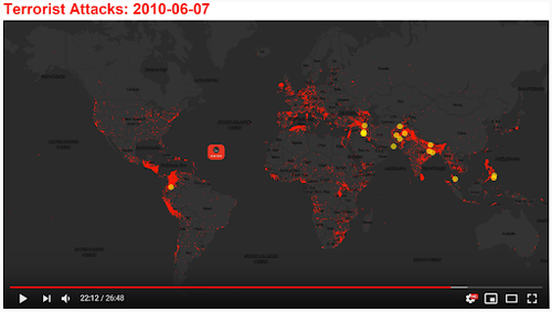
Time Lapse of Global Terrorist Attacks: 47 years of Terrorism |
This visualization shows the time lapse for terroist attacks over 47 years. A very appealing dynamic visualization that can make readers understand the rate, spread, pattern of terrorist attacks in different countries. A very good chart to use for an overview of global terrorism acts. However, in terms of specifics, this chart might not be very useful for providing low-level visuals. |
|
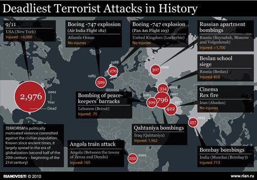
Deadliest Terrorist Attacks in history http://iblagh.com/en/10-deadliest-terror-attacks-history/981dd-160535339/ |
This visualization shows the location of the 10 deadliest terror attacks. In addition, the number of deaths/injuries are shown too. This visualization is informative and straight to the point as the objective is clear and it directs the user to the locations using labels and tooltips. One downside to it is that it only shows the top 10 attacks. Hence, it disregards other information on other terrorist acts. |
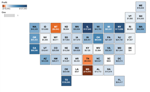
| Grid map of region's profits
https://www.tableau.com/about/blog/2015/11/how-make-tiled-maps-tableau-45742 |
The grid map is a very simple, clear and minimalistic map visualization, unlike actual map visualization which can be messy and overwhelming. Our group are evaluating the possibility of using grid maps to show the number of deaths, the number of terrorist acts, terrorist groups activeness in which country etc. One downside to this grid map is that the grid layouts is not accurate to the actual world map which makes is less realistic. |
The following show the proposed storyboard that we designed during our brainstorming sessions:
| Sketches | Description |
|---|---|
|
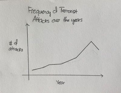
Frequency of Terrorist Attacks across the years |
We intend to use a line chart to show the frequency of terrorist attacks over the years. This can be further categorized by the types of terrorist attacks or regions. The intent of this chart is to provide an overview or a general idea of the pattern/trend and frequency of terrorist acts over time. |
|
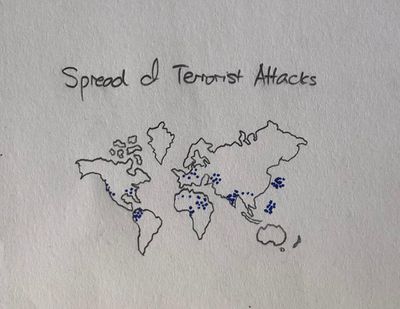
Spread of Terrorist Attacks |
We intend to plot a map visualization chart to show where the terrorist acts have taken place over the years. This can also be further categorized by the types of terrorist attacks, continents and regions. The intent of this chart is to provide an overview or a general idea of when and where did all these terrorist acts took place. |
|
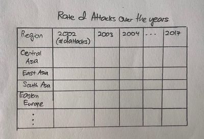
Rate of Terrorist Attacks
|
We intend to plot a table chart to show the rate of terrorist attacks over the years. The intent of this chart is to show a more detailed representation of the rate of terrorist attacks. In addition, we intend to sort the table rows by countries or grouping by regions in decreasing order based on the rate of terrorist attacks. To further make the chart intuitive, we intend to use colour codes based on he frequency of terrorist attacks. Red to Green. Red being high number of terrorist attack occurrence and green representing a low number of occurrences. |
|
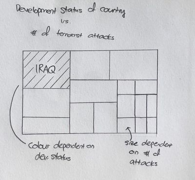
Country's Development Status vs Number of Terrorist Attacks |
We intend to plot a heatmap to show the number of terrorist attacks of different countries based on their developmental status. The purpose of this is to evaluate if a country's development status has some correlation to the frequency of terrorist attacks occurring in that country. The Size of a cell represents the number of terrorist attacks and the colour of each cell represents the developmental status of that country. |
|
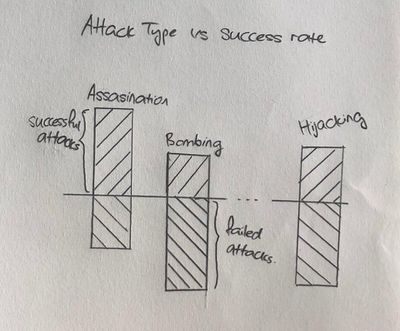
Attack Types against Success Rate |
We intend to plot a bar graph to represent the frequency of the types of terrorist attacks that have occurred over the years. In addition, we will be factoring in the success or failure of a particular terrorist attack. The bars facing upwards will represent success terrorist attacks and the bars facing downwards will represent unsuccessful terrorist acts, also meaning that the terrorist acts have been prevented. This is to show a rough idea of how the current police/task's capabilities in preventing terrorist acts. |
| Key Technical Challenges | Solution |
|---|---|
|
Data Preparation (Cleaning and Transforming) |
Work together as a team to think of the logical way to produce the right data output after doing data cleaning and data transforming through the use of R tools such as tidyr and plyr |
|
Unfamiliarity in Programming using R especially on R-Shiny |
|
|
Unfamiliarity of using the Visualisation Tools |
Work together as a team to help one another along as we face issues while using the visualisation tools. Moreover, we will self-learn the tools ourselves by researching on them. |
|
Unfamiliarity in implementing Interaction and Animated activities in the Visualisation |
Do a sketch prototype of our storyboard or the user interaction’s process of how to use the visualisation. We can also assign one of our team members who are good at UI/UX to assist and teach us the skills he has adopted. |
| Name | Comment |
|---|---|
| Name | Comment |
| Name | Comment |
