IS428 AY2019-20T1 Assign Jessica Yuen Chui Shan
To be a Visual Detective - VAST Challenge 2019: Mini-Challenge 2
Contents
Overview Assignment Details
One of St. Himark’s largest employers is the Always Safe nuclear power plant. The pride of the city, it produces power for St. Himark’s needs and exports the excess to the mainland providing a steady revenue stream. However, the plant was not compliant with international standards when it was constructed and is now aging. As part of its outreach to the broader community, Always Safe agreed to provide funding for a set of carefully calibrated professional radiation monitors at fixed locations throughout the city. Additionally, a group of citizen scientists led by the members of the Himark Science Society started an education initiative to build and deploy lower cost homemade sensors, which people can attach to their cars. The sensors upload data to the web by connecting through the user’s cell phone. The goal of the project was to engage the community and demonstrate that the nuclear plant’s operations were not significantly changing the region’s natural background levels of radiation. When an earthquake strikes St. Himark, the nuclear power plant suffers damage resulting in a leak of radioactive contamination. Further, a coolant leak sprayed employees’ cars and contaminated them at varying levels. Now, the city’s government and emergency management officials are trying to understand if there is a risk to the public while also responding to other emerging crises related to the earthquake as well as satisfying the public’s concern over radiation. Note: reviewing the city description document may be helpful to understanding the landscape and character of the city.
Problem, Motivation, Objectives
Dataset Import Structure & Process
Tasks Instruction & Interactive Visualization
Your task, as supported by visual analytics that you apply, is to help St. Himark’s emergency management team combine data from the government-operated stationary monitors with data from citizen-operated mobile sensors to help them better understand conditions in the city and identify likely locations that will require further monitoring, cleanup, or even evacuation. Will data from citizen scientists clarify the situation or make it more uncertain? Use visual analytics to develop responses to the questions below. Novel visualizations of uncertainty are especially interesting for this mini-challenge.
Task 1: Visualize radiation measurements over time from both static and mobile sensors to identify areas where radiation over background is detected. Characterize changes over time.
Limit your response to 6 images and 500 words.
Task 2: Use visual analytics to represent and analyze uncertainty in the measurement of radiation across the city.
a. Compare uncertainty of the static sensors to the mobile sensors. What anomalies can you see? Are there sensors that are too uncertain to trust?
b. Which regions of the city have greater uncertainty of radiation measurement? Use visual analytics to explain your rationale.
c. What effects do you see in the sensor readings after the earthquake and other major events? What effect do these events have on uncertainty?
Limit your responses to 12 images and 1000 words.
Task 3: Given the uncertainty you observed in question 2, are the radiation measurements reliable enough to locate areas of concern?
a. Highlight potential locations of contamination, including the locations of contaminated cars. Should St. Himark officials be worried about contaminated cars moving around the city?
b. Estimate how many cars may have been contaminated when coolant leaked from the Always Safe plant. Use visual analysis of radiation measurements to determine if any have left the area.
c. Indicated where you would deploy more sensors to improve radiation monitoring in the city. Would you recommend more static sensors or more mobile sensors or both? Use your visualization of radiation measurement uncertainty to justify your recommendation.
Limit your responses to 12 images and 1000 words
Task 4: Summarize the state of radiation measurements at the end of the available period. Use your novel visualizations and analysis approaches to suggest a course of action for the city. Use visual analytics to compare the static sensor network to the mobile sensor network. What are the strengths and weaknesses of each approach? How do they support each other?
Limit your response to 6 images and 800 words.
Task 5: The data for this challenge can be analyzed either as a static collection or as a dynamic stream of data, as it would occur in a real emergency. Describe how you analyzed the data - as a static collection or a stream. How do you think this choice affected your analysis? Limit your response to 200 words and 3 images.
Data Preparation
In the zipped folder, we were given 3 raw datasets namely:
1) MobileSensorReadings.csv - contains mobile sensor readings from various user IDs from 6 April 2020 0000 to 10 April 2020 2359 and its coordinates (longitude & latitude)
2) StaticSensorLocations.csv - contains sensor readings of 9 different sensor IDs with the coordinates (longitude & latitude)
3) StaticSensorReadings.csv - contains static sensor readings from various user IDs from 6 April 2020 0000 to 10 April 2020 2359 and its coordinates (longitude & latitude)
Removing Redundant Data
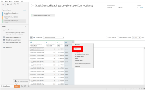
In both MobileSensorReadings.csv and StaticSensorReadings.csv, there is a column named "Units" that were not used in the data pre-processing. Hence, I decided to remove it when I was importing the csv files into Tableau. To do so,
- 1. Add StaticSensorReadings.csv into the Panel.
- 2. Right click on the column "Units" and click "Hide" for both StaticSensorReadings.csv and MobileSensorReadings.csv
Merging StaticSensorReadings.csv and StaticSensorLocations.csv
To make the data more accurate and meaningful, I decided to merge StaticSensorReadings.csv with StaticSensorLocations.csv.

I would then save the data from StaticSensorReadings and StaticSensorLocations in a new CSV file. I have named it as SensorReadings.csv
Merging SensorReadings.csv and MobileSensorReadings.csv
Similar to the StaticSensor CSV files, I decided to merge SensorREadings.csv with MobileSensorReadings.csv.
Bear in mind that we need to remove "Units" column in MobileSensorReadings.csv too
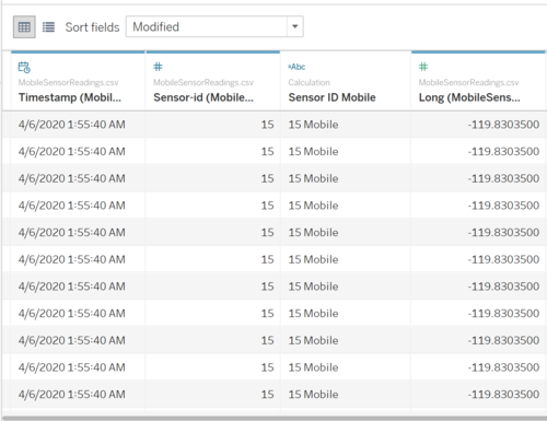
Concat "Static"/"Mobile" with Sensor ID
As both MobileSensorReadings.csv and SensorReadings.csv has Sensor ID, I decided to add a "Static" or "Mobile" behind each sensor ID so that it would be clearer for me to understand the data. Hence, I decided to do it to avoid any confusion.
Interactive Visualization
The interactive visualization could be found here:
Home Page
I decided to separate the visualizations with tabs labelled Mobile Sensor Visualizations and Static Sensor Visualizations. This helps to give a more user-friendly visualization for the user.
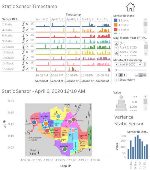
The following is a screenshot of the homepage.
Mobile Sensor Visualization
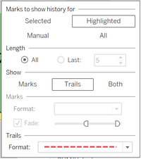
In this visualization, readers would be able to see where the mobile sensors were placed in the map, and using the animated trail, they would be able to see the path that the sensor took based on the timestamp.
Static Sensor Visualization
In this visualization, readers would be able to tell where the static sensors were placed, observe how the readings change over time and readers would be able to observe any patterns of the readings in a glance.
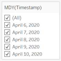
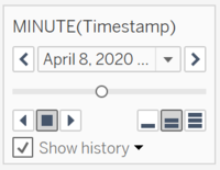
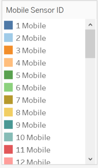
To have a better visualization of the data, I decided to customize interactive elements to help the users analyze the data better. The following elements were used:
Objectives
This section aims to answer the 5 tasks.
1)
Mobile Sensors
The frequency of mobile sensors were quite consistent for majority of the mobile sensors. However, for mobile sensor 12, there was a significant jump of value at 9 April 2020, 2:43:25 AM. This might be a sign that there was an earthquake at where mobile sensor 12 was.
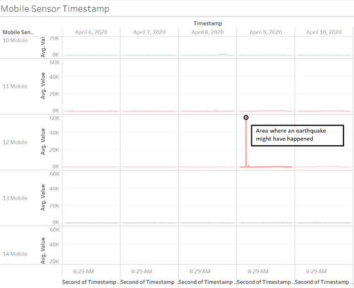
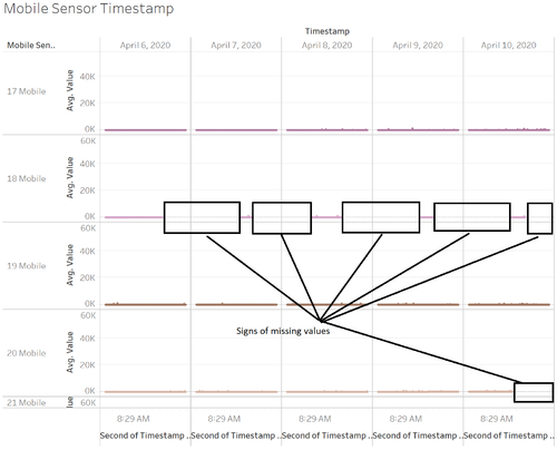
Also, there were missing values for few of the mobile sensors. Below is a screenshot of missing values for mobile sensor 18 and mobile sensor 20.
Additionally, we received data of 0 for mobile sensor 25 on 8 April 2020, 4:27:35 AM till 8 April 2020, 9:05:35 AM before it started recording values above 0.

Static Sensors
As for the static sensors, there were more fluctuation of readings for 8 April 2020 till 10 April 2020. The highest reading received was on 9 April 2020, 2:52:35 PM by static sensor 9.
![]()
The lowest reading received was on 10 April 2020, 12:11:10 PM by static sensor 14.
![]()
Similar to mobile sensors, there were missing values for static sensor 15 on 9 April 2020 till mid of 10 April 2020.
![]()
2a)
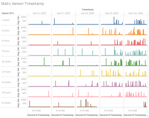
The following is a screenshot for the static sensor readings from 6 April 2020 to 10 April 2020.
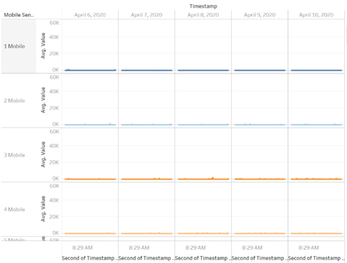
The following is a screenshot for the mobile sensor readings from 6 April 2020 to 10 April 2020.
Comparing on both screenshots, the readings for mobile sensors seemed to be quite consistent for 6 April 2020 and 7 April 2020 while static sensors had occasional spikes for some sensors on the first 2 days. However, from 8 April 2020 till 10 April 2020, there had been more consistent spikes which might indicate that an earthquake happened on 8 April 2020. I believe that there are not much uncertainty for static sensors as the data were quite consistent. However, there had been missing data for static sensor 15 for 9 April 2020 and mid of 10 April 2020, hence there are some anomaly.
On the other hand, mobile sensors had been consistent readings apart from mobile sensor 5, 6, 9, 14, 18, 19, 20, 21, 22, 23, 24, 25, 27, 28, 29, 30, 48 and 49. I believe that they had missing data was probably due that the mobile had moved out of the map, hence it was unable to record any readings.

Mobile sensor 18 data was only captured ocassionally, and on 6 April 2020, 5:00:10 PM till 7 April 2020, 12:56:00 PM, no data was being recorded. This could be further proved after running the animation during that period of time.

Additionally, there are only 9 static sensors being recorded in the whole map, so happenings around West Parton, East Parton, Oak Willow and Easton might not be captured. Some sensors also had sudden spikes hence, would be difficult to understand the problems of regions around that sensor.
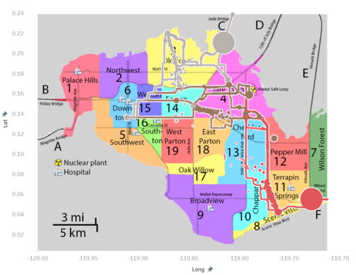
b) Based on the following screenshot, the regions of city that have greater uncertainty of radiation measurements would be Broadview, Old Town and Jade Bridge. By measuring it based on the highest population variance would mean that these areas would be more likely to have a greater fluctuation values.
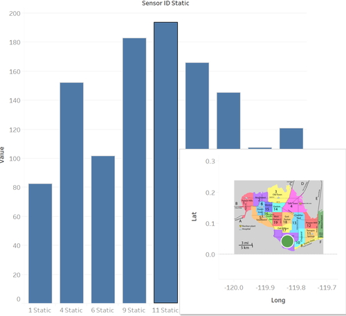
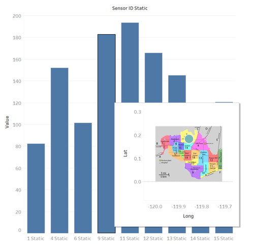
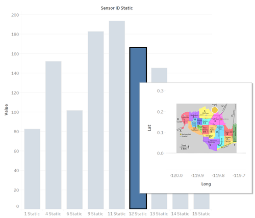
c) With reference from both screenshots, there should be an earthquake on 8 April 2020 in late afternoon approximately at around 4.35pm onwards. However, the spikes were not continuous and it started decreasing shortly after the spike had happened. This data hence, might not be credible and left the readers uncertain.
3a)
Based on the screenshot below, the biggest area of contamination location would be at Old Town that was caused by Mobile Sensor 12, and the path that was led from Jade Bridge that was caused by Mobile sensor 10. Wilson Forest is also caused by mobile sensor 29. With visualization based on contaminated cars, Downtown and Broadview are potential locations of contamination as user-ids such as HSS has drove through the potential contaminated areas caused by the mobile sensors.
St Himark officals should be worried with regards to the contaminated cars moving around the city as these cars might bring the radiation to areas that were not previously affected. It would be great if these officials take precaution before the radiation spreads to the unaffected areas of St Himark.
b)
The cars that were contaminated by the coolant leaked are:
- Ckimball, with mobile sensor 46,
- MySensor, with mobile sensor 7,
- CitizenScientist, with mobile sensors 19, 20, and 25
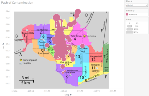
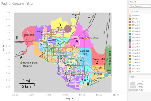
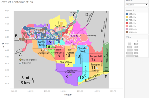
Ckimball had drove through with Mobile sensor 46 at Jade Bridge, while CitizenScientist had drove through with Mobile sensor 19, 20, 25 at Downtown and Wilson Forest respectively. Additionally, MySensor had drove through with Mobile sensor 7 at Old Town city. By viewing the path that these 3 cars had taken, it was very likely that they had brought the contamination to other parts of St Himark.
c) While Static sensors meant that they would not be shifted to any other locations, mobile sensors on the other hand, would be difficult for me to gauge as it is constantly changing its location. I would hence, advise to put 2-3 more static sensors around the map, specifically at the nuclear plant area (Safe Town). This is to ensure that cars that drove past Safe Town would be less likely to get contaminated and hence, bring the radiation to other parts of St. Himark. There could be more static sensors build near Wilson Forest as it was the 2nd highest potential area for contamination. Another alternative would be having 2 static sensors on each of the highway - so as to tackle any cars that are contaminated when they travel in/out of the map.
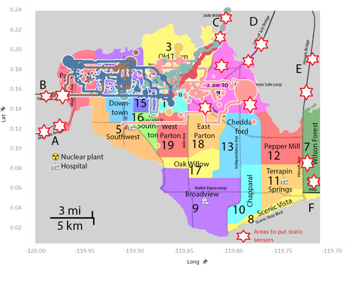
4) As seen from the graphs below, Jade Bridge and Old Town seemed to have the most severe contamination as compared to other regions. Therefore, the management should focus on decominating the 2 areas first before proceeding with other static sensor areas. Likewise, mobile sensor areas of 22, 24, 28, 27, 25, 21, 45, 29 (Terrapin Springs, Wilson Forest, Broadview) should be the priority of decomination as these areas seemed to have a higher contamination as compared to other mobile sensor areas.

5) The data that was given were static collection, however I decided to use the dynamic stream approach as the main idea of this challenge is to allow the management have a better visualization of where they should place their sensors to better monitor the situation in St. Himark. Animation could be used too, to keep track of real time movements as it allows readers to have a better user experience. Hence, this will allow the management to have a quicker response time when any problem arises.


