IS428 AY2019-20T1 Assign Fresi
Mini-Challenge 2: Citizen Science to the Rescue
Contents
- 1 Problem & Motivation
- 2 Dataset Analysis & Transformation Process
- 3 Interactive Visualization
- 4 Interesting & Anomalies Observations
- 4.1 Q1: Visualize radiation measurements over time from both static and mobile sensors to identify areas where radiation over background is detected. Characterize changes over time. Limit your response to 6 images and 500 words. Provide your answer and corresponding images here.
- 4.2 Q2 – Use visual analytics to represent and analyse uncertainty in the measurement of radiation across the city.
- 4.2.1 a. Compare uncertainty of the static sensors to the mobile sensors. What anomalies can you see? Are there sensors that are too uncertain to trust?
- 4.2.2 b. Which regions of the city have greater uncertainty of radiation measurement? Use visual analytics to explain your rationale.
- 4.2.3 c. What effects do you see in the sensor readings after the earthquake and other major events? What effect do these events have on uncertainty?
- 4.3 Q3 – Given the uncertainty, you observed in question 2, are the radiation measurements reliable enough to locate areas of concern?
- 4.3.1 a. Highlight potential locations of contamination, including the locations of contaminated cars. Should St. Himark officials be worried about contaminated cars moving around the city?
- 4.3.2 b. Estimate how many cars may have been contaminated when coolant leaked from the Always Safe plant. Use visual analysis of radiation measurements to determine if any have left the area.
- 4.3.3 c. Indicated where you would deploy more sensors to improve radiation monitoring in the city. Would you recommend more static sensors or more mobile sensors or both? Use your visualization of radiation measurement uncertainty to justify your recommendation.
- 4.4 Q4 – Summarize the state of radiation measurements at the end of the available period. Use your novel visualizations and analysis approaches to suggest a course of action for the city. Use visual analytics to compare the static sensor network to the mobile sensor network. What are the strengths and weaknesses of each approach? How do they support each other? Limit your response to 6 images and 800 words.
- 4.5 Q5 - The data for this challenge can be analysed either as a static collection or as a dynamic stream of data, as it would occur in a real emergency. Describe how you analysed the data - as a static collection or a stream. How do you think this choice affected your analysis? Limit your response to 200 words and 3 images.
- 5 References
- 6 Comments
Problem & Motivation
St. Himark is a vibrant community with a population of 246,839 people located in the Oceanus Sea. It also home to the Always Safe nuclear power plant, a 200 Megawatts electric (MWe) pressurized water reactor (PWR). The Always Safe nuclear power plant provides 72% of the city’s electricity and provides jobs for 700 highly skilled professionals. It has always been the pride of the city, yet it was not quite built to be compliant with the recommended safety standards developed by international organizations and is now ageing.
The nuclear plant sustained moderate (but not life-threatening) damage during the earthquake resulting in some contamination being released. Further, a coolant leak sprayed employees’ cars and contaminated them at varying levels. The city has installed stationary sensors which could be used to determine affected areas, but they don’t cover all parts of the city. Luckily, the Himark Science Society has stepped in with citizen scientists to help crowdsource this important task. Utilize these various sensors to understand which parts of the city are most affected. Meanwhile, mayor Jordan, city officials, and emergency services are overwhelmed and are desperate for assistance in understanding the true situation on the ground and how best to deploy the limited resources available to this relatively small community.
With the huge amount of contamination data collected from the sensors reading, there is a need to build an interactive comprehensive visualization platform to monitor which parts of the city are the most affected.
The interactive visualization will focus on:
- The monitoring of Static sensors reading, one at the entrance to the Always Safe nuclear power plant and eight dispersed around the city.
- The monitoring of 50 mobile sensors that travel in and out of the city.
- Understanding the observation and identify the anomalies from the static and mobile sensor reading.
- Identifying the area/s that are heavily affected by the contamination and dispatch necessary help for its citizens.
Dataset Analysis & Transformation Process
The data zip folder contains 1 shapefile folder, 4 maps of St Himark city, and 3 CSV files.
The 3 CSV files are:
- StaticSensorLocations.csv
- StaticSensorReadings.csv
- MobileSensorReadings.csv
Static Sensors
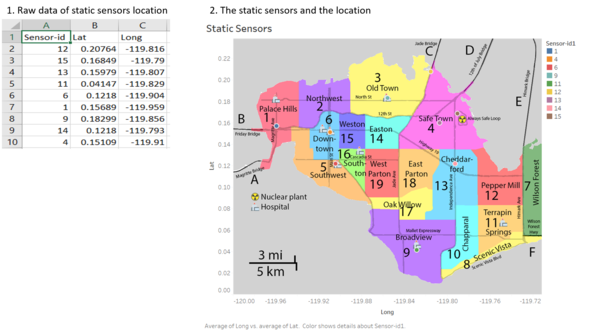
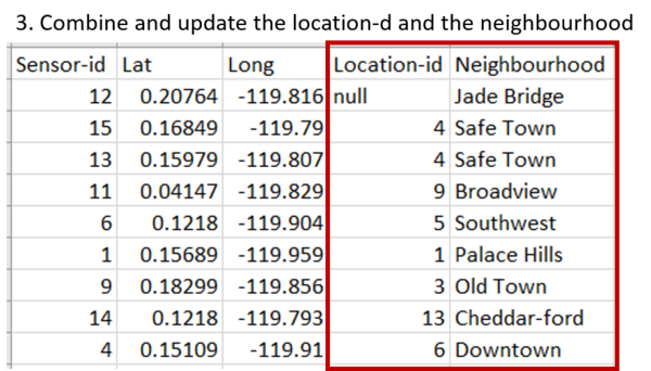
There are 9 static sensors in St. Himark based on the picture above, where one sensor (sensor-id 15) is placed at the entrance to the Always Safe nuclear power plant and eight dispersed around the city. These detectors provide near-real-time monitoring in the unlikely event of a radiological emergency.
Looking on the static sensor location data, we notice a problem.
Issue: The StaticSensorReadings lacks of location-id and the neighbourhood attributes
Solution: Using the StaticSensorLocations and Figure 1, we update the record by adding additional 2 column which are (1) location-id and (2) neighbourhood.
Mobile Sensors
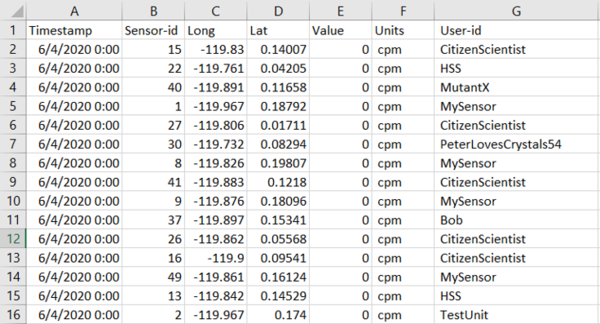
There are 50 mobile sensors attached to the vehicles. The timestamps are reported in 5-second intervals. The locations travelled by the mobile sensors are based on the longitude and latitude values.
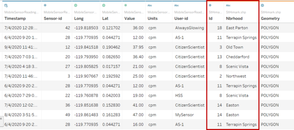
Issue: Like StaticSensorLocations.csv’s problem, the MobileSensorReadings.csv only has Longitude and Latitude attributes to match the vehicle with its location.
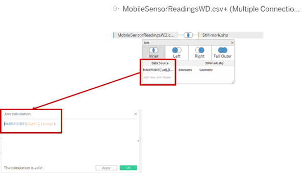
Solution: Combine the MobileSensorReading.csv to St.Himark.sph by using inner join function in Tableau.
We use inner join (Intersects) between Join calculation of MAKEPOINT([Lat], [Long]) on MobileSensorReadings.csv and Geometry on St.Himark.shp.
Once done, Tableau will produce three additional attributes, which are (1) Id – neighbourhood id number, (2) Neighbourhood, and (3) Geometry.
Combining Static and Mobile Data
Next, we need to combine the static and the mobile sensor data. The structure of the captured data by both the static sensor and mobile sensor is similar. However, the static sensor doesn’t have a longitude and latitude attributes and therefore unable to identify the exact location of the sensor. Below image shows the main differences of attributes between static and mobile data captured:
The following section illustrates the issues faced in the data analysis phase and the data transformation needed to create the desired data structure used for insight generation.
Issue: The details of Longitude and Latitude of the static sensor is presented in the StaticSensorLocation instead of StaticSensorReading. We need to combine the two data together to enable the visualization of static sensor location on the St. Himark’s map.
Solution: Combine the StaticSensorLocation file with the StaticSensorReading file by using inner joint of sensor-id in Tableau Prep.
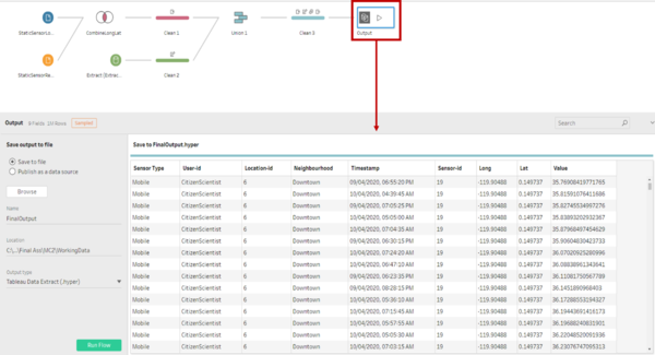
Once the data is joined, there will be a duplicate of Sensor-id1 attributes which we removed afterwards through the cleaning process. At the end in the Output 2 (picture below), we have the StaticSensorReading with the Latitude and Longitude attributes.
Before we combine Mobile and Static sensors data, we need to rename the id column and Nbrhood attribute in the mobile sensors file (name: Extract (Extract)). We rename id to Location-id and Nbrhood to Neighbourhood for easy understanding of the data.
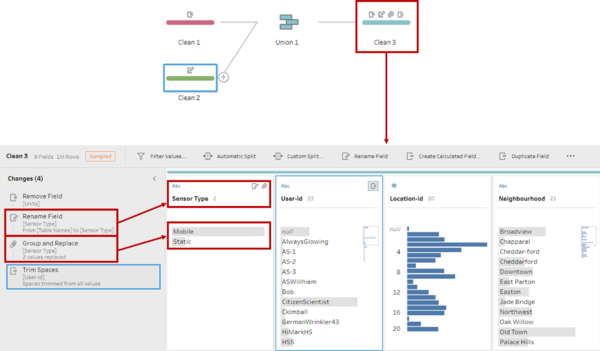
Issue: Once, the union between static and mobile sensor is formed, it will be hard to distinguish if a sensor is a static or a mobile sensor especially the number of static sensor-id is the same as mobile sensor-id.
Solution: Rename the Table Name attribute from the union table to “Sensor Type” while we change the 2 values from MobileSensorReading.csv and StaticSensorReading.csv to “Static” and “Mobile” respectively. Afterwards, we removed the Units attribute as both static and mobile has the same measurement of CPM. We also trim spaces in User-id attribute as some input has extra space.
Lastly, we will extract the finalized data that contains both static and mobile sensor reading.
Interactive Visualization
The visualization platform can be accessed here: https://public.tableau.com/profile/fresi3383#!/vizhome/Fresi_VASTChallenge_MiniProject2/HomeDashboard
Home Dashboard
The following shows the home dashboard:
For easy navigation, the following interactions are implemented:
| Interactive Technique | Reason | Brief Implementation Steps |
|---|---|---|
| ||
|
Static Sensors Reading Dashboard
The following shows the home dashboard:
For easy navigation, the following interactions are implemented:
| Interactive Technique | Reason | Brief Implementation Steps |
|---|---|---|
|
Static Sensors Distribution per Region Dashboard
The following shows the home dashboard:
For easy navigation, the following interactions are implemented:
| Interactive Technique | Reason | Brief Implementation Steps |
|---|---|---|
|
Mobile Sensors Reading Dashboard
The following shows the home dashboard:
For easy navigation, the following interactions are implemented:
| Interactive Technique | Reason | Brief Implementation Steps |
|---|---|---|
|
Mobile Sensors Distribution per Region Dashboard
The following shows the home dashboard:
For easy navigation, the following interactions are implemented:
| Interactive Technique | Reason | Brief Implementation Steps |
|---|---|---|
| ||
|
Mobile Sensors Trajectories Dashboard
The following shows the home dashboard:
For easy navigation, the following interactions are implemented:
| Interactive Technique | Reason | Brief Implementation Steps |
|---|---|---|
| ||
|
Interesting & Anomalies Observations
Using the graphs from the visualization platform to perform investigation and analysis, the following aims to provide the answer to the questions posed.
Q1: Visualize radiation measurements over time from both static and mobile sensors to identify areas where radiation over background is detected. Characterize changes over time. Limit your response to 6 images and 500 words. Provide your answer and corresponding images here.
| Sensor Type | Radiation Measures | Proof | ||||||||||||||||||||
|---|---|---|---|---|---|---|---|---|---|---|---|---|---|---|---|---|---|---|---|---|---|---|
|
| ||||||||||||||||||||||
|
| ||||||||||||||||||||||
|
| ||||||||||||||||||||||
|
| |||||||||||||||||||||
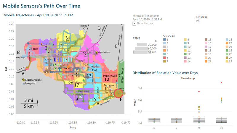
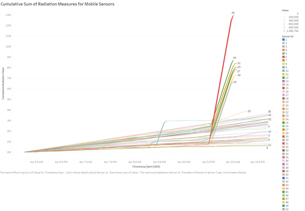
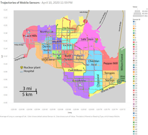
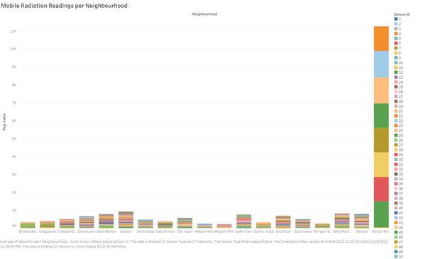
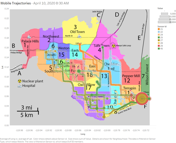
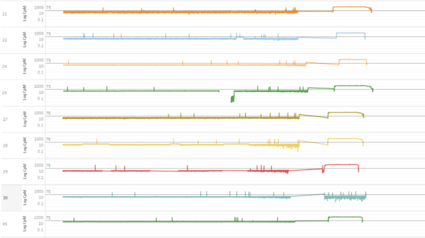
From 9 April 2020 at approximately 1900 to 10 April 2020 at 0600, mobile sensor-id 21, 22, 24, 25, 27, 28, 29, and 45 which pass through the Wilson Forest Highway recorded a substantial increase in radiation level. The increment in these sensors is aligned with the observation from Figure 1.3. |
| |||||||||||||||||||||
|
|
Q2 – Use visual analytics to represent and analyse uncertainty in the measurement of radiation across the city.
a. Compare uncertainty of the static sensors to the mobile sensors. What anomalies can you see? Are there sensors that are too uncertain to trust?
| Sensor Type | Uncertainties and Anomalies | Evidence |
|---|---|---|
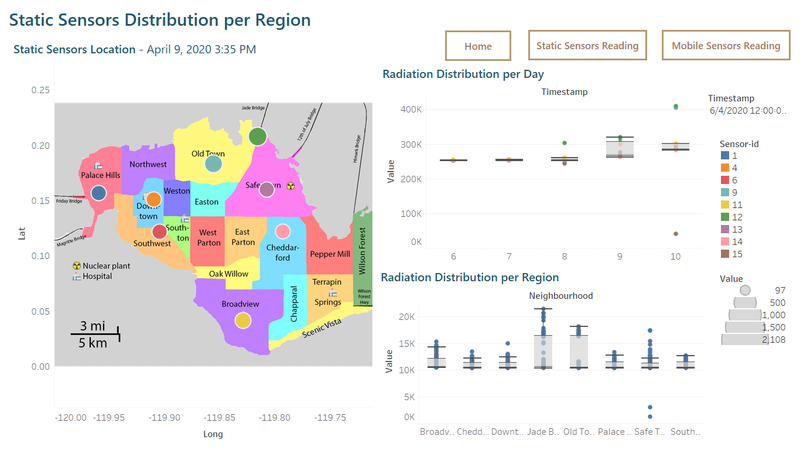
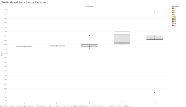
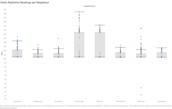
Looking at the distribution of static sensors boxplot, we see static sensor-id 12 displayed an extreme radiation on 8 April 2020. By 10 April 2020, there are 2 categories of outlier, (1) sensors-id 9 and 12 showed highest value of radiation and (2) sensor-id 15 recorded an extreme low value given the proximity of the sensor to the nuclear power plant. |
Figure 2.1 | |
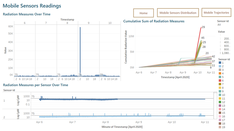
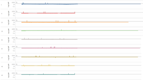
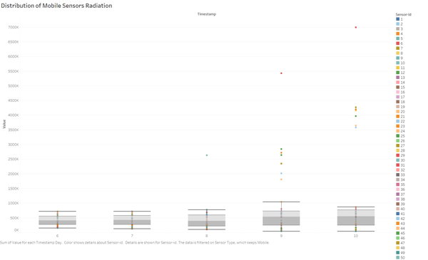
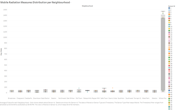
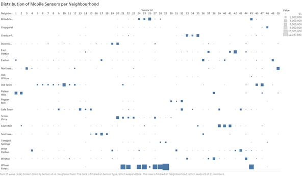
The first anomaly is there are 10 mobile sensors-id (1, 6, 23, 26, 34, 35, 47, 48 and 49) which had stopped recording on 8 April 2020 at around 0719 onwards as what shown in Figure 2.2. |
Figure 2.2 | |
Figure 2.3 | ||
In conclusion, mobile sensors-id provide a less consistent and therefore less reliable radiation measure. More considerations need to be taken to draw conclusion based on the mentioned mobile sensors-id mentioned above. |
Figure 2.4 |
b. Which regions of the city have greater uncertainty of radiation measurement? Use visual analytics to explain your rationale.
| Sensor Type | Regions with uncertainties | Evidence |
|---|---|---|
Figure 2.5 | ||
Figure 2.6 | ||
Figure 2.7 |
c. What effects do you see in the sensor readings after the earthquake and other major events? What effect do these events have on uncertainty?
| Sensor Type | Effects after the earthquake or other major events | Evidence |
|---|---|---|
Both figure 1.6 and 2.8 pointed out the same mobile sensors with high radiation measures and therefore the measures is highly certain. |
Figure 2.8 | |
Figure 2.9 |
Q3 – Given the uncertainty, you observed in question 2, are the radiation measurements reliable enough to locate areas of concern?
a. Highlight potential locations of contamination, including the locations of contaminated cars. Should St. Himark officials be worried about contaminated cars moving around the city?
| Sensor Type | Potential Contaminated Locations and Cars | Evidence |
|---|---|---|
Figure 3.1 | ||
Figure 3.2 | ||
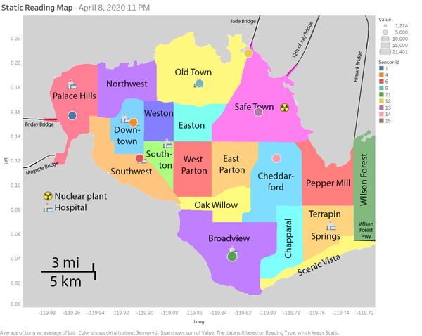
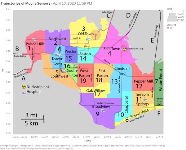
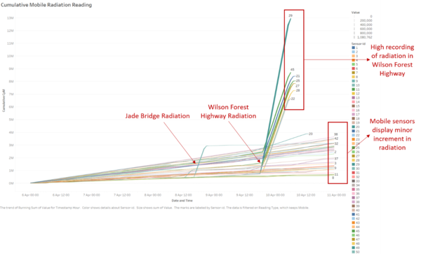
As we can see from Figure 3.3, the locations of contaminated cars are (1) Scenic Vista, (2) Terrapin Springs, (3) Chapparal, (4) Cheddar-ford, (5) Broadview, (6) Oak Willow, (7) East Parton, (8) Safe Town, (9) West Parton, (10) Southwest, (11) South-ton, (12) Downtown, and (13) Easton. Last, special attention needs to be given to (1) Jade Bridge and (2) Wilson Forest Highway as both areas recorded the highest radiation values. |
Figure 3.3 |
b. Estimate how many cars may have been contaminated when coolant leaked from the Always Safe plant. Use visual analysis of radiation measurements to determine if any have left the area.
| Sensor Type | Number of cars that may have been contaminated | Evidence |
|---|---|---|
Figure 3.4 | ||
Figure 3.5 | ||
Figure 3.6 | ||
Figure 3.7 | ||
Figure 3.8 |
c. Indicated where you would deploy more sensors to improve radiation monitoring in the city. Would you recommend more static sensors or more mobile sensors or both? Use your visualization of radiation measurement uncertainty to justify your recommendation.
Figure 3.9
Based on our analysis, we conclude that static sensors-id provides a more accurate and reliable radiation measure as compared to the mobile sensors-id. Therefore, it would be more useful for St. Himark to install more static sensors. For the new locations, a priority should be given to Safe Town and the proximity regions such as Pepper Mill, East Parton, and Easton which currently has no static sensor. The next locations are the entrance and exit routes of the city such as Friday Bridge, Magritte Bridge, Wilson Forest Highway, Himark Bridge, 12th of July Bridge.
Even though static sensors are more accurate, mobile sensors are important to monitor dynamic changes of radiation when a vehicle travels from one region to another. Therefore, the official should find a way to improve the mobile sensor reading as a mobile sensor enables the gathering of radiation measures far away from the static sensors.
Q4 – Summarize the state of radiation measurements at the end of the available period. Use your novel visualizations and analysis approaches to suggest a course of action for the city. Use visual analytics to compare the static sensor network to the mobile sensor network. What are the strengths and weaknesses of each approach? How do they support each other? Limit your response to 6 images and 800 words.
Figure 4.1
Figure 4.2
The summary status of the two types of sensors are:
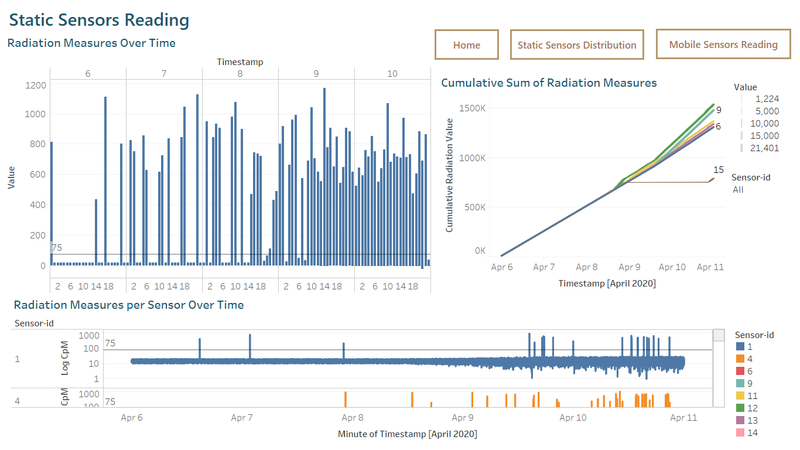
- Overall, by the end of the recording period, we can see an increase of values demonstrated by the static and mobile sensors.
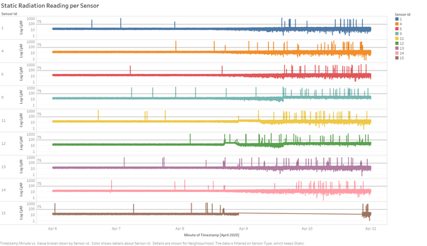
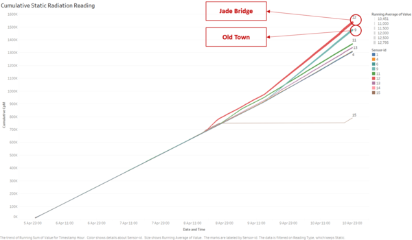
- Referring to Figure 4.1, all the static sensors recorded a rise in the radiation background except for sensor-id 15 which stopped recording on 8 April 2020 at around 1600. Sensor-id 12 located in Jade Bridge logged the highest accumulated radiation by the end of the recording followed by sensor-id 9 located in Old Town due to its proximity to the nuclear power plant and Jade Bridge. The city mayor should focus on decontaminating these two locations, e.g. barricade the areas to prevent people from entering until the decontamination processes are done.
- For the mobile sensors, vehicles with sensor-id 21, 22, 24, 25, 27, 28, 30, and 45 recorded high level of radiation and possible cross-contamination in the Wilson Forest Highway. The government should search for these vehicles and decontaminated them as soon as possible.
- Last, the government should invest more on sensors and placed at least one static sensor in each region, bridges, and highways.
Looking back at our discussion over the past 3 questions, we could safely claim that static sensors provide more accuracy and reliability in measuring the radiation measures. Based on the static readings, St.Himark’s officials and citizens can rely on these sensors to inform them about real-time and accurate measures. However, the static sensor is not mobile, and the coverage may be limited. For instance, static sensor-id 9 in Old Town will not represent all areas in that region due to the area size.
On the other hand, mobile sensors had been proven to be less accurate and bring about uncertainty to the radiation measures. However, mobile sensors are versatile and flexible as it can cover the specific areas that can’t be covered by static sensors. Also, as the mobile sensor is attached to a vehicle, it helps to (1) detect if the vehicle is exposed to the radiation, (2) possible cross-contamination between vehicles and (3) locate the vehicles in or out of the city.
Overall, both static and mobile sensors complement each other in measuring background radiation and detect any possible radiation leakage from the nuclear power plant. Many of St. Himark’s citizen will find the improvement in term of accuracy for mobile sensor measure to be necessary. By doing so, the government can gain more confidence from the people in the city.
Q5 - The data for this challenge can be analysed either as a static collection or as a dynamic stream of data, as it would occur in a real emergency. Describe how you analysed the data - as a static collection or a stream. How do you think this choice affected your analysis? Limit your response to 200 words and 3 images.
For this analysis, the data will be treated as dynamic steam as we wish to get insights on the real-time condition on the ground.
For example, the use of cumulative sum graph of static and mobile sensors enabled us to spot the most affected sensors and any other possible measures.
By analysing the data as a stream, we will monitor the change in radiation reading over time to (1) identify the sensors with highest radiation measure, (2) identify the areas with high radiation, and (3) identify vehicles with high contamination. The dynamic nature of radiation contamination required continuous monitoring in real-time to determine the next solution. Therefore, treating the data as the stream will be more suitable as compared to analyse the data as a static collection.
References
- Live real-time monitoring map of radiation counts in the USA - https://wattsupwiththat.com/2011/03/17/live-real-time-monitoring-map-of-radiation-counts-in-the-usa/
- Background Radiation - https://en.wikipedia.org/wiki/Background_radiation
- Geospatial analysis made easy with two new spatial functions: MakePoint and MakeLine - https://www.tableau.com/about/blog/2019/6/geospatial-analysis-made-easy-two-new-spatial-functions-makepoint-and-makeline
- VAST Challenge 2019: Disaster at St. Himark - https://github.com/jwoLondon/vastchallenge2019/blob/master/mc2Exploration.md
