IS428 AY2019-20T1 Assign Chye Soon Hang Observations
Contents
- 1 Q1: Visualize radiation measurements over time from both static and mobile sensors to identify areas where radiation over background is detected. Characterize changes over time.
- 2 Q2. Use visual analytics to represent and analyze uncertainty in the measurement of radiation across the city.
- 2.1 a. Compare uncertainty of the static sensors to the mobile sensors. What anomalies can you see? Are there sensors that are too uncertain to trust?
- 2.2 b. Which regions of the city have greater uncertainty of radiation measurement? Use visual analytics to explain your rationale.
- 2.3 c. What effects do you see in the sensor readings after the earthquake and other major events? What effect do these events have on uncertainty?
- 3 Given the uncertainty you observed in question 2, are the radiation measurements reliable enough to locate areas of concern?
- 3.1 a. Highlight potential locations of contamination, including the locations of contaminated cars. Should St. Himark officials be worried about contaminated cars moving around the city?
- 3.2 b. Estimate how many cars may have been contaminated when coolant leaked from the Always Safe plant. Use visual analysis of radiation measurements to determine if any have left the area.
- 3.3 c. Indicated where you would deploy more sensors to improve radiation monitoring in the city. Would you recommend more static sensors or more mobile sensors or both? Use your visualization of radiation measurement uncertainty to justify your recommendation.
- 4 4. Summarize the state of radiation measurements at the end of the available period. Use your novel visualizations and analysis approaches to suggest a course of action for the city. Use visual analytics to compare the static sensor network to the mobile sensor network. What are the strengths and weaknesses of each approach? How do they support each other?
- 5 5. The data for this challenge can be analyzed either as a static collection or as a dynamic stream of data, as it would occur in a real emergency. Describe how you analyzed the data - as a static collection or a stream. How do you think this choice affected your analysis? Limit your response to 200 words and 3 images.
Q1: Visualize radiation measurements over time from both static and mobile sensors to identify areas where radiation over background is detected. Characterize changes over time.
Based on the visualization above, we can clearly see that the fluctuations of sensor readings only started after the earthquake happened on Apr 8, 1:56pm. The reading started to rise at the nuclear plant. Subsequently, by Apr 8, 4:30pm, the radiation outspread have reached more towns, which can be seen in the darken shadings of the various towns around Safe Town. Therefore, users can easily identify how fast the contamination has been spread.
There were also places with low average readings, but sensors have high spikes before. Hence, such places are of high concerns as well.
Q2. Use visual analytics to represent and analyze uncertainty in the measurement of radiation across the city.
a. Compare uncertainty of the static sensors to the mobile sensors. What anomalies can you see? Are there sensors that are too uncertain to trust?
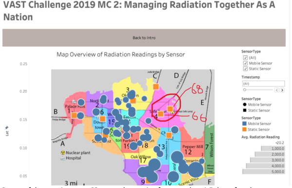
Based on the visualization showing static sensors, the strange part of the data is that when the earthquake happened, sensors like 66 and 68 which are right in the vicinity of the nuclear plant, did not report high readings and that is highly suspicious.
On top of that, static sensor 68 stopped reporting for more than 1.5 days after the earthquake happened. This might imply that the sensor might have broken down during the incident and missed out on capturing important information for us to understand about the situation.
This situation happens with the mobile sensors as well as shown in the screenshot above, with multiple sensors not reporting for quite a long period of time.
Such scenario makes the dataset less credible in helping us to identify the true root cause or underlying problem in the entire incident.
b. Which regions of the city have greater uncertainty of radiation measurement? Use visual analytics to explain your rationale.
From this visualization, you can see that Old Town presents a huge uncertainty due to the sudden spike. Despite having normal average, this spike still creates a doubt to users as to what caused the spike. Hence, regulatory should prioritize this area.
c. What effects do you see in the sensor readings after the earthquake and other major events? What effect do these events have on uncertainty?
As mentioned earlier, some of the sensors stopped reporting data after the earthquake. This could have blindsided our analysis as that period could have presented critical information of the radiation which we failed to capture.
Given the uncertainty you observed in question 2, are the radiation measurements reliable enough to locate areas of concern?
a. Highlight potential locations of contamination, including the locations of contaminated cars. Should St. Himark officials be worried about contaminated cars moving around the city?
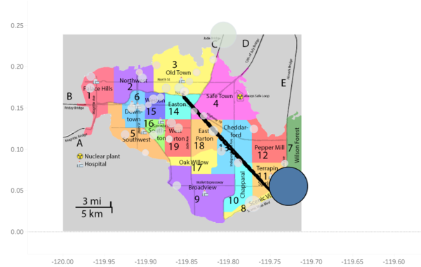
These 3 mobile sensors being highlighted have reported relative higher average radiation readings (Bigger circle). The following screenshots will show some of their movements.
This screenshot above shows the movement of mobile sensor 5. Due to its high average radiation reading, it is rather concerning to see that it went past Old Town and it might resulted in the sudden spike of reading in Old Town. And currently, the last known location is at Jade Bridge, which could have potentially contaminated the bridge and the officials need to ensure that the car does not get out to other places via Jade Bridge and continue spreading the contamination.
b. Estimate how many cars may have been contaminated when coolant leaked from the Always Safe plant. Use visual analysis of radiation measurements to determine if any have left the area.
Using the visualization from question 3a, cars with sensor, 5, 21, 22, 24, 27 and 29 have relative higher radiation readings.
Among these cars, the visualization only managed to display the final location of car 5, which is at Weston. The dataset did not have the data of the other potential contaminated cars.
c. Indicated where you would deploy more sensors to improve radiation monitoring in the city. Would you recommend more static sensors or more mobile sensors or both? Use your visualization of radiation measurement uncertainty to justify your recommendation.
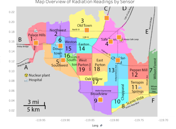
Personally, I feel that it will be more useful to use static sensors. Currently, only a few towns have static sensors. The problem with using mobile sensors is that it is constantly moving around and might have been contaminated by areas it have been to, presenting uncertainty to its representation of individual towns. As such, the next step should be deploying static sensors in all towns and put more in bigger towns.
4. Summarize the state of radiation measurements at the end of the available period. Use your novel visualizations and analysis approaches to suggest a course of action for the city. Use visual analytics to compare the static sensor network to the mobile sensor network. What are the strengths and weaknesses of each approach? How do they support each other?
Similar to question 3c, I would highly recommend the officials to start installing more static sensors across St.Himark, especially in the following areas,
- Towns without static sensors at the moment
- More around Safe Town and immediate neighbours (East Parton, Pepper Mill, Old Town, Easton, and Cheddarford)
Static Sensors has proven to be more reliable during the incident. Only one static sensor went down while 19 mobile sensors have missing data during the incident. However, there are still some limitation to static sensors. It is not possible for static sensors to accurately monitor places beyond the city. Hence, there is still a need for mobile sensors but more of the support role while the static sensors serve as the main indicator for radiation reading.
5. The data for this challenge can be analyzed either as a static collection or as a dynamic stream of data, as it would occur in a real emergency. Describe how you analyzed the data - as a static collection or a stream. How do you think this choice affected your analysis? Limit your response to 200 words and 3 images.
For static data collection, which is the current data collection, it can help us to identify area of concerns that we need to rectify and pointing out possible root cause. However, with dynamic data, I will be able to present live visualization showing the constant movement of data points. One use case for live data would be using map plot. Shading of the various towns on map will represent the severity of radiation contamination. As the data keep feeding the dashboard, the map plot will constantly update and display the latest data points. This example will be beneficial for emergency response department where they can detect potential emergency as early as possible and act on it.


