Crime Scream-Proposal
|
Crime Scream |
|
|
|
|
Contents
PROBLEM
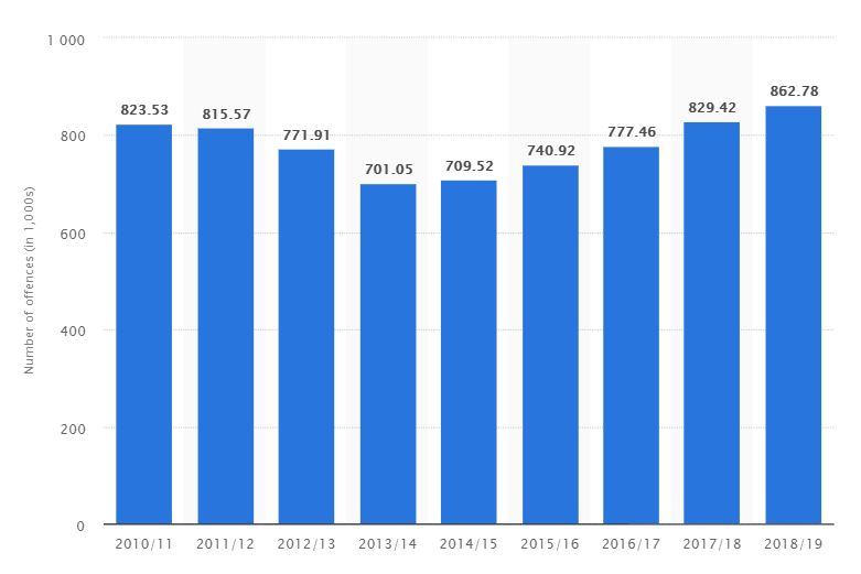
Crime rates have remained high over the years in the City of London. From the year 2010/11 it has even increased from around 823,000 to 862,000 by year 2018/19. Number of reported crimes have increased by 2.2% from last year but it is at an alarming increase of 20% from 2014/15. There has been police budget cuts in recent years and this has resulted in a decrease in the number of police officers in the service. Even police officers themselves are feeling unsafe to be patrolling and do stop and search on people on the streets.
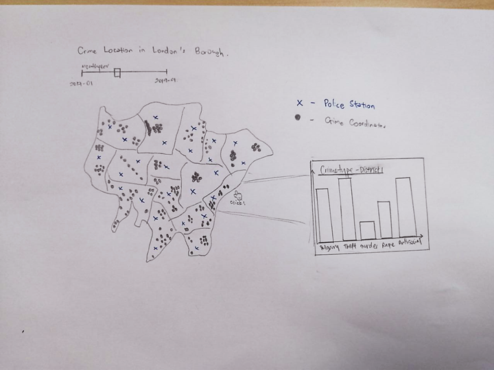
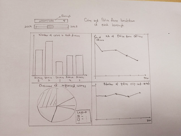
Keeping these points in mind, we are hoping to be able to visualize the crime hotspots in London. In addition, mapping the police station locations to compare the crime rates and police surveillance to have a better overview on areas which may require increased security.
MOVITATION
There has been a lack of platform to visualize the local area security in respect to the police forces and location of crime over time. Currently, with the police budgets being cut and number of officers decreasing, it is crucial to show the areas with lack of security and an attempt to lower crime rates in these crime hotspots in London.
DATASET
Our initial approach was to analyze the whole of the UK, from the year of 2015 to 2017, to analyze which cities are more prone to which crime type. However, upon looking at our crime dataset that was obtained from the UK government data website, we realised that there was an abundance of data and decided to simply use the dataset of 2017. After further analysis, we realised that there were too many areas to focus on as different cities of the UK have different crime statistics based on crime type. Thus, we decided to perform local crime analysis and focus solely on the capital of the UK, London.
UK crime data
| Data Column | Data Description |
|---|---|
| Crime ID | Unique identifier of each crime |
| Month | Month Year of the occurrence |
| Falls Within | At present, also the force that provided the data about the crime. This is currently being looked into and is likely to change in the near future. |
| Longitude | Longitude |
| Latitude | Latitude |
| Location | Location of the occurrence (street name) |
| LSOA code | References to the Lower Layer Super Output Area that the anonymised point falls into, according to the LSOA boundaries provided by the Office for National Statistics. |
| Crime type | Crime types such as Criminal damage and arson, Burglary and Anti-social behaviour etc. |
| Last Outcome | A reference to whichever of the outcomes associated with the crime occurred most recently. |
| Context | A field provided for forces to provide additional human-readable data about individual crimes. Currently, for newly added CSVs, this is always empty. |
The crime dataset was obtained from the UK police whereby one row of data represents one occurence. The data shows the occurrences of crimes in the UK. It includes data fields such as the Crime ID, coordinates of the crime, crime type and crime outcome etc as seen in the data table above. However, as we have the coordinates of the crime, we do not need certain columns such as the Fall Within column and the Location column.
London district polygon shapefile
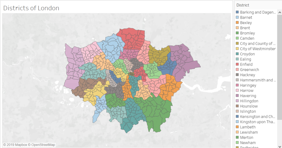
n order to analyze by the districts, we obtained the London ward polygon shapefile dataset from the UK government data website. As seen below, the shapefile is being imported into Tableau, whereby each colour represents one district of London and each polygon represents one ward.
RELATED WORK & LIST OF REFERENCES
1. Density Concentration Mapping
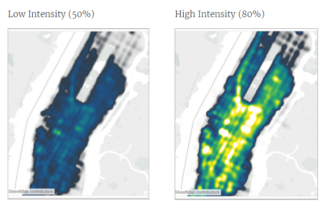
We are dealing with all the exact locations of crime being committed based on the latitude and longitude. It is very helpful to plot the areas where there is a high concentration of crimes being committed.
2. Choropleth Map
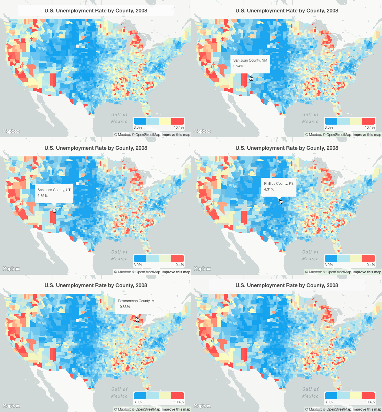
Depicting the crime rates by each district or boroughs in London will show a nice area where it is prone to crimes and also knowing the safer part of London.
3. Aggregated Number of Crimes in each borough/district
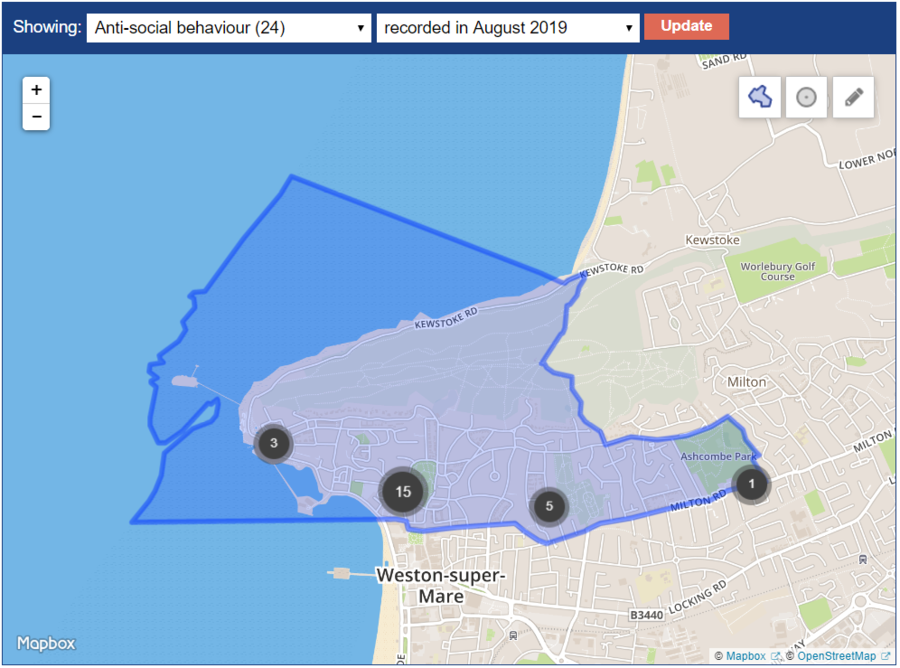
Sometimes plotting too many points on the map is too confusing for users and making visualization even messier. By aggregating the points into a region/section of the map will allow users to understand briefly on the number of crimes in that locality.
Lidt of References:
https://blog.mapbox.com/7-data-visualizations-techniques-for-location-544c558cc960
https://medium.com/@davemorison/an-interactive-visualization-of-londons-crime-data-using-shiny-applications-and-r-7ca9011e064b
https://www.met.police.uk/sd/stats-and-data/met/crime-data-dashboard/
https://www.london.gov.uk/what-we-do/mayors-office-policing-and-crime-mopac/data-and-statistics/crime-dashboard
KEY TECHNICAL CHALLENGES
Data Preparation
- Python (Pandas, Geopandas)
- Pandas will be used to manipulate the data into dataframe and Geopandas to manipulate the geographical location and
coordinates for easier usage on Tableau
- Mitigation: Pandas is still frequently used by some of us, we are able to help each other clean up the data before using it. Geopandas is a new concept for all of us → we are able to look up examples on how to use the library and manipulate the geographical data for us to work with
Data Visualization (Interactive Dashboard)
- RShiny
- R programming is new to all of us, understanding the syntax and using it to plot graphs will be challenging
- Mitigation: Datacamp is provided to us, we are able to do the RShiny learning packages to pick up the required skills for us to finish up the tasks at hand.
Slow Rendering of Data
- We have not worked on RShiny before, but there might be a lag when the user interact with the dashboard and rendering the data due to the extensive amount of data we will be using
- Mitigation: We can look into ways to make our code more efficient so rendering data will not take too long which hinders the usability of our app for the user
