Ball4life Proposal V2
After consultations with Prof KAM, we felt that our previous scope of the proposal was too board and we might not be able to complete it in time. Therefore, we revised our project topic to analyse the game of James Harden.
<--- Go Back to Project Groups
Contents
INTRODUCTION
The National Basketball Association (NBA) is a men’s professional basketball league in North America. Comprising of 30 teams (29 in the United States and 1 in Canada), it is one of the 4 major professional sports leagues in the United States and Canada. Furthermore, it is widely regarded as the premier basketball league in the world, with many fans touting it as the hardest league with the world’s best players competing in it.
With an average NBA team being valued at US$1.9 billion, the NBA continues to generate earnings in the hundreds of millions. This, coupled with growing fan bases in China, Philippines, Vietnam and Europe ensures that the NBA will be able to provide entertaining and competitive basketball games for all their fans.
PROBLEM & MOTIVATION
Despite the wide array of sports analytics visualisations on the NBA, most are done with enterprise software such as Tableau and Microsoft PowerBi. However, there is little to no visualisation done on the NBA using self-implemented coding applications such as R Shiny. This presents a significant untapped opportunity for the team to develop a visualization web application that serves two main pain points:
- Allow users to modify or expand on existing base code using R Shiny to visualise NBA applications.
- Provide users with instant information not discernible by looking at raw figures on the NBA website.
On a macro scale, the visualisation is able to provide users who are interested in NBA analytics with an initial understanding on the different metrics being tracked by the NBA, and its effect on determining a player’s overall efficiency.
Using James Harden, the industry dubbed statistical anomaly, the team aims to build a visualisation tool centred around James Harden’s shot selection, his field goal percentages and his performance when paired with different players.
OBJECTIVE
This visualisation aims to provide insights into the following:
- How has James Harden's shot selection change over the years
- How does his performance varies with different lineup paired with him
- How effective is his performance compared with similar players
SELECTED DATABASE
The Data Sets we will be using for our analysis and for our application is listed below:
| Dataset/Source | Rationale Of Usage |
|---|---|
|
This will help us to properly plot out his shot distribution on the floor. This plot will help to understand his preferred and most effective scoring areas. | |
|
This dataset will allow us to analyse how his performance varies when pair up with different teammates. This will allow his coach to determine the best lineup to pair him up with. | |
|
By having this information, we can carefully analyse and compare James Harden's performance in a few key areas with adjacent players with similar build and playing style. |
BACKGROUND SURVEY
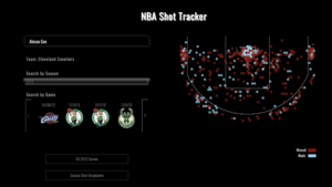
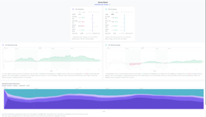
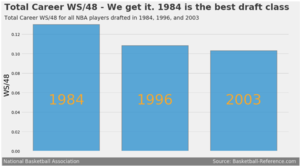
We did basic background research on some existing visualizations or dashboards we could drive inspirations from or make it better. Below are a few visuals we found:
| References to Existing Visualizations | Key Takeaways |
|---|---|
Title: NBA Shot Tracker |
Feedback Clear illustration of insights on player’s field goal percentage Simple and intuitive UI to better engage audiences Too little information, would require more information to better understand individual’s game |
Title: Player Analysis |
Feedback Detailed breakdown of player’s efficiency rate in the 2 key offensive tools Leveraged on time-series data to better understand player’s growth or decline Too little information, would require more information to better understand individual’s game |
Title: Best Draft Class |
Feedback Could have included trend line to predict next round of best draft class There is a lack of filter to show what are the factors being considered in efficiency |
PROPOSED STORYBOARD
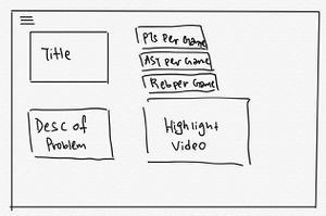
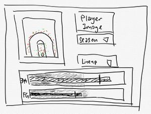
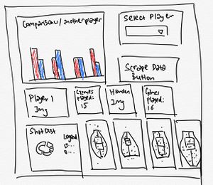
With a clearer idea of what we want after looking at a few visualization examples, we came up with a few storyboard ideas.
| Proposed Storyboard | Description |
|---|---|
|
Homepage
| |
|
Understanding Efficiency of James Harden
| |
|
Comparing James Harden to Top Shooting Guards
|
CHALLENGES
| Challenges | Mitigation Plan |
|---|---|
|
Refine web scraping techniques to write automated scripts to scrape from NBA web pages |
|
|
|
|
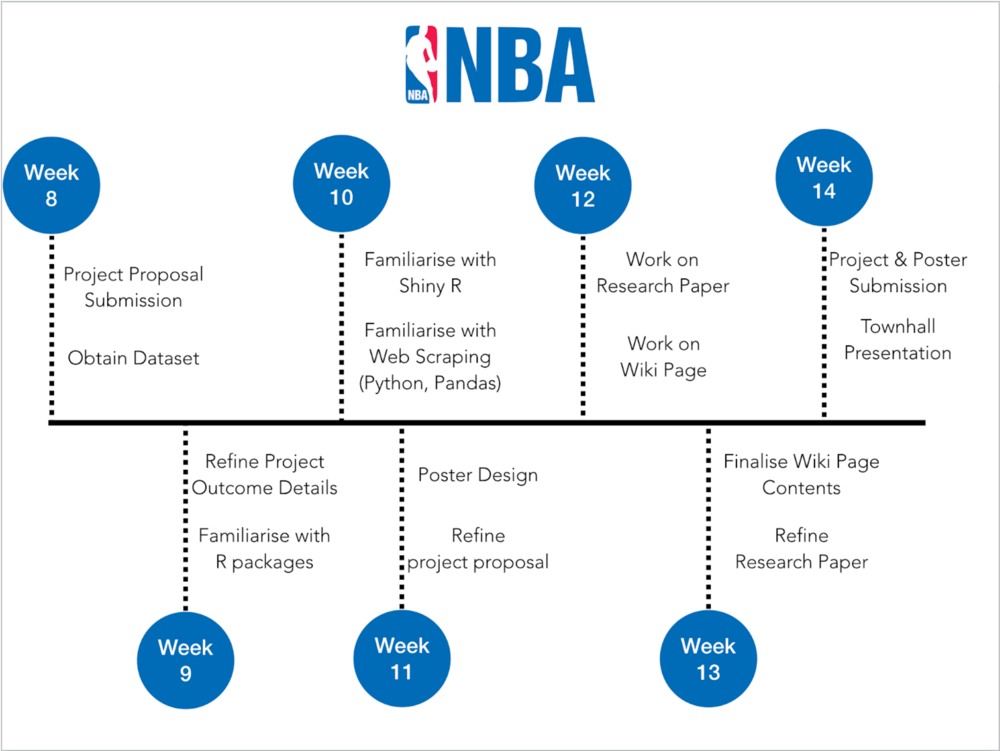
TIMELINE
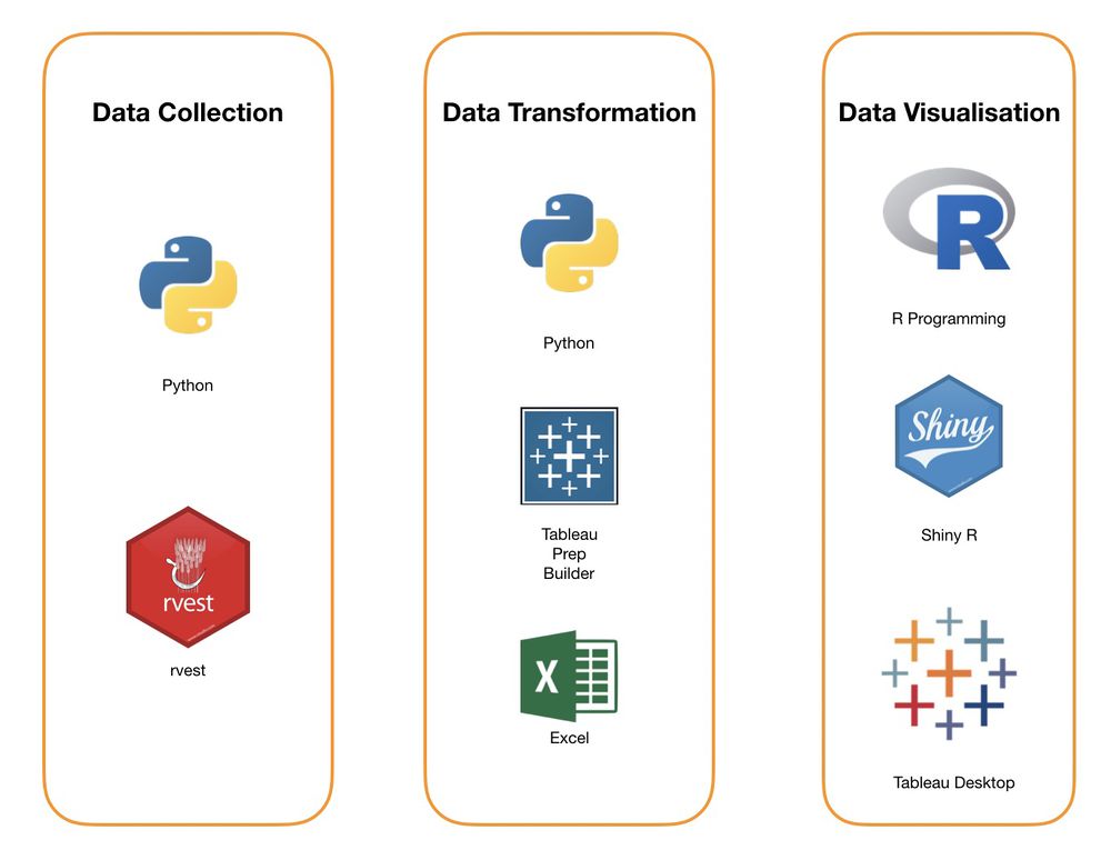
TOOLS/TECHNOLOGIES
COMMENTS
Feel free to leave us some comments so that we can improve!
| No. | Name | Date | Comments |
|---|---|---|---|
| 1. | Insert your name here | Insert date here | Insert comment here |
| 2. | Insert your name here | Insert date here | Insert comment here |
| 3. | Insert your name here | Insert date here | Insert comment here |

