Business Mafia Proposal

Contents
- 1 Project Motivation
- 2 Project Objective
- 3 Data Sources
- 4 Literature Review
- 5 Our Methodology
- 6 Project Storyboard
- 7 Application Overview
- 8 Our Findings
- 9 Reflecting on our project
- 10 Project Timeline
Project Motivation
A significant proportion of Airbnb hosts rent out portions of their own homes to generate additional side income. Instead of relying on a robust approach when setting prices, they tend to do so intuitively, relying on gut feeling. Our group hopes to offer these homeowners an alternative way to price their listings - through an amalgamation of factors such as their listing's geographical location and its relationship with Downtown Seattle.
However, the primary challenge here is simplifying and summarising the technical, complex analytics techniques into layman terms; it would require breaking down the technical jargon associated with it. In order to carry this out effectively, we created an RShiny Application which would guide owners systematically through the thought process. This would allow owners to not only derive the final proposed listing price, but also better understand our thought process and methodology behind the derivation of the price.
Project Objective
Through our project, we aim to:
- Derive street network distance between various key attractions and Airbnb listings in Downtown Seattle
- Analyse the spatial relationships between various key locations and Airbnb listings in Downtown Seattle to determine if the listing's location to key places affect its listing price
- Through the use of Local Geographical Weighted Regression (GWR) Model, we hope to help Airbnb owner(s) determine the better pricing for their listing(s).
Data Sources
| Data | Source | Data Description | Source URL | Data Type |
|---|---|---|---|---|
Literature Review
Literature Sources:
- https://towardsdatascience.com/airbnb-rental-listings-dataset-mining-f972ed08ddec
- https://wiki.smu.edu.sg/18191isss608g1/Group01_Proposal
- https://www.researchgate.net/profile/Ben_Miller6/publication/225322212_A_comparison_of_methods_for_the_statistical_analysis_of_spatial_point_patterns_in_plant_ecology/links/02e7e533e0ff93e167000000/A-comparison-of-methods-for-the-statistical-analysis-of-spatial-point-patterns-in-plant-ecology.pdf
Literature Review 1: Airbnb Rental Listings Dataset Mining
Literature's Objective: An exploratory analysis of Airbnb's Data to understand the rental landscape in New York City
- NYC's data was also obtained from Inside Airbnb and it contains the same three tables as ours, except that it was for New York City
- Listings.csv - contains 96 detailed attributes for each listing. Some of the attributes are continuous (i.e. Price, Longitude, Latitude, ratings) and others are categorical (Neighbourhoods, Listing_type, is_superhost) which is used for the analysis
- Reviews.csv - Detailed reviews given by guests with six attributes. The key attributes include date (datetime), listing_id (discrete), reviewer_id (discrete), comments (textual)
- Calendar.csv - Provides details about booking for the next year for each listing. There are four attributes in total, they are: listing_id (discrete), date (datetime), available (categorical) and price (continuous).

This is a screenshot of a paragraph taken off the literature. The context behind this paragraph was that the authors were trying to find out the number of days in a year each listing is made available for booking. Our group ran into a similar problem when analysing our Seattle Airbnb dataset.
Unfortunately, the number of days available for booking by each listing is not made publicly available by Airbnb. We found the method proposed by the authors useful as this was a simple solution that made a good enough estimation for us to gauge the number of days available for booking, and conclude if the listing was highly sought after or if it was one of those listings where it opened it's doors only few times each year.

Furthering on the earlier introduced idea that demand can be gauged from the number of reviews left by guests on their home owners, the authors investigated on how demand changes across three years - 2016 (left most graph), 2017 and 2018 (right most graph). All three graphs showed identical trends that demand across the year picks up. The period of peak demand across all three periods happens during the month of October. After which, demand tends to fall. This is mainly attributed to seasonality factors, as the seasons gradually shifts from Fall to Winter. From this, we can conclude that demand and seasonality in New York City are likely to be related to one another. This is a similar idea that can be looked into when exploring Seattle's Airbnb Dataset.

This graph shows the average listing prices per night for each month across all NYC Airbnbs. The average prices tend to increases as one progresses along in the year and Spikes in December. This pattern is similar to that of demand graph above, except in the months of November and December, where the demand starts falling since end October. Hence, one hypothesis that our group came up with when analysing listing prices and demand rates across months of the year(s) is that Airbnb owners do not take into account demand when setting prices. We attribute this to the lack of holistic pricing model(s) or analysis tool(s) that Airbnb owners do not use to understand demand patterns before determining prices. As most Airbnb owners set out to rent their apartments/rooms out to earn additional income, we believe that most owners set prices based on their intuition. This might likely be the case for Airbnb owners in Seattle as well.

This is the basic interactive graph with all the listing in New York City appearing in a clustered fashion. The user can click on the clusters to see the listing it comprises of. This gives a zoom-in view, more minute view of the landscape. A user can further click on each listing to see details of the listing such as the Listing Name, Host Name, Price of Listing, Property Type and Room Type. This visualisation helps to explore the listing geographically. It gives the overall sense of how the listings are distributed across neighborhood. We can see from the map that maximum listing are clustered around Manhattan and Brooklyn region, followed by Queens, Bronx and the least number of listing are in Staten Island. Click on the thumbnail and it will bring you to the animation!
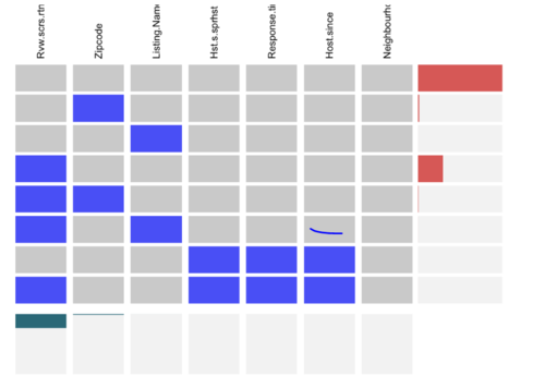
When it comes to dealing with missing values in the dataset, the authors chose to construct a Visna plot to analyse the missing values for the variables they would be using for in their exploratory analysis. To preserve all the information, they imputed or dropped all the rows and columns containing null values when conducting their exploratory data analysis. The variables that they used in their visna plot were:
- host_is_superhost
- neighbourhood_group_cleansed
- host_response_time
- review_scores_rating
- name
- host_since
- zipcode
Few observations were made from this exercise:
- Most rows have no missing values
- reviews_score_rating variable have close to 30% missing fields across all rows
- zipcode, name, host_response_time, host_since and host_is_superhost have only few missing values across all rows and hence are not reflected in the visna plot.
From the plot above, it can be concluded that the Airbnb dataset only contains few missing values which further argues that the analysis done on the data can be performed without much loss of information.
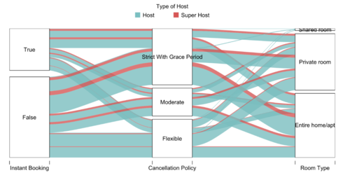
The aim of this analysis is to see if there is any relationship between the different categorical variables in the dataset. The variables under examination are instant_booking, cancellation_policy and room_type. The goal of this study is to see if regular hosts and super hosts have different policies and to examine if there is a correlation among the variables.
Key takeaways from the above chart
- Majority of the listings are not available for instant bookings. Majority of the ones available tend to have strict cancellation policy.
- Properties that are entire homes or apartments tend to have a stricter cancellation policy compared to shared and private rooms. This makes sense as the hosts would want to prevent incurring a huge loss by last-minute cancellations on entire homes/apartments type bookings.
- As the number of shared rooms listings are very few, the line in the graph is very thin. From the graph, all the lines suggest that the shared rooms are available for instant booking and have slightly more flexible cancellation policy.
- Owners of shared rooms are generally regular hosts.
- Based on the features here under inspection, there are no major discrepancies in behaviour between regular hosts and super hosts as they seem to display similar behavior types.
Literature Review 2: Hawk-R-Stall Rental Singapore
Literature's Objective: Determining the market rate for stall rentals and appropriate bidding price for hawker stalls in Singapore
Most of the learnings we gathered from this literature review relates to how we can improve the UI of our project deliverables. This particular project was chosen as the analysis technique used is similar to ours (Geographically Weighted Regression) and that it is a piece of work by someone more experienced then us. Also, by studying work beyond the scope of undergraduate, we are confident that we can pick up fresh, new ideas.
Something different that all other IS415 projects do not have is the 'Project Groups' tab in the project proposal page. This allows for easier navigation between projects as clicking on it allows the user to return to the Project Groups page. Users can more easily exit a group's project and continue on to other projects. We decided to incorporate this feature into our project as well.

The creators of Hawk-R-Stall Rental Singapore have included a User Guide for their RShiny application under the 'Application' tab of their project page. This serves to improve the User Experience (UX) as users can refer to this user guide as and when they have queries regarding the application. This is another feature that we will be incorporating to our project to improve the UX. Ultimately, we want to build applications that are user-friendly and easy-to-use! And a big part of it involves making the UX as seamless as possible!

The authors of Hawk-R-Stall Rental Singapore have included a section under their Project Proposal which addresses the flaws of existing visualisations available. This idea is again something that is not commonly found within undergraduate's work. A considerable amount of resources have been spent on researching into existing solutions. This helps the authors to better their product as they can address pain areas that they find in other tools that are not yet addressed. This is also an idea that we are looking to incorporate, if we can find existing RShiny applications/visualisations that are similar to our group's project.
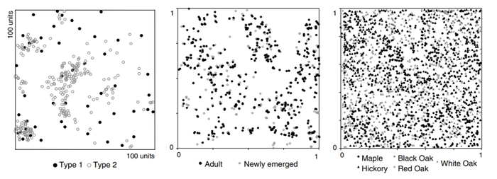
Literature Review 3: Studies the usage of spatial point pattern analysis methods for the purposes of plant ecology
Plant Ecology, accepted: 10 February 2006 and published online: 30 March 2006
We have chosen this research paper for its broader usage of SPPA in the studies of plant ecology, as well as different statistical method.
One of the interesting takeaways we caught from this review was its use of a bivariate spatial point pattern analysis on top of a univariate analysis. This usage of two variables helps answer the question if the events of interest are occurring with any respect to separate types of events. The examples used in the review are such as comparing the points of newly emerged plants, and adult plants. Applying to our project’s scope and objective, introducing this analysis brings us one step further in deriving the reasons behind the high Airbnb listing activities in Downtown Seattle; a possible causation.
In the research paper analysis, they had 3 bivariate sets of events used: the Gibbsian point pattern, the Bramble canes event set (newly emerged vs. adults) and the Lansing Woods event set (hickory vs. maple, with other species having smaller grey symbols)
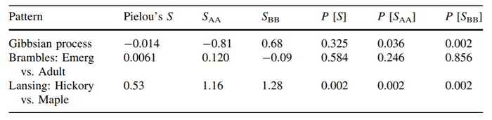
Interpreting the table gave information such as whether the Gibbsian process has a high association value with Dixon's SAA and SBB, and whether Pielou's S is any disimilar from being completely random.
For a second order effect, they used Ripley's K and Neighbourhood Density Function. The overall analysis of the second order concluded that it supports the contingency table analyses.
The usage of a bivariate analysis certainly gives more room for our model to be built upon. Unfortunately, the lack of data hinders us from exploring other events that could suggest the high number of listings in Downtown Seattle. Hence, future research can consider adopting this similar approach to identify a possible reason for dense airbnb listings in Downtown Seattle. Knowing so could inspire new business strategies for home owners or Airbnb itself.
A second interesting finding is the usage of a global and local approach that is combined - the Spatial Analysis by Distance Indices (SADIE)
 |
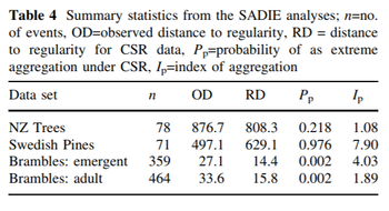 |
This approach uses an algorithm in which observed events are iteratively displaced until they achieve a regular arrangement. As seen from the image, these distances are interpreted by totalling up the number of moves each event records until a regular pattern of events are achieved.
Comparing the 2 of the plots, we can see from the top right plot, B, that its lines are not overlapping each other as frequently as the bottom left plot, C. More so, B has a shorter length of lines while C has a larger variance. In addition, observing the directions of the lines in C, they show some radiation outwards and away from distinct clusters.
Similarly, a summary statistic was produced in the literature. Pp is the probability as an extreme aggregation of CSR - offering a statistical result at the same time. Thus, the plots, along with the table, offer another way to observe the clustered distribution of events.
While this technique will not be used, it gives an additional option of interpreting spatial point patterns.
Our Methodology
R-Packages Used:
- corrplot
- dplyr
- DT
- ggplot2
- ggpubr
- GWmodel
- leaflet
- olsrr
- plotly
- raster
- RColorBrewer
- rgdal
- rsconnect
- sf
- shiny
- shinydashboard
- shinythemes
- sp
- SpatialAcc
- spdep
- tidyverse
- tmap
- tmaptools
General Methodology
- Data wrangling/Data Cleaning
- Extracting only listings in Downtown Seattle
- Extracting out top 12 key attractions in Downtown Seattle
- Computing the street distance from each listing to the 12 different key attractions (Using Open Street Map Server)
- Geographical Accessibility technique as a form of data exploration
- Hansen's Potential Model
- Power function
- Spatial Point Pattern Analysis
- First Order
- Second Order
- Geographically Weighted Regression Model
- Feature Engineering
- Running correlation test obtain correlation of coefficient (R value) - choosing only variables that are significant at 95% confidence level
- Kernel Density Function Used
- Bandwidth used
Geographical Accessibility
Geographical Accessibility refers to the ease of reaching destinations. People who are in highly accessible places can reach many other places quickly while people in inaccessible places can reach fewer places in the same amount of time. In our project, we decided to use Geographical Accessibility technique as an exploratory technique to understand the accessibility of each individual listings. Specifically, we will like to identify areas within Downtown Seattle that have higher accessibility scores and hypothesize that listings within these areas should fetch higher prices.
Hansen's Potential Model

To model geographical accessibility, the Hansen Potential Model was used. To use this model in R, we worked with the ‘SpatialAcc’ library with the ac() function called. There are five parameters that had to be addressed in the ac() function and further paragraphs in this literature will be used to address these five parameters.
Parameter 1: ‘p’
The parameter p is a vector that quantifies the demand for services in each location (origin i). In the case of our project, this refers to all listings within Downtown Seattle. To obtain the population, we filtered for all listings within Downtown Seattle from listings.csv data source. There were a total of 1148 Downtown Seattle listings in our dataset. To quantify the demand from each listing, we looked at the ‘accommodates’ variable. We assumed that the true demand from each listing was represented by the number of guest a listing can accommodate.
Parameter 2: ‘n’
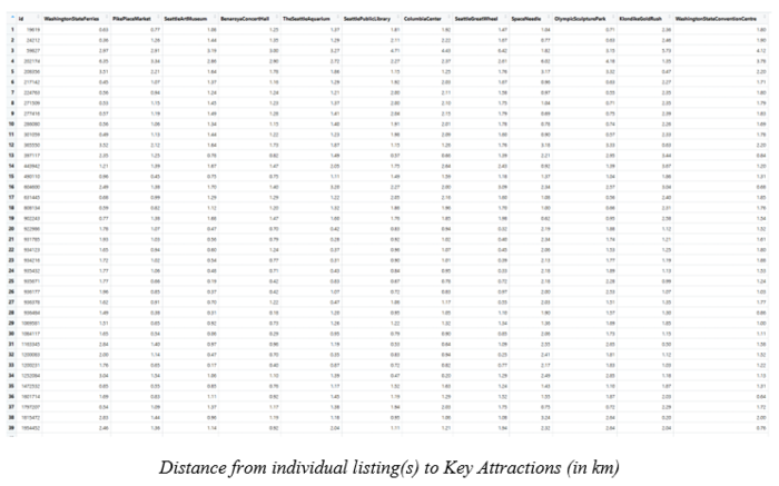
The parameter n is a vector that quantifies the supply of services in each location. We obtained all key attractions within Downtown Seattle from internet sources like tripadvisor.com or planetware.com. A total of 12 key attractions within Downtown Seattle were chosen.

The 12 key attractions are:
- Washington State Ferries
- Olympic Sculpture Park
- Pike Place Market
- Seattle Art Museum
- Benaroya Concert Hall
- Seattle Aquarium
- Seattle Public Library
- Space Needle
- Washington State Convention Centre
- Klondike Goldrush
- Seattle Great Wheel
- Columbia Center
Their corresponding location (latitude, longitude) was extracted from Common Place Name (CPN) dataset taken off City of Seattle Open Data Portal. For the capacity of each key attraction, we searched up the internet to find out either the size of each key attraction or the highest demand the place has ever accommodated. Also, we considered other factors, such as whether the location was enclosed or open spaced, if entry into the attraction requires the visitor to pay entrance fee and whether the attraction was suited only for a specific group of visitors to enter. Taking everything into account, we imputed a new column, ‘capacity’, into our dataset. It represented the supply of service at each location.
Parameter 3: ‘D’
The parameter D is a matrix of quantity separating the demand from the supply. It was a distance matrix using the road network distance. Road Network distance between each listing to all 12 key attractions was calculated using the ‘OSRM’ package. We used Road Network distance and not Euclidean distance (flying distance) as Downtown Seattle was cluttered with city blocks. It was impossible for anyone to travel in a straight line, from any listing to any attraction. Each individual listing’s distance to all 12 key attractions was computed and recorded in a distance matrix. The distance matrix was uploaded into R as a data frame, with 1148 rows by 12 columns.
Parameter 4: ‘power’’

The Distance Decay function is used to reflect the rate of increase of friction in distance. It is used to model how demand decreases as distance increases. In the ac() function, it allows only for the Power function decay and not the exponential function decay. We initially wanted to work with the exponential function instead of the Power function as we believe that visitors will visit still visit these key attractions even if they were a distance away. Hence, the dip in demand as distance increases should not be as steep. Given that only Power function is available, we used a power factor of 0.5 for our model.
Parameter 5: ‘family’’
Family refers to the type of function we used to model Geographical Accessibility. In our case, we used the ‘Hansen’ family.
Spatial Point Pattern Analysis
Geographically Weighted Regression
Based on Tobler’s First Law of Geography, a widely adopted principle is that everything is related with everything else, but closer things are more related than each other.
In geographically-weighted regression (GWR) models, heterogeneity in data relationships across space is examined. The geographical weighting of data implies that observations nearer each other have more influence in in determining the local regression variables and hence R2. In the context of this project, we investigate the spatial variations in price explained by various attribute data of Airbnb listings and the OSM distances from the listings to attractions in Downtown Seattle.
Formula

Package Used:
The ‘GWmodel’ in R was used to build the models. In the global regression model, which uses an Ordinary Least Square (OLS) method, a multiple linear regression was conducted, and all observations were weighted equally, without the influence of the listing’s geographical location. The variables included are significant at 95% level and gave an output multiple R2 of 51.93% adjusted R2 of 50.64%.
In the local regression model, an adaptive bandwidth was used as the listings are unevenly distributed in Downtown Seattle. The kernel functions are as follows:
i) Gaussian: Continuous, and weight decreases according to Gaussian curve as distance between observation and calibration points increases
ii) Exponential: Continuous, and weight decreases according to Exponential curve as distance between observation and calibration points increases
Distribution of Listings
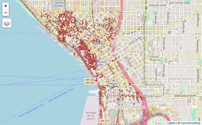
We first narrowed the listings into the boundaries of Downtown Seattle, denoted by both the Zoning Data set and the City Clerks Neighbourhood dataset. From the plot above, it is evident that these listings are unevenly distributed.
Variables and Feature Engineering
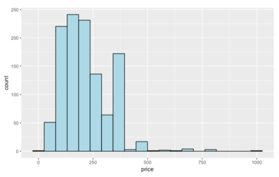
1. Dependent Variable: Price
The histogram plot of the prices in the Downtown area is very much left-skewed.
After removing a listing that is $0 in price, the summary statistics of Airbnb listing prices are as follows:
- Min: $39.00
- 25th percentile: $135.50
- 50th percentile (Mean): $199.00
- 75th percentile: $275.00
- Max: $999.000
2. Independent Variables:
In the Airbnb dataset, the variables which we have chosen to take a deeper look at, screened for multicollinearity and the feature engineering we have done has been summarized in the table below:
| # | Variable | Description of Variable and Wrangling done |
|---|---|---|
The number of guests the listing can accommodate; serves as a proxy to replace the square_area of each listing, which was omitted since more than 80% of the observations were missing | ||
| A string containing all amenities/facilities the listing has Feature Engineering: Out of the 157 possible listings found in downtown listings, we categorized the amenities into 3 groups to help with discriminating the prices in Airbnb listings better. This was inspired by GuestReady’s article on the must-haves and ‘wow’ factor extras. We then computed an index value ‘AmenitiesIndex’, which weighs the count of each category of amenities the listings have. The 3 groups are namely; 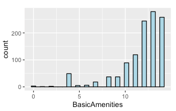 (1) Basic Amenities: Includes essential amenities such as Wifi, Heating, a Laptop friendly work space, Washer etc., including amenities that make up the criteria of what Airbnb defines as the minimal for a ‘Business Travel Ready’ listing. These basic amenities are present in at least 50% of listings  (2) Leisure Amenities: Beyond the basics, the article suggested that guests seeking a ‘home away from home’ comfort would require a few more amenities to make their stay more comfortable; which includes amenities such as cooking basics, a dishwasher, 24 hour check ins, a pool etc. In our categorization, we defined leisure amenities as those present in only 25-50% of listings.  (3) Luxury Amenities: This last group contain amenities and facilities which are more rare in nature, such as a hot tub, lock box, BBQ grill, and having a patio or balcony etc. These amenities are present in around 10-25% of the listings. For these 3 new numerical variables, we did a count of the number of amenities each listing had within each category. Then we computed | ||
Categorical variable describing the type of property e.g. Boutique hotel, Condominium, Hostel 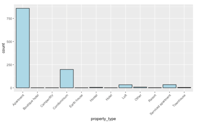 | ||
Categorical variable describing the space which is listed out i.e. Entire home, Private room or Shared room 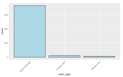 | ||
Number of bathrooms available in the listing  | ||
Categorical variable describing the type of bed available e.g Airbed, Couch, Sofa etc.  | ||
Project Storyboard


Application Overview
Our Findings
Conclusion from each of the methodologies + conclusion/future works
Reflecting on our project
 |
 |
Reflections:
Jiaks
Chloe
Bobby
Project Timeline
