Business Mafia Proposal
Contents
Project Motivation
A significant proportion of Airbnb hosts rent out portions of their own homes to generate additional side income. Instead of relying on a robust approach when setting prices, they tend to do so intuitively, relying on gut feeling. Our group hopes to offer these homeowners an alternative way to price their listings - through an amalgamation of factors such as their listing's geographical location and its relationship with Downtown Seattle.
However, the primary challenge here is simplifying and summarising the technical, complex analytics techniques into layman terms; it would require breaking down the technical jargon associated with it. In order to carry this out effectively, we created an RShiny Application which would guide owners systematically through the thought process. This would allow owners to not only derive the final proposed listing price, but also better understand our thought process and methodology behind the derivation of the price.
Project Objective
Through our project, we aim to:
- Derive individual walking distance between various key attractions and Airbnb listings in Downtown Seattle
- Analyse the spatial relationships between various key locations and Airbnb listings in Downtown Seattle to determine if the listing's location to key places affect its listing price
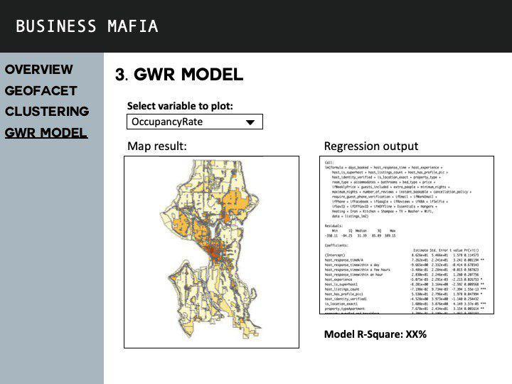
- Through the use of Local Geographical Weighted Regression (GWR) Model, we hope to help Airbnb owner(s) determine the better pricing for their listing(s).
Our Datasets
| Data | Source | Data Description | Source URL | Data Type |
|---|---|---|---|---|
Literature Review
Literature Sources:
- https://towardsdatascience.com/airbnb-rental-listings-dataset-mining-f972ed08ddec
- https://www.airbnbcitizen.com/the-airbnb-community-in-seattle/
- https://stanleyadion.shinyapps.io/AmazeingCrop/
Literature Review 1: Airbnb Rental Listings Dataset Mining
Literature's outcome: An exploratory analysis of Airbnb's Data to understand the rental landscape in New York City
- NYC's data was also obtained from Inside Airbnb and it contains the same three tables as ours, except that it was for New York City
- Listings.csv - contains 96 detailed attributes for each listing. Some of the attributes are continuous (i.e. Price, Longitude, Latitude, ratings) and others are categorical (Neighbourhoods, Listing_type, is_superhost) which is used for the analysis
- Reviews.csv - Detailed reviews given by guests with six attributes. The key attributes include date (datetime), listing_id (discrete), reviewer_id (discrete), comments (textual)
- Calendar.csv - Provides details about booking for the next year for each listing. There are four attributes in total, they are: listing_id (discrete), date (datetime), available (categorical) and price (continuous).
This is a screenshot of a paragraph taken off the literature. The context behind this paragraph was that the authors were trying to find out the number of days in a year each listing is made available for booking. Our group ran into a similar problem when analysing our Seattle Airbnb dataset.
Unfortunately, the number of days available for booking by each listing is not made publicly available by Airbnb. We found the method proposed by the authors useful as this was a simple solution that made a good enough estimation for us to gauge the number of days available for booking, and conclude if the listing was highly sought after or if it was one of those listings where it opened it's doors only few times each year.
Furthering on the earlier introduced idea that demand can be gauged from the number of reviews left by guests on their home owners, the authors investigated on how demand changes across three years - 2016 (left most graph), 2017 and 2018 (right most graph). All three graphs showed identical trends that demand across the year picks up. The period of peak demand across all three periods happens during the month of October. After which, demand tends to fall. This is mainly attributed to seasonality factors, as the seasons gradually shifts from Fall to Winter. From this, we can conclude that demand and seasonality in New York City are likely to be related to one another. This is a similar idea that can be looked into when exploring Seattle's Airbnb Dataset.
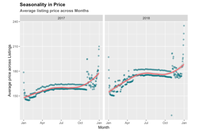
This graph shows the average listing prices per night for each month across all NYC Airbnbs. The average prices tend to increases as one progresses along in the year and Spikes in December. This pattern is similar to that of demand graph above, except in the months of November and December, where the demand starts falling since end October. Hence, one hypothesis that our group came up with when analysing listing prices and demand rates across months of the year(s) is that Airbnb owners do not take into account demand when setting prices. We attribute this to the lack of holistic pricing model(s) or analysis tool(s) that Airbnb owners do not use to understand demand patterns before determining prices. As most Airbnb owners set out to rent their apartments/rooms out to earn additional income, we believe that most owners set prices based on their intuition. This might likely be the case for Airbnb owners in Seattle as well.
Our Methodology
Project Storyboard
Application Overview
Our Findings
Reflecting on our project
Project Timeline


