Group05 Dashboard
|
|
|
|
|
|
Contents
Data Preparation
Data Source
Dashboard Design
This project aims to provide an interface for user to apply time series clustering to time related data so that they can perform clustering analysis without the need to code and visualise the result in a more interactive and visual manner. However, the dtwclust package output plots are based on default R base which can be further improved in terms of visualization.
Design Specification to Improve
The dashboard aims to bring about the following improvement of the current packages:
- Static Visualizations
The visualizations provided in current dtwclust packages are static, where users can plot dendrogram, series, centroid or sc (series and centroid) to visualize the time series clustering. However, the plot is static which is difficult for users to do identification of the cluster. For example, user is not able to identify the variable of selection within the cluster.
- Manual Calibration
User are only able to manually calibrate the key parameters such as, type of clustering, distance algorithm, centroid algorithm, number of cluster and method of agglomeration (for hierarchical clustering).
Choice of Visualization and Critic
Critics on the default visualizations provided in the dtwclust packages will be discussed as well to the areas for improvement for our visualization designs
| Visualization | Discussion |
|---|---|
|
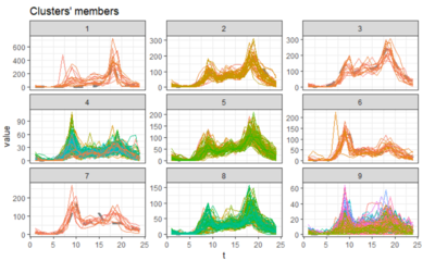
The current dtwclust package plot of series and centroid allows the user to visualize the time series of different cluster. The different colour lines represent the individual series of the variable (label). However, the plot only visualizes the time series of different cluster but user is not able to determine which series belongs to which cluster. | |
|
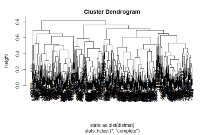
The current cluster dendrogram plot does not help in visualising the cluster especially when the dataset is large. Hence, it is difficult for user to visualize any of the cluster output. It can also be observed that the label of the series is all cluttered together and not aligned which further cause the dendrogram plot to be unappealing. |
Functional Design Specification
- User Friendly Data Preparation and Data Exploratory
- Cluster Evaluation
Exposing the Cluster Evaluation to user. Enhance the experience by recommending the number of cluster based on cluster evaluation output. User have the flexibility to use the recommended cluster or desired number of cluster. The corresponding model will be retrieve from the models computed for subsequent analysis.
- Cluster Characteristics


