ISSS608 2018-19 T1 Assign Song Chenxi Task 2
|
|
|
|
|
|
Task 2: Spatio-temporal Analysis of Citizen Science Air Quality Measurements
Using appropriate data visualisation, you are required will be asked to answer the following types of questions:
· Characterize the sensors’ coverage, performance and operation. Are they well distributed over the entire city? Are they all working properly at all times? Can you detect any unexpected behaviors of the sensors through analyzing the readings they capture? Limit your response to no more than 4 images and 600 words.
· Now turn your attention to the air pollution measurements themselves. Which part of the city shows relatively higher readings than others? Are these differences time dependent? Limit your response to no more than 6 images and 800 words.
Part A sensors’ coverage
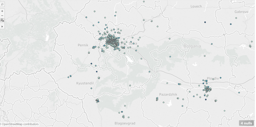
When we print all the location in the map, the stations almost distributed in Sofia.
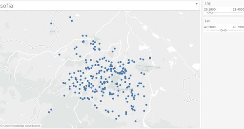
After filter the area of Sofia, the stations are distributed well among the entire country.
Part B Anomalies
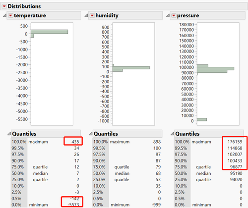
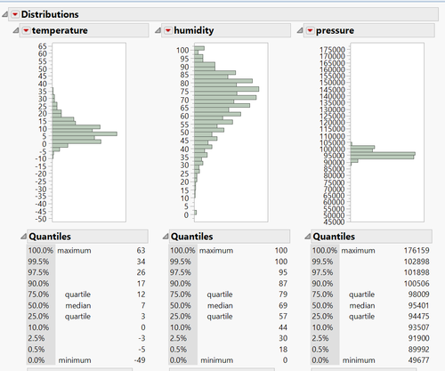
In the data cleaning process, when we check the EDA of temperature, humidity and pressure.
The min temperature is -5573, so some sensors are definitely worked abnormally.
Part C readings
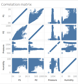
From the correlation matrix, we can observe that P1 and P2 is totally positive correlated, so we just focus on exploring one type of reading.
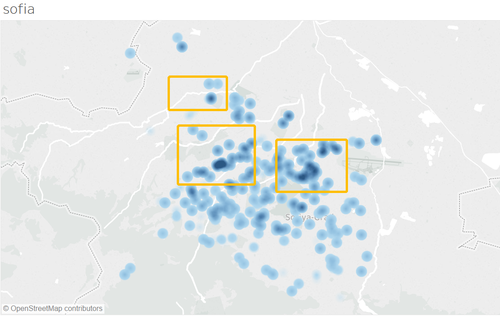
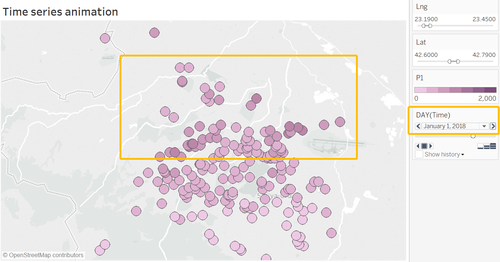
From the density map, the highlight part in map have the higher reading of P1.
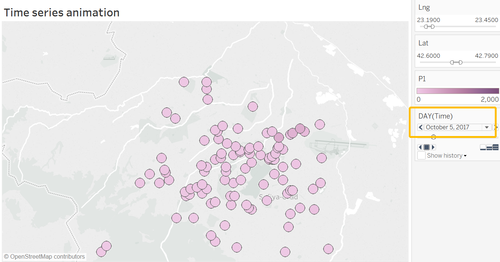
Capturing two screenshot from the animation, we can observe different things from two pics.
Compared reading in Oct/52017, color of the circle is becoming darker while the number of stations also expanded. So it is probably indicate worse air condition cause more stations to observe and supervise.
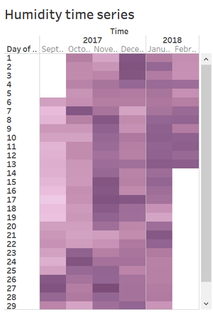
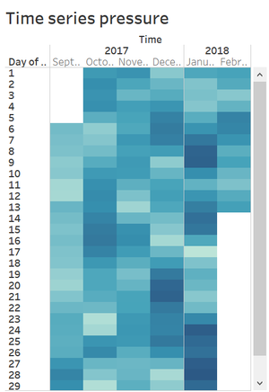
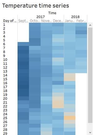
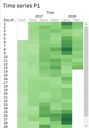
From the heatmap, all the readings have time series characters.
P1 and pressure are higher in Jan while humidity is higher in Nov.
