ISSS608 2018-19 T1 Assign Song Chenxi
|
|
|
|
|
|
|
Air pollution is an important risk factor for health in Europe and worldwide. A recent review of the global burden of disease showed that it is one of the top ten risk factors for health globally. Worldwide an estimated 7 million people died prematurely because of pollution; in the European Union (EU) 400,000 people suffer a premature death. The Organisation for Economic Cooperation and Development (OECD) predicts that in 2050 outdoor air pollution will be the top cause of environmentally related deaths worldwide. In addition, air pollution has also been classified as the leading environmental cause of cancer.
Air quality in Bulgaria is a big concern: measurements show that citizens all over the country breathe in air that is considered harmful to health. For example, concentrations of PM2.5 and PM10 are much higher than what the EU and the World Health Organization (WHO) have set to protect health.
Bulgaria had the highest PM2.5 concentrations of all EU-28 member states in urban areas over a three-year average. For PM10, Bulgaria is also leading on the top polluted countries with 77 μg/m3on the daily mean concentration (EU limit value is 50 μg/m3).
According to the WHO, 60 percent of the urban population in Bulgaria is exposed to dangerous (unhealthy) levels of particulate matter (PM10).
The Task
In this assignment, you are required to use visual analytics approach to reveal spatio-temporal patterns of air quality in Sofia City and to identify issues of concern.
Task 1: Spatio-temporal Analysis of Official Air Quality
Characterize the past and most recent situation with respect to air quality measures in Sofia City. What does a typical day look like for Sofia city? Do you see any trends of possible interest in this investigation? What anomalies do you find in the official air quality dataset? How do these affect your analysis of potential problems to the environment?
Your submission for this questions should contain no more than 10 images and 1000 words.
Task 2: Spatio-temporal Analysis of Citizen Science Air Quality Measurements
Using appropriate data visualisation, you are required will be asked to answer the following types of questions:
· Characterize the sensors’ coverage, performance and operation. Are they well distributed over the entire city? Are they all working properly at all times? Can you detect any unexpected behaviors of the sensors through analyzing the readings they capture? Limit your response to no more than 4 images and 600 words.
· Now turn your attention to the air pollution measurements themselves. Which part of the city shows relatively higher readings than others? Are these differences time dependent? Limit your response to no more than 6 images and 800 words.
Task 3
Urban air pollution is a complex issue. There are many factors affecting the air quality of a city. Some of the possible causes are:
· Local energy sources. For example, according to <a href="http://unmaskmycity.org/project/sofia/">Unmask My City</a>, a global initiative by doctors, nurses, public health practitioners, and allied health professionals dedicated to improving air quality and reducing emissions in our cities, Bulgaria’s main sources of PM10, and fine particle pollution PM2.5 (particles 2.5 microns or smaller) are household burning of fossil fuels or biomass, and transport.
· Local meteorology such as temperature, pressure, rainfall, humidity, wind etc
· Local topography
· Complex interactions between local topography and meteorological characteristics.
· Transboundary pollution for example the haze that intruded into Singapore from our neighbours.
In this third task, you are required to reveal the relationships between the factors mentioned above and the air quality measure detected in Task 1 and Task 2. Limit your response to no more than 5 images and 600 words.
Reference
· https://wiki.smu.edu.sg/18191isss608g1/Assignment
· <a href="https://uk-air.defra.gov.uk/assets/documents/reports/cat13/1309250915_130923_Review_of_air_quality_monitoring_station_classifications.pdf">https://uk-air.defra.gov.uk/assets/documents/reports/cat13/1309250915_130923_Review_of_air_quality_monitoring_station_classifications.pdf</a>
· <a href="https://www.google.com.sg/maps/place/Sofia,+Bulgaria/@42.7053962,23.0148081,10.38z/data=!4m5!3m4!1s0x40aa8682cb317bf5:0x400a01269bf5e60!8m2!3d42.6978289!4d23.3219147">https://www.google.com.sg/maps/place/Sofia,+Bulgaria/@42.7053962,23.0148081,10.38z/data=!4m5!3m4!1s0x40aa8682cb317bf5:0x400a01269bf5e60!8m2!3d42.6978289!4d23.3219147</a>
Data preparation
Part A raw data
1>Official air quality measurements (5 stations in the city) (EEA Data.zip) – as per EU guidelines on air quality monitoring see the data description.
2> Citizen science air quality measurements (Air Tube.zip), incl. temperature, humidity and pressure (many stations) and topography (gridded data).
3>Meteorological measurements (1 station) (METEO-data.zip): Temperature; Humidity; Wind speed; Pressure; Rainfall; Visibility
4>Topography data (TOPO-DATA)
Part B Data cleaning
1 EEA data
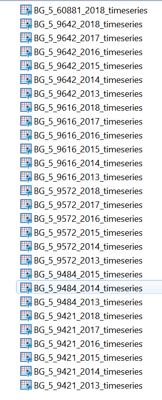
With all data in EEA zip are from 2013to 2018 separately, I concatenated data among all the time and joined with metadata as well as “sofia_topo” data.
2 Air tube data
<img border=0 width=255 height=73 id="Picture 48" src="assignment%203%20report%20-%20Copy1118_files/image002.jpg">
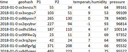
After joining two years’ data, use R code to transform geohash to latitude and longtitude.
geocoded <- gh_decode(data$geohash)
joined_data <- cbind(data, geocoded)
write_csv(joined_data, path = "sofia-air_air-sofia/Air Tube/data_bg_2017_geocoded.csv")
3 lbsf_20120101-20180917_IP
Joined IP data with EEA data to get the value of concentration.
4 Air tube
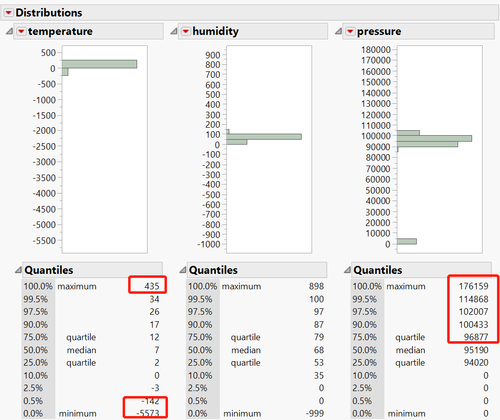
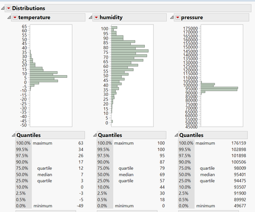
During the EDA analysis, it is observed that the max
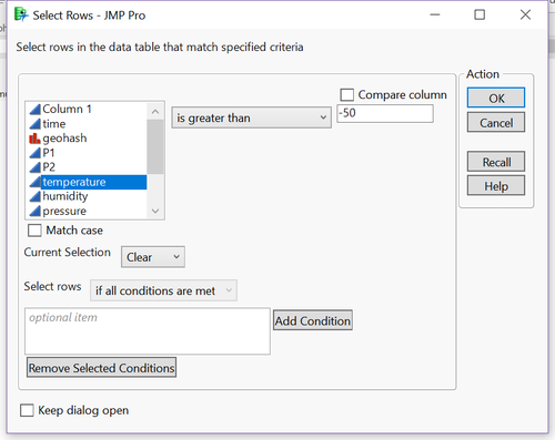
Value is 435 and min is -5573, which is unreasonable. So need to delete these data.
After removing the data under-5, the distribution is more normal distributed.
Part C Software Used in Analysis
· Tableau
· JMP Pro
· R
Task 1: Spatio-temporal Analysis of Official Air Quality
Characterize the past and most recent situation with respect to air quality measures in Sofia City. What does a typical day look like for Sofia city? Do you see any trends of possible interest in this investigation? What anomalies do you find in the official air quality dataset? How do these affect your analysis of potential problems to the environment?
Your submission for this questions should contain no more than 10 images and 1000 words.
Part A Past and most recent comparison
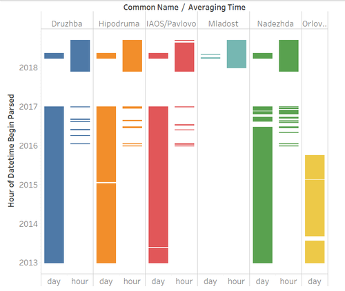
In this graph, x-axis is “averaging time” type and y-axis is daily time records changing from 2013 to 2018.
The different color indicates different stations.
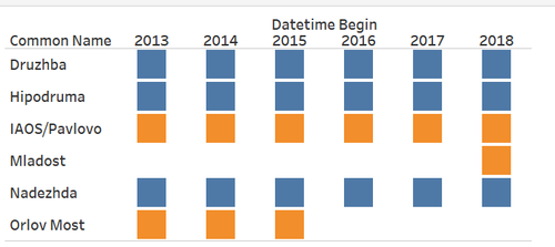
In the past from 2013 to 2016, there were 5 stations, each of them used daily measurement method.
From 2016 to 2017, one station called “Orlov Most” closed and four stations all began to use a combination of daily and hourly measurement.
Recently, from 2017 onwards, all stations use hourly as the main methods along with daily menthods, in the same time, a new station called “Mladost” launched.
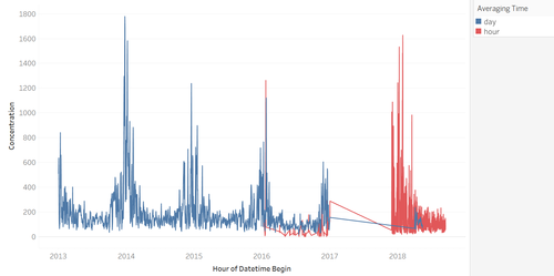
From the end of 2015, stations began discontinuous use hourly measurement and they began to reuse measured daily again in 2018.
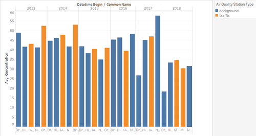
In this chart, orange is traffic air quality station and blue is the background air quality station.
From 2016 they closed a traffic one until 2017 and opened a new traffic station in 2018, which probably due to the more serious traffic pollution trends.
Traffic stations have been classified as 'located such that its pollution level is determined predominantly by the emissions from nearby traffic (roads, motorways, highways)'. Background stations are not influenced significantly by single sources but by an integrated contribution from all sources.
From 2018, the traffic seems to be predominantly impact the air pollution.
Part B calendar heatmap
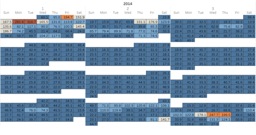
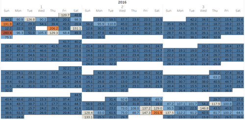
To analyze whether air pollution concentration is determined by temperature, I build the calendar map to show the time series. From the calendar, we can easily observe that the higher concentration all mainly distributed among January, February, Nov and Dec.
Part C station
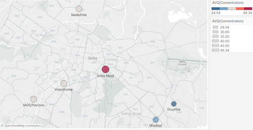
For different station, we can observe that the Orlov Most has the highest level of average pollution followed by IAOS/Pavlovo. After exploring the data, we can find that all these two stations are traffic stations.
Part D daily observation
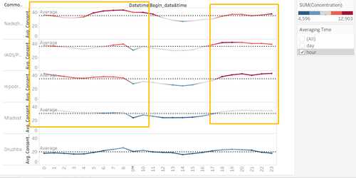
After selecting the daily measurement, we can observe the daily trend hour by hour. Also, for most of the stations, the air pollution is comparatively terrible at 4 to 10 am and after 6pm.
Task 2: Spatio-temporal Analysis of Citizen Science Air Quality Measurements
Using appropriate data visualisation, you are required will be asked to answer the following types of questions:
· Characterize the sensors’ coverage, performance and operation. Are they well distributed over the entire city? Are they all working properly at all times? Can you detect any unexpected behaviors of the sensors through analyzing the readings they capture? Limit your response to no more than 4 images and 600 words.
· Now turn your attention to the air pollution measurements themselves. Which part of the city shows relatively higher readings than others? Are these differences time dependent? Limit your response to no more than 6 images and 800 words.
Part A sensors’ coverage
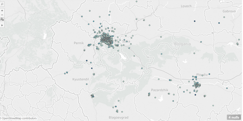
When we print all the location in the map, the stations almost distributed in Sofia.
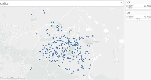
After filter the area of Sofia, the stations are distributed well among the entire country.
Part B Anomalies
In the data cleaning process, when we check the EDA of temperature, humidity and pressure.
The min temperature is -5573, so some sensors are definitely worked abnormally.
<img border=0 width=5 height=5 id="Picture 22" src="assignment%203%20report%20-%20Copy1118_files/image003.jpg">
<img width=18 height=18 src="assignment%203%20report%20-%20Copy1118_files/image001.png" alt="*">
<img width=18 height=18
src="assignment%203%20report%20-%20Copy1118_files/image001.png" alt="*"> 
<img width=18 height=18 src="assignment%203%20report%20-%20Copy1118_files/image001.png" alt="*">
<img width=18 height=18 src="assignment%203%20report%20-%20Copy1118_files/image001.png" alt="*">
Part C readings
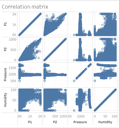
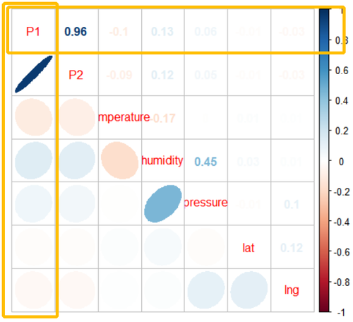
From the correlation matrix, we can observe that P1 and P2 is totally positive correlated, so we just focus on exploring one type of reading.
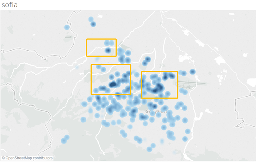
From the density map, the highlight part in map have the higher reading of P1.
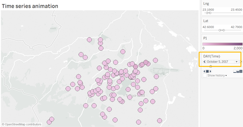
Capturing two screenshot from the animation, we can observe different things from two pics.
Compared reading in Oct/52017, color of the circle is becoming darker while the number of stations also expanded. So it is probably indicate worse air condition cause more stations to observe and supervise.
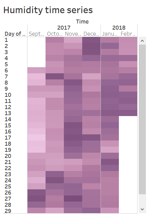
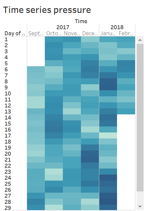
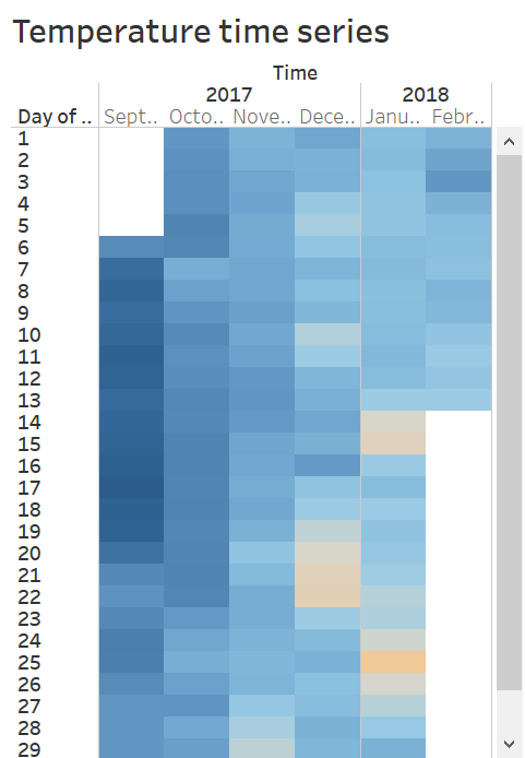
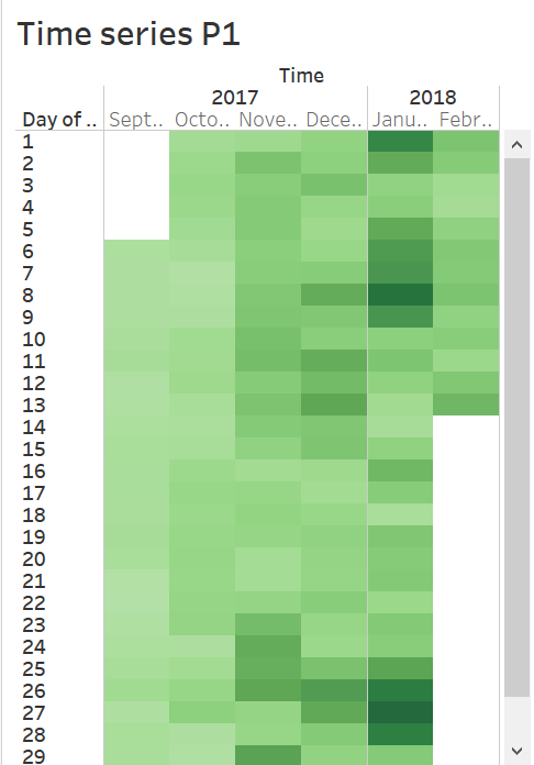
From the heatmap, all the readings have time series characters.
P1 and pressure are higher in Jan while humidity is higher in Nov.
Task 3
Urban air pollution is a complex issue. There are many factors affecting the air quality of a city. Some of the possible causes are:
· Local energy sources. For example, according to <a href="http://unmaskmycity.org/project/sofia/">Unmask My City</a>, a global initiative by doctors, nurses, public health practitioners, and allied health professionals dedicated to improving air quality and reducing emissions in our cities, Bulgaria’s main sources of PM10, and fine particle pollution PM2.5 (particles 2.5 microns or smaller) are household burning of fossil fuels or biomass, and transport.
· Local meteorology such as temperature, pressure, rainfall, humidity, wind etc
· Local topography
· Complex interactions between local topography and meteorological characteristics.
· Transboundary pollution for example the haze that intruded into Singapore from our neighbours.
In this third task, you are required to reveal the relationships between the factors mentioned above and the air quality measure detected in Task 1 and Task 2. Limit your response to no more than 5 images and 600 words.
Part A air pollution with Local meteorology such as temperature, pressure, rainfall, humidity, wind
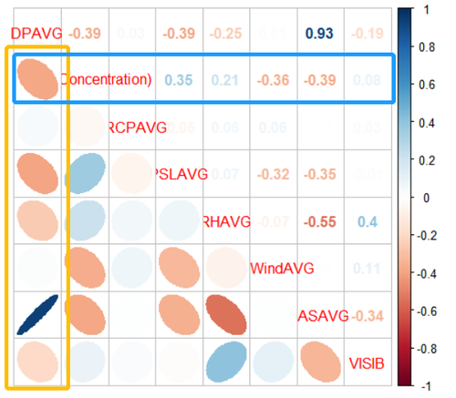
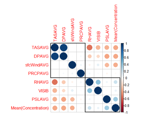
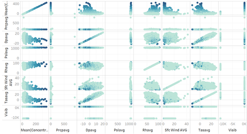
From the Correlation Matrices, PRCPAVG (Daily average precipitation amount) is most positively related to concentration with <a href="https://www.baidu.com/link?url=77T5dU8sc9WEVFVKYbfDagaTeud2vNgIhmDI1S8O5z4s6K711YhJ9aNl5zJWMix79wCISDYHCY9v5QSZ3FZNbSWmUCWKBMza5hww6h6v2DuQlcyOll-PLB8xfbW6J98L&wd=&eqid=e9bd3b690000afdc000000065bf0cea6" target="_blank">correlation coefficent</a> 0.35.
Next, RHAVG (Daily average relative humidity) is also positively impact the air pollution with coefficient 0.21 followed by VISIB with <a href="https://www.baidu.com/link?url=77T5dU8sc9WEVFVKYbfDagaTeud2vNgIhmDI1S8O5z4s6K711YhJ9aNl5zJWMix79wCISDYHCY9v5QSZ3FZNbSWmUCWKBMza5hww6h6v2DuQlcyOll-PLB8xfbW6J98L&wd=&eqid=e9bd3b690000afdc000000065bf0cea6" target="_blank">correlation coefficent</a>.09.
On the other hand, the TASACG (Daily average temperature) is most negatively related to concentration with <a href="https://www.baidu.com/link?url=77T5dU8sc9WEVFVKYbfDagaTeud2vNgIhmDI1S8O5z4s6K711YhJ9aNl5zJWMix79wCISDYHCY9v5QSZ3FZNbSWmUCWKBMza5hww6h6v2DuQlcyOll-PLB8xfbW6J98L&wd=&eqid=e9bd3b690000afdc000000065bf0cea6" target="_blank">correlation coefficent</a> -0.39.
Next, sfcwindAVG (Daily average wind speed) is negatively related to concentration with <a href="https://www.baidu.com/link?url=77T5dU8sc9WEVFVKYbfDagaTeud2vNgIhmDI1S8O5z4s6K711YhJ9aNl5zJWMix79wCISDYHCY9v5QSZ3FZNbSWmUCWKBMza5hww6h6v2DuQlcyOll-PLB8xfbW6J98L&wd=&eqid=e9bd3b690000afdc000000065bf0cea6" target="_blank">correlation coefficent</a> 0.36.
Part B P1P2 with Local meteorology such as temperature, pressure, humidity
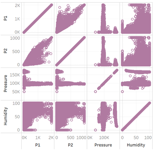
Temperature, humidity as well as pressure these factors seem to be all have lightly impact on P1
and P2,which P1 and P2 positively correlated entirely.
4 Dashboard
</d
