ISSS608 2018-19 T1 Assign Chen Jingyi Task 1
|
|
|
|
|
|
Contents
Basic findings
1.Differences in monthly and yearly trends of each station
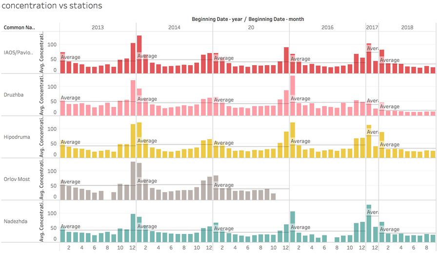
Overall: there's no significant difference among the yearly average pollutant indicator of different stations in 2013-2016, but there is a
significant drop in 2018 compared to 2016.(Here we don't consider data in 2017 since so many missing values)
Trend of months are almost the same in different years; highest value appear in late autumn and winter (October to January),especially there are peaks in December and January; lowest records always detected in spring and summer(March to September).
2.Daily records VS hourly records
Here we dig deeper into the dataset by looking at the 2 record types separately:
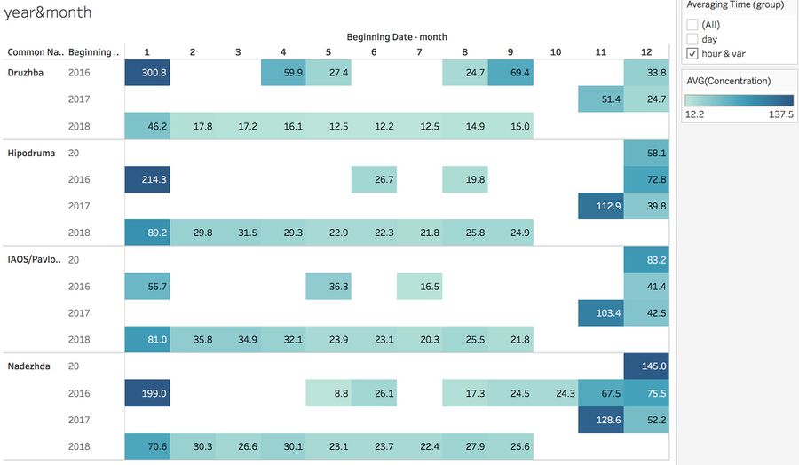
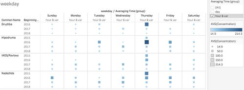
For the “hour and var” type, data are collected only from 2015 and onwards(For 'Druzhba' only 2016 and onwards), and station 'Orlov Most' doesn't record this type of concentration. The records is only consecutive from Nov 2017 to Sep 2018, others are just random collections from several months, which is weird and not good for getting any trend since not enough data.
There are also significant gaps among records of different months, which can range from 8.8 to 300.In 2018, there appear a peak in jan, stable and low in other months, all observation stations got highest records of concentration in Jan, 2016.
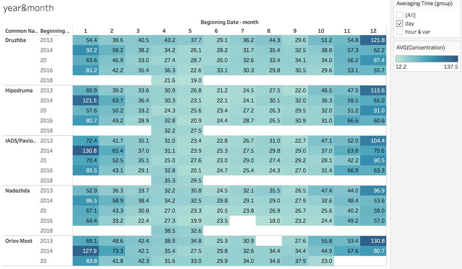
For the “Day” type, data are collected from 5 years(Orlov Most only from 2013 to 2015). Compared with another type, the fluctuations are more stable and consecutive, but there's no 2017 data, in 2018 only April and May have records.
Here we can discover a trend: overall there's a moderate decrease in 5 years; highest value appeared from Dec 2013 to Jan 2014, and from Dec 2015 to Jan 2016.
3.Hourly trend
Here we examine the concentration by hour:
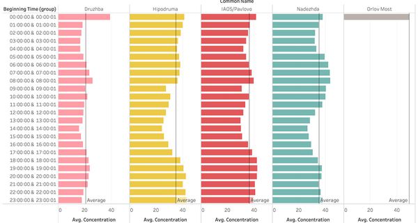
Peak: 8-9 am, 19-20 pm, 0-1am
Low ebb: 1 am to 5 am, 12pm to 16 pm
Highest of the day: 6-9 am, 17pm to 1 am
This trend is same as people’s life pattern: activity of the day starts at 6am in the morning, with concentration starts to increase, when reaches 8am, here comes the rush hour with most of people going to school or work, and public transportations exhaust pollutant gases so concentration reaches the peak. Then people are less actively moving so concentration decrease. When it’s close to normal off-work time(5pm), the data start rising again.
Anomalies & Possible influences
After deep exploration, we can gather all the unusual trends and observation in this data set:
- Ten months' records are missing in 2017, which makes the data highly biased.
- Station 'Orlov most' stopped collecting data after 2015, and it only records data at midnight, which is very strange.
- 'Hour and var' type: data only consistent from Nov 2017 to Sep 2018, others just random collection from several months, which is weird.In addition, data are collected only from 2015 and onwards('Druzhba' only 2016 and onwards),
- 'Day' type: there's no 2017 data, for 2018 there's only records of April and May.
- The different types of 'AveagingTime type' can cause inconsistencies throughout the data.
- For “day”,there's no difference among weekdays, but for “hour and var”, very large number of records on Thurdays.
Possible influences:
- Some parts of the data is highly biased, and other inconsistencies and irregularities make it hard to draw a complete picture and generate a pattern from dataset.
- Lack in several months' data and records which are not evenly taken from different time slots makes it hard to conclude a general trend.
- Two different types of measurements can cause confusion since they have different criterion of measurement.
Interesting trends
- Combine 'Hour and var' and 'Day' together, normally PM10 records for one hour is 1.6 times of the 24-hour records, but the highest average values of 'Hour and var' is far more higher than 'Day'. However, the lowest values of 'Hour and var' are far more lower than 'Day'.
- The records of concentration are high around 12pm, which indicates that most Sofia citizens may choose to enjoy their nightlives.
- Dfferences in station types:
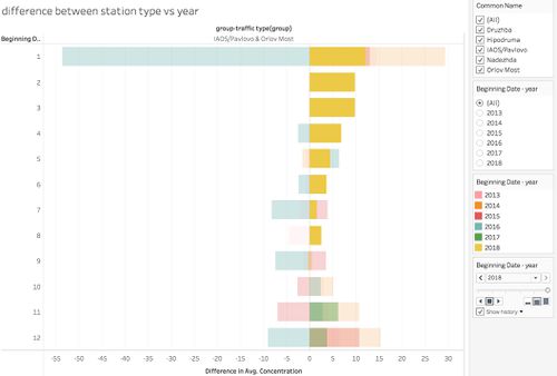
- Explore the differences of average concentration between two quality station type(background='Druzhba' + 'Hipodruma' + 'Nadezhda')(traffic=' IASO' + 'Orlov Most') by using bar graph to plot their difference, if the bars are on the right side, which means the average concentration of 'background' is larger than 'traffic', and vice versa.
- 'Traffic' - Located in close proximity to a road, in a location that should represent the highest concentrations to which the population are exposed to within the zone. Located such that the pollution level for the specific pollutant is determined predominantly by the emissions from road traffic (i.e. not ship, railway, airplane, off-road) on distinct major roads.
- 'Background' - Located such that its pollution levels are representative of the average exposure of the general population within the type of area under assessment. The pollution level should not be dominated by a single source type (e.g. traffic), unless that source type is typical within the area.
- In 2013-2015 and 2018, the concentration of 'background' is larger than 'traffic'. However in 2016, there's a reverse pattern.More records about 'Traffic' are smaller than those of 'Background', even more there is a huge discrepancy in January.
