ISSS608 2018-19 T1 Assign Charu Malik Inferences
|
|
|
|
|
|
Task 1: Spatio-temporal Analysis of Official Air Quality
It is important to note that we only have 2017 readings for November and December. Orlov Most does not have any readings for April 2013. This will be important for us to consider when comparing PM10 concentration levels between stations during that time period.
We can see seasonality in the plot shown below. In general, there is an increase in the PM10 concentrations every winter (Dec-Jan) consistently across all stations. The flat portion in 2017 is reflective of the absence of data collected over this period. The severity of the air pollution peaks in winter is decreasing year by year with 2017 having the lowest yearly peak. Historically, 2014 was the worst year for PM10 concentrations across most stations.
In the plot below, we notice that for 2013 to 2017, Nadezhda and Orlov Most have an inverse correlation. As the concentrations in Nadezhda become comparatively better, they become comparatively worse in Orlov Most. Throughout majority of this period, Nadezhda has had better conditions then other stations during winter months (Nov-Jan), only dipping slightly below average in the summer months (Jun/Jul).
Another noteworthy pattern is discernable from 2017-2018 in Druzhba. The air quality has drastically improved over this period of time in comparison to other stations. This is definitely a trend that is worthy of deeper investigation.
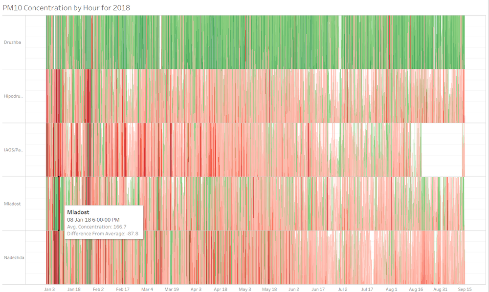
The dynamic nature of this visualization encourages the user to explore and discover new patterns or anomalies at a lower level that may not necessarily have been observable at an aggregated level. For example, in the figure below we can see a sudden spike of PM10 levels in Mladost on 8th January 2018 followed by a marked improvement in the days that follow. We should further investigate any other external factors which could contribute to this localized phenomenon that we can observe.
As we only have partial 2018 data, the calendar view stops at September for all stations. Nevertheless, this view helps us deep dive into the lowest level of information we have and understand seasonality based on hour of the day.
The first thing we notice from this view is a gap in the data at 9am in Jan across all stations. This may be due to a regularly scheduled maintenance of the stations as 2018 is the first year in which hourly readings are taken. As time passed, this maintenance may no longer have been deemed necessary.
We can also clearly see a pattern of higher concentrations of PM10 during winter (Jan-Feb) as also confirmed by our other views. Unfortunately, we do not have full year data to confirm when exactly the pollution increases towards the end of the year.
During winter, we can see that concentrations rise from 5pm onwards and peak between midnight to 3pm. This trend is not seen during spring or summer time and as such may be caused by other weather conditions that exist only during winter.
At Nadezhda during spring we see elevated readings between 5am and 1pm. From the tooltip we are able to see that these spikes generally happen on a Thursday or Friday. We must further investigate whether there are some events occurring on these days which contribute to the patterns we can see.
Task 2: Spatio-temporal Analysis of Citizen Science Air Quality Measurements
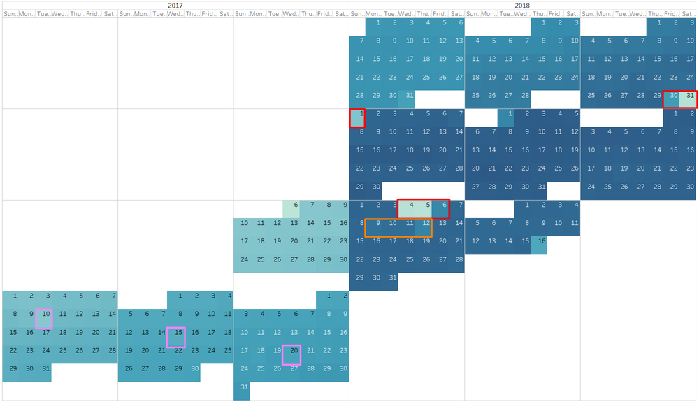
The number of readings taken daily are an overall increasing trend with more citizens participating, assembling their own stations and collecting information. In the pink cells below, we can see days with a slight dip in the number of readings. Especially since these days are the 10th, 15th and 20th, we have cause to suspect a scheduled maintenance of some of the sensors. These maintenance activities seem to have shifted to either the start or end of the month in 2018. However, there is still a curious dip at the end of March and another in the first week of July which seems to have some spillover effect onto the second week, highlighted in Orange in the figure below. Further investigation is needed to understand the cause of this.
A deeper look into erroneous readings shows us that almost every day there were come erroneous readings. However, on the 4th and 5th of July 2018, there were no erroneous readings at all. This coincides with the sudden dip in number of readings we have previously discussed.
From the animated plot of no of readings. We can observe that the number of readings and stations are increasing every month. Initially in September 2017 stations were concentrated towards the city center with only 6 stations as outliers on the edges of the city. The number of stations has increased more densely towards the city center than the edges. While the edges of the city are still sparse, there are now significantly more stations around the periphery which are taking as many readings as the most active stations were in September 2017. It is important to note that August 2018 only has half a month’s worth of information, thus the volume of readings appears smaller than the preceding month.
In September 2017, majority of the stations were reporting no errors with a small minority reporting 100% as faulty dispersed throughout the city center. Over the rest of 2017, many new stations were added which reported data correctly. None of these initially faulty stations were fixed. In 2018, a significant number of new stations were added to the southern part of the city which reported 100% erroneous data. We can see that generally if stations had erroneous readings, more than 60% of the readings were erroneous. There were very few stations with a small percentage of error.
P1 and P2 concentration readings are generally strongly correlated as we would expect. When the concentration of PM10 particles increases, we would also expect PM2.5 concentration to increase. The ratio of P1:P2 hovers between 1 and 2 when the data is aggregated at a weekly level.
However, this changes when we view the data from a daily perspective. We can see a spike on the 18th of March where the average P1 reading was more than 4 times the average P2 reading. This is something to potentially investigate as it does not follow the general trend of the expected ratio. It is possible that the pollution on this particular day was due to an event that took place then rather than the general environmental conditions.
We do see that concentrations increase in the winter month (Nov-Feb) as is also corroborated by the Official Air Quality data.


