ISSS608 2018-19 T1 Assign Charu Malik Visualizations
|
|
|
|
|
|
Contents
Chart Creation
The visualizations described in this section are in order of creation and presentation on the accompanying live dashboard. The dashboard exploratory journal is segregated into 3 sections. For each section, a brief description of each of the visualizations created is summarized below:
Official Air Quality Measurements
Sofia Official Air Quality Station Map
This map shows the relative locations of the 6 official air quality stations in Sofia along with rivers and water features in white, parks and forests in dark grey and the distinctive International Airport on the right hand side.
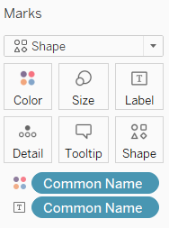
To display the above map, the fields added to Tableau rows and columns and the marks applied are shown below:
Readings Captured
This plot helps users understand the different types of measurements that were taken which form the dataset.
To display the above plot, the fields added to Tableau rows and columns and the filters applied are shown below:
For Averaging Time, the following Aliases have been set for ease of understanding of the type of measurements that are taken.
PM10 Dynamic Seasonality Plot
The plot below shows the seasonality of PM10 concentrations across all 6 official stations in Sofia.
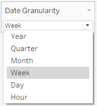
This plot allows the user to select the date granularity as which the data is displayed.
A parameter and calculated field have been setup to allow user selection of date granularity.
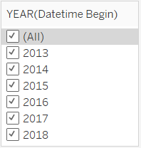
Users are also given the provision of deep-diving into specific years of interest via a filter.
Rows and columns for this view are setup as below:
Dynamic Horizon Chart
The Dynamic Horizon Chart is used to show the magnitude of PM10 readings for stations and for any given time-period. Users are able to select their chosen time horizon and the date granularity to see the variability at either a quarterly, monthly, weekly or hourly level.
This plot is generated by using a user-input bin size with which values are assigned.
A calculated field is created to display the difference of concentration from the average.
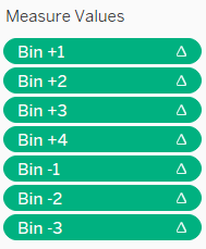
7 different calculated fields are then created to bin the concentrations appropriately:
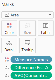
The rows and columns are setup as below:
Difference From Average and Average Concentration are in the Level of Detail in order to be displayed in the tooltip. Difference From Average must be computed using Common name to ensure that the chart is presented correctly.
Tooltip and Title configuration is as below:
Hourly Concentration Calendar View
The calendar view is a representation of an hourly calendar aggregated at weekly level to show the relative concentrations of PM10 captured at the official air stations for 2018.
The column and rows are setup as below:
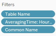
Only 2018 records are selected by placing a filter on the names of the tables which we initially imported. Hourly readings are selected for presentation in this view and the stations names are also filtered to allow the user the ability to view their station of interest.
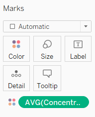
The chart is colored by concentration levels and a stepped colour scale has been chosen to allow for easy visual distinction between pollution severity levels.
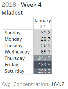
The tooltip has been configured to provide additional information. As each cell in the current view represents a week’s worth of readings at a specific hour of day at one station, the tooltip further displays the readings at each day of the week to enable us to pick out specific days of the week which have worse air pollution.


