Difference between revisions of "Kou Task3"
Jump to navigation
Jump to search
(Created page with "<!--MAIN HEADER --> {|style="background-color:#1B338F;" width="100%" cellspacing="0" cellpadding="0" valign="top" border="0" | | style="font-family:Century Gothic; font-size:...") |
|||
| Line 25: | Line 25: | ||
<br/> | <br/> | ||
| − | <font size = 5>''' | + | <font size = 5>'''Task3'''</font> |
| − | == | + | == Meteorology vs PM10 == |
| − | + | The data shows meteorology vs PM10 with the date. Temperature seems to have a negative relationship with PM10, on the other hand, humidity and air pressure seem to have a positive relationship with PM10. I assume people use heating appliances in cold season, therefore PM10 is high in that season. *For some reason, air pressure has some missing data, therefore instant plunge appears on the chart. | |
| − | [[File: | + | [[File:Fig9 image.png|1000px|frameless|center]]<br> |
| − | == | + | == Local topography vs PM10 == |
| − | + | Below shows scatterplots for altitude vs PM10 measurements and building distance. High altitude or high density of building leads to high PM10 concentration and the difference becomes large in the winter season. | |
| − | [[File: | + | Altitude vs PM10 |
| + | [[File:Fig12 image.png|1000px|frameless|center]]<br> | ||
| − | + | Building Distance vs PM10 | |
| − | + | [[File:Fig11 image.png|1000px|frameless|center]]<br> | |
| − | |||
| − | |||
| − | |||
| − | |||
| − | |||
| − | |||
| − | |||
| − | |||
| − | |||
| − | |||
| − | |||
| − | |||
| − | [[File: | ||
Latest revision as of 17:42, 18 November 2018
|
|
|
|
|
|
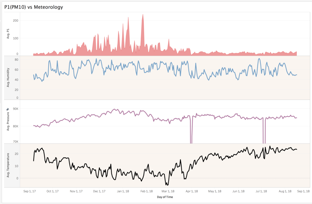
Task3
Meteorology vs PM10
The data shows meteorology vs PM10 with the date. Temperature seems to have a negative relationship with PM10, on the other hand, humidity and air pressure seem to have a positive relationship with PM10. I assume people use heating appliances in cold season, therefore PM10 is high in that season. *For some reason, air pressure has some missing data, therefore instant plunge appears on the chart.

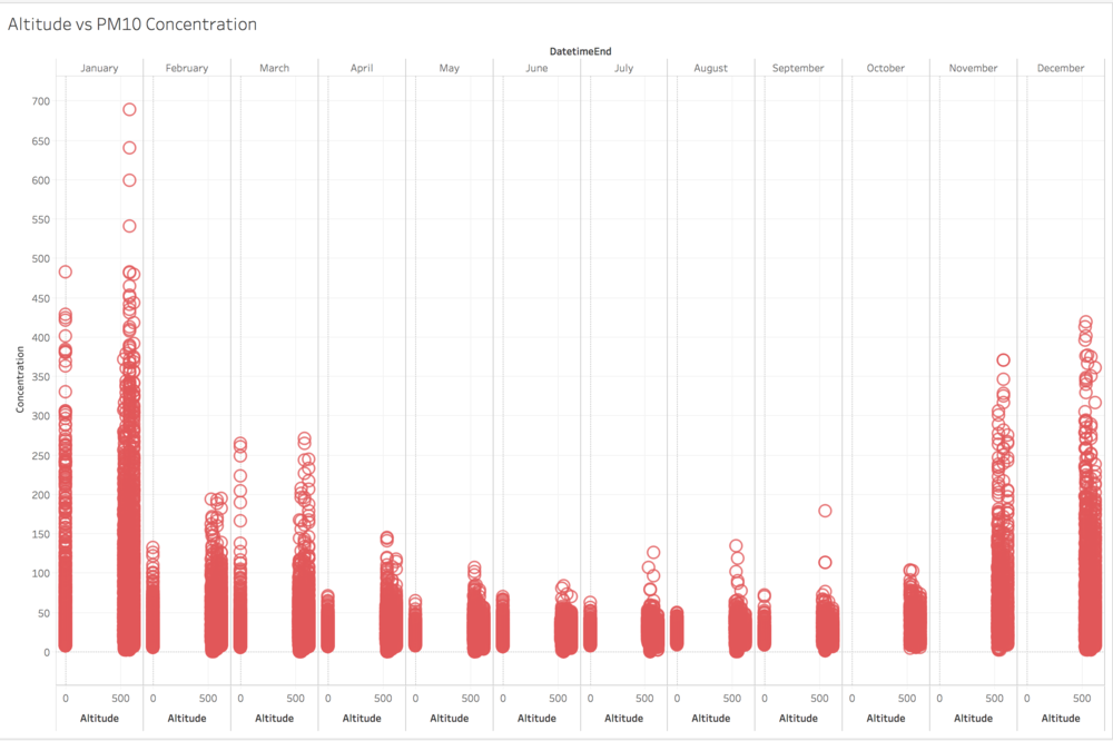
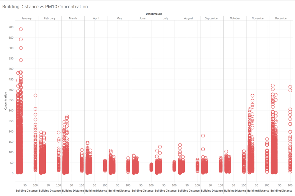
Local topography vs PM10
Below shows scatterplots for altitude vs PM10 measurements and building distance. High altitude or high density of building leads to high PM10 concentration and the difference becomes large in the winter season.
Altitude vs PM10

Building Distance vs PM10
