Difference between revisions of "Group05 Dashboard"
| (8 intermediate revisions by 2 users not shown) | |||
| Line 13: | Line 13: | ||
| style="font-family:Century Gothic; font-size:100%; solid #000000; background:#383838; text-align:center;" width="20%" | | | style="font-family:Century Gothic; font-size:100%; solid #000000; background:#383838; text-align:center;" width="20%" | | ||
; | ; | ||
| − | [[Group05_Dashboard|<b><font size="3"><font color="#FFFAF0"> | + | [[Group05_Dashboard|<b><font size="3"><font color="#FFFAF0">Dashboard Design</font></font></b>]] |
| style="font-family:Century Gothic; font-size:100%; solid #1B338F; background:#000000; text-align:center;" width="20%" | | | style="font-family:Century Gothic; font-size:100%; solid #1B338F; background:#000000; text-align:center;" width="20%" | | ||
| Line 30: | Line 30: | ||
|} | |} | ||
| − | + | ==Data Source== | |
| − | For this project, | + | For this project, BLUEbikes data set used for development of app. This dataset was picked in an attempt to understand on the demand for bike sharing data in Boston and to perform time series clustering to identify docking stations which have the same demand throughout the day for company to better manage the distribution of bikes throughout the city. |
<br> | <br> | ||
<br> | <br> | ||
| − | Data was obtained from [https://www. | + | Data was obtained from [https://www.bluebikes.com/system-data BLUEbikes System Data] and a subset of the first week of August 2018 (01 August - 07 August 2018) was used. |
{| class="wikitable" | {| class="wikitable" | ||
| Line 41: | Line 41: | ||
|- | |- | ||
| tripduration | | tripduration | ||
| − | || Duration of the Trip | + | || Duration of the Trip (seconds) |
|- | |- | ||
| starttime | | starttime | ||
| − | || Start Time of the trip | + | || Start Time and Date of the trip |
|- | |- | ||
| stoptime | | stoptime | ||
| − | || | + | || Stop Time and Date of the trip |
|- | |- | ||
| − | | | + | | start station id |
|| ID of the Start Station | || ID of the Start Station | ||
|- | |- | ||
| − | | | + | | start station name |
|| Name of Start Station | || Name of Start Station | ||
|- | |- | ||
| − | | | + | | start station latitude |
|| Latitude of Start Station | || Latitude of Start Station | ||
|- | |- | ||
| − | | | + | | start station longitude |
|| Longitude of Start Station | || Longitude of Start Station | ||
|- | |- | ||
| − | | | + | | end station id |
|| ID of End Station | || ID of End Station | ||
|- | |- | ||
| − | | | + | | end station name |
|| Name of End Station | || Name of End Station | ||
|- | |- | ||
| − | | | + | | end station latitude |
|| Latitude of End Station | || Latitude of End Station | ||
|- | |- | ||
| − | | | + | | end station longitude |
|| Longitude of End Station | || Longitude of End Station | ||
|- | |- | ||
| Line 78: | Line 78: | ||
| usertype | | usertype | ||
|| Type of User <br> | || Type of User <br> | ||
| − | (Customer = | + | (Customer= Single Trip or Day Pass user; Subscriber= Annual or Monthly Member) |
|- | |- | ||
| − | | | + | | birth year |
| − | || Year of Birth | + | || Year of Birth |
|- | |- | ||
| gender | | gender | ||
|| Gender (Zero=unknown; 1=male; 2=female) | || Gender (Zero=unknown; 1=male; 2=female) | ||
|} | |} | ||
| − | |||
| − | |||
==Dashboard Design== | ==Dashboard Design== | ||
| − | This project aims to provide an interface for | + | This project aims to provide an end-to-end interface for users to apply time series clustering to time related data so that they can perform clustering analysis without the need to code and visualise the result in a more interactive and visual manner. |
| + | <br><br> | ||
| + | Dashboard will need to allow user to import data of their interest and perform the relevant data aggregation before performing Time Series Clustering and showing the result from Time Series Clustering. Since output plots from the <b>dtwclust</b> package are based on default R base, it can be further improved in terms of visualization. | ||
| + | |||
===Design Specification to Improve=== | ===Design Specification to Improve=== | ||
The dashboard aims to bring about the following improvement of the current packages: | The dashboard aims to bring about the following improvement of the current packages: | ||
| Line 123: | Line 124: | ||
<b>User Friendly Data Preparation</b> | <b>User Friendly Data Preparation</b> | ||
| − | The application will enable the user to import the dataset and a data table will be generated to allow the user to view the dataset of choice. From there, the user can select the data column of choice to be | + | The application will enable the user to import the dataset and a data table will be generated to allow the user to view the dataset of choice. From there, the user can select the data column of choice to be analysed. The data table also allows user to search for fields within the dataset. |
|- | |- | ||
| [[File:Storyboard Data Exploratory.png|500px|center]] | | [[File:Storyboard Data Exploratory.png|500px|center]] | ||
| Line 135: | Line 136: | ||
<b>Data Analytics and Cluster Evaluation</b> | <b>Data Analytics and Cluster Evaluation</b> | ||
| − | The data | + | The data analytics technique of interest is time series clustering. Clustering technique itself have various types, different options for distance computation, centroid algorithm and method algorithm. The application main function is to allow user to explore different clustering technique on time series dataset. With that, the main focus of the data analytics tab is to allow user to do so without the need to coding, but a simple user input interface. |
The application aims to expose the Cluster Evaluation to user. In addition, to enhance the experience by recommending the number of cluster based on cluster evaluation output. User have the flexibility to use the recommended cluster or desired number of cluster. The corresponding model will be retrieve from the models computed for subsequent analysis. | The application aims to expose the Cluster Evaluation to user. In addition, to enhance the experience by recommending the number of cluster based on cluster evaluation output. User have the flexibility to use the recommended cluster or desired number of cluster. The corresponding model will be retrieve from the models computed for subsequent analysis. | ||
Latest revision as of 16:23, 8 December 2018
|
|
|
|
|
|
Contents
Data Source
For this project, BLUEbikes data set used for development of app. This dataset was picked in an attempt to understand on the demand for bike sharing data in Boston and to perform time series clustering to identify docking stations which have the same demand throughout the day for company to better manage the distribution of bikes throughout the city.
Data was obtained from BLUEbikes System Data and a subset of the first week of August 2018 (01 August - 07 August 2018) was used.
| Field Name | Description |
|---|---|
| tripduration | Duration of the Trip (seconds) |
| starttime | Start Time and Date of the trip |
| stoptime | Stop Time and Date of the trip |
| start station id | ID of the Start Station |
| start station name | Name of Start Station |
| start station latitude | Latitude of Start Station |
| start station longitude | Longitude of Start Station |
| end station id | ID of End Station |
| end station name | Name of End Station |
| end station latitude | Latitude of End Station |
| end station longitude | Longitude of End Station |
| bikeid | ID of bike |
| usertype | Type of User (Customer= Single Trip or Day Pass user; Subscriber= Annual or Monthly Member) |
| birth year | Year of Birth |
| gender | Gender (Zero=unknown; 1=male; 2=female) |
Dashboard Design
This project aims to provide an end-to-end interface for users to apply time series clustering to time related data so that they can perform clustering analysis without the need to code and visualise the result in a more interactive and visual manner.
Dashboard will need to allow user to import data of their interest and perform the relevant data aggregation before performing Time Series Clustering and showing the result from Time Series Clustering. Since output plots from the dtwclust package are based on default R base, it can be further improved in terms of visualization.
Design Specification to Improve
The dashboard aims to bring about the following improvement of the current packages:
- Static Visualizations
The visualizations provided in current dtwclust packages are static, where users can plot dendrogram, series, centroid or sc (series and centroid) to visualize the time series clustering. However, the plot is static which is difficult for users to do identification of the cluster. For example, user is not able to identify the variable of selection within the cluster.
- Manual Calibration
User are only able to manually calibrate the key parameters such as, type of clustering, distance algorithm, centroid algorithm, number of cluster and method of agglomeration (for hierarchical clustering).
Choice of Visualization and Critic
Critics on the default visualizations provided in the dtwclust packages will be discussed as well to the areas for improvement for our visualization designs
| Visualization | Discussion |
|---|---|
|
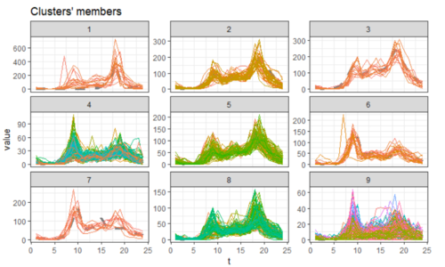
The current dtwclust package plot of series and centroid allows the user to visualize the time series of different cluster. The different colour lines represent the individual series of the variable (label). However, the plot only visualizes the time series of different cluster but user is not able to determine which series belongs to which cluster. | |
|
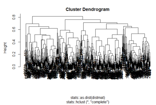
The current cluster dendrogram plot does not help in visualising the cluster especially when the dataset is large. Hence, it is difficult for user to visualize any of the cluster output. The series is all cluttered together and not aligned which results in difficulty in visualizing the dendrogram plot. |
Functional Design Specification
The project also aims to incorporate the following functional design in the application to enhance user experience and create better engagement.
| Storyboard | Detailed Design |
|---|---|
|
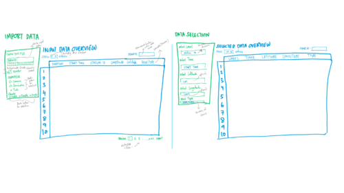
User Friendly Data Preparation The application will enable the user to import the dataset and a data table will be generated to allow the user to view the dataset of choice. From there, the user can select the data column of choice to be analysed. The data table also allows user to search for fields within the dataset. | |
|
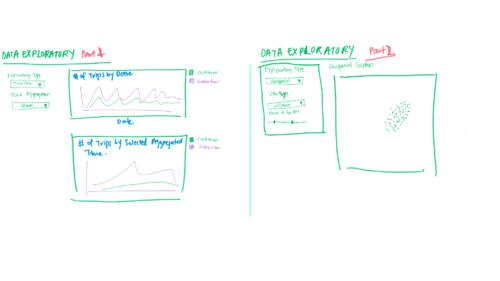
Visually Driven Data Exploratory As one of the important data preparation steps in any time series analysis is to be able to aggregate the time, the application will have an added feature to enable user to do so with ease. In addition, the user is able to visualize different time aggregation of their dataset. The application will have two different kind of data exploratory, where one is the timeline of the dataset, which will be a normal line graph. If the dataset contains longitude and latitude data, the user can also opt to explore the data using geospatial. | |
|
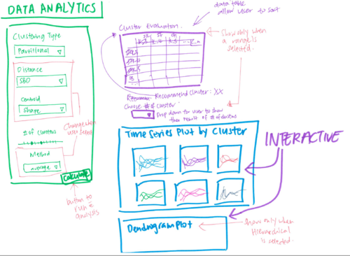
Data Analytics and Cluster Evaluation The data analytics technique of interest is time series clustering. Clustering technique itself have various types, different options for distance computation, centroid algorithm and method algorithm. The application main function is to allow user to explore different clustering technique on time series dataset. With that, the main focus of the data analytics tab is to allow user to do so without the need to coding, but a simple user input interface. The application aims to expose the Cluster Evaluation to user. In addition, to enhance the experience by recommending the number of cluster based on cluster evaluation output. User have the flexibility to use the recommended cluster or desired number of cluster. The corresponding model will be retrieve from the models computed for subsequent analysis. | |
|
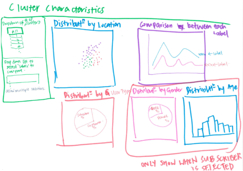
Diving Deep into Cluster Characteristics Finally, with the time series clustering performed, the application also allows user to further analyse the clusters. User are also able to select different variable from the dataset to investigate the characteristics and the idiosyncrasies of each cluster, for example the distribution of gender or age within the cluster. |
