Task 1 - Official Air Quality
Sofia City - Air Quality Analysis
|
|
|
|
|
|
|
Contents
- 1 Task 1: Spatio-temporal Analysis of Official Air Quality
- 2 Location of Air Quality Stations
- 3 Past and Present Air Quality Situation in Sofia City
- 4 A Typical Day in Sofia City (2018)
- 5 Trends of Possible Interest
- 6 Anomalies in Official Air Quality Dataset
- 7 Impact to Analysis of Potential Problems to Environment
Task 1: Spatio-temporal Analysis of Official Air Quality
Characterize the past and most recent situation with respect to air quality measures in Sofia City. What does a typical day look like for Sofia city? Do you see any trends of possible interest in this investigation? What anomalies do you find in the official air quality dataset? How do these affect your analysis of potential problems to the environment?
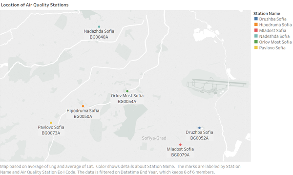
Location of Air Quality Stations
The air quality stations of Sofia City are located in the following regions.
Past and Present Air Quality Situation in Sofia City
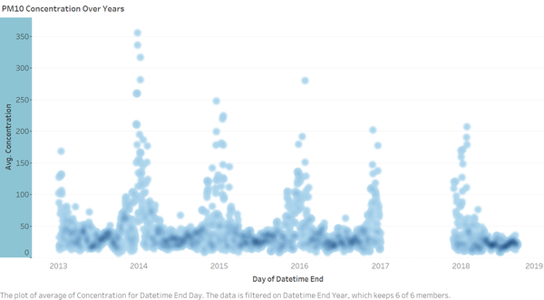
The quality of the air in Sofia City is measured by the concentration of PM10 particles in the environment. From the Density Map, it is observed that the average concentration peaks every year between November and January. But overall, the air quality appears to improve over time.
The Calendar Heat Map below shows the concentration of PM10 particles by month and weekly over time. Generally, it can be observed that the air quality dips to "Poor" and "Very Poor" levels during the winter months. There appears to be no difference in the air quality between the weekends and weekdays. Based on this visualisation, the air quality appears to improve over time.
A Typical Day in Sofia City (2018)
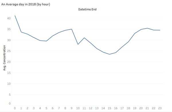
An average day in Sofia City usually consist of air quality that is classified as fair. According to official air quality, the air quality improves during the day hours between 8am to 8pm and deterioates to moderate level between 8pm to 8am.
Trends of Possible Interest
Air Quality Deteoriates during the Winter Months
An interesting observation noted during the above analysis is that the air quality deteriorates consistently during the winter months over all the years this study covers. There could be good reasons for this trend which can be further pursued subsequently.
No Difference in Air Quality between Weekends and Weekdays
Based on the calendar heat map, it appears that there is no difference in the air quality between weekends and weekdays. This strikes me as fairly interesting because in general, we may expect more traffic and vehicles on the road during weekdays, thus resulting in higher concentration of pollutants in the surrounding air.
Air Quality Appears to Improve over the Years
The official air quality readings appears to indicate that the concentrate of PM10 particles in the air is dropping over the years. The air quality pollutant index had also slowly improved to Good levels during the summer months. This is an interesting trend to investigate as it could be a sign that Bulgaria's efforts (if any) to clean up the environment are taking effort, or there could be changes in the way air quality is being measured in the recent years.
Anomalies in Official Air Quality Dataset
Missing Data
It is observed that there is missing data in the official air quality dataset between January and November 2017. There is no way of imputing values into such a wide date range. Hence, it had been decided to leave it as it is. The missing data will show up as blank in the visualisation and analysis.
Difference in Interval of Measurements
PM10 measurement readings are available in daily form between 2013 and 2016. However, it changed to hourly form between 2017 and 2018. This poses certain challenges in the analysis. Nevertheless, average by day is taken during the Tableau analysis so that the data sampling still takes place by daily in the years 2017 to 2018.
Impact to Analysis of Potential Problems to Environment
We are unable to take year 2017 into consideration during trending exercises due to the missing data.
For the difference in intervals for the PM10 measurements, this does not pose an issue as Tableau is capable of consolidating the data by da


